John Hurrell – 25 April, 2009
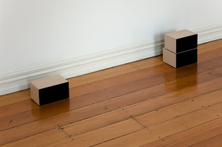
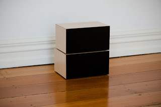
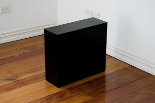
Probably these works are best in a home where their ambiguity is most pronounced. At Starkwhite they are clearly ‘art' and highly aesthetic. No one is likely to go looking for the missing remote control in the gallery space. In a house surrounded by other domestic accoutrements on the other hand, the box forms - not the wall components - would throw you. They are harder perhaps to worship as surrogate status symbols, and obviously mischievous.
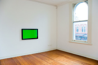
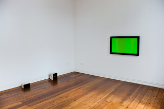
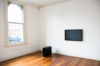
This exhibition by New Plymouth artist Matt Henry teases out the confusing similarities between minimalist sculpture and elegant sound systems, or monochromatic minimalist painting (under glass) and flat plasma screens. These ambiguous geometric forms are presented in the two upstairs rooms that overlook K’ Rd, approximately mirroring of each other in their placement within the adjacent spaces.
These pristine box-or-slablike sculptures on the floor have a remarkable finish. They look sharply crisp, each edge or plane of their form looking almost hallucinatory in their hyper-reality. More perfect than perfect in their formality.
The leadless ‘sound systems’ are accompanied by a painting/sculpture hybrid where painted, glass covered canvas panels are float-mounted and framed. In one room the panel is a fluro lime green that has associations with outdoor TV sport broadcasts. In the other, the colouration of that panel is a very dark grey. You could confuse it with black caught in a raking light.
While they look vaguely like plasma screens, they are really thick and clunky in comparison. Closer to paintings that ridicule the presentational formats of ‘sensitive’ painting by being deliberately gross in their proportion and frame colour, they become bizarre fetish objects, items devoid of function that look store bought and not obviously ‘art’. They look impressively expensive.
Probably these works are best in a home where their ambiguity is most pronounced. At Starkwhite they are clearly ‘art’ and highly aesthetic. No one is likely to go looking for the missing remote control in the gallery space. In a house surrounded by other domestic accoutrements on the other hand, the box forms - not the wall components - would throw you. They are harder perhaps to worship as surrogate status symbols, and obviously mischievous.
- John Hurrell
 Advertising in this column
 Two Rooms presents a program of residencies and projects

This Discussion has 0 comments.
Comment
Participate
Register to Participate.
Sign in
Sign in to an existing account.