John Hurrell – 23 September, 2009
These gorgeous surfaces evoke the Sublime and force your eye to rush to the ceiling and its corners, seeking out strategically positioned, negatively-shaped drip-free zones that allow planar respite.
Wellington
Wall Works
Curated by Christina Barton
8 September - 4 October 2009
David Cauchi, Michael Harrison, Patrick Lundberg, Julia Morison, Simon Morris, Reuben Paterson, Kim Pieters, and Jeena Shin.
The notion of drawing or painting directly onto the gallery wall has been with us for at least forty years now, probably becoming most well known with the practice of Sol Lewitt. For this method, Tina Barton has picked an unusual group of artists to work on the Adam Art Gallery walls, eight individuals some of which you and I would be unlikely to predict: David Cauchi, Michael Harrison, Patrick Lundberg, Julia Morison, Simon Morris, Reuben Paterson, Kim Pieters, and Jeena Shin.
For the first half of the show the gallery was opened so that the visiting public could observe the artists constructing their artworks. If you click on the link here you can examine nineteen slides showing samples of the processes involved. (Put your cursor on one image and lefthand click halfway down the righthand edge to change it).
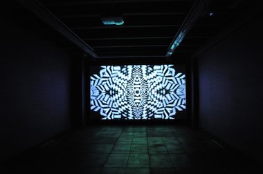
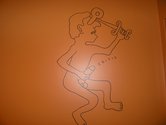
Barton has come up with a terrifically inventive eight-unit combination. The big surprises are Cauchi to install graffiti in the two toilets, Paterson to screen a DVD loop in the dark walled, rubber-floored ‘dungeon’, and Harrison to paint on a large moveable wall by the entrance. Inspired choices.
David Cauchi’s contribution is a revelation - far funnier and classier than what you’d pick up from his blogsite. His use of the orange and green planar surfaces of the Ladies and Gents on which to place withering (often appropriated) comments on idealism, art world participants, liberal democracy and our meaningless lives in general make him a sort of Aztec-obsessed Keith Haring-meets-Emil Cioran, and are so entertaining (though he’s serious in his unrelenting scorn of anything and everything, not trying to get laughs) that his incessant but earnest quips could turn you into a compulsive dunny loiterer.
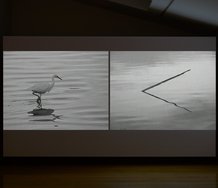
Reuben Paterson’s black and white film on a pearlescent glittery screen celebrates a queer politic in its furtive, bunkerlike space and bombarding central-state imagery. The flashing, pulsing sequences of kaleidoscopic patterns expand and contract, spin and tilt; hurling you through the screen at unexpected speeds - via different jarring scales - to explore delicate geometric snowflakes and dotty asymmetrical Brownian motion. It is difficult to leave the space because you keep discovering new shapes and tumbling axial alignments you had never previously noticed.
The tunnelling physicality of Paterson’s project has similarities with Kim Pieters’ towering and shimmering wall paintings of cascading pale blue and creamy dribbles on the staircase. These gorgeous surfaces evoke the Sublime and force your eye to rush to the ceiling and its corners, seeking out strategically positioned, negatively-shaped drip-free zones that allow planar respite.
Similarly vertical linear qualities, but much finer and graphic - not overtly painted - are also apparent in Julia Morison’s multi-panelled Myriorama mural that descends down the wall under the Adam’s infamous Athfield-designed floor/ceiling slot. Her columns of 106 portable and reusable panels, each with a gently mottled background overlayed with one of thirty-two repeatable permutations of entangled or parallel lines, drop down or traverse three linked walls, and play off against two thick black parallel bands that bisect the high planes.
Simon Morris and Jeena Shin use only one wall each. With Morris’ looping grid of pale yellow ochre lines you can see where the tone and saturation levels vary, and how - using templates not pencil - the artist has gradually built up the horizontal structure. You can also see how in the first half he has added extra lines, doubling back in reverse to create a denser complexity. The occasional ball within the transparent trajectories indicates where the tips of adjacent lines have overlapped, providing clues to where certain sections of pathway have shared common routes.
Jeena Shin’s large mural features tumbling tangram-like forms of overlapping rectangles and triangles in glossy grey on a matt white plane. The occasional fine ridge shows traces of her process as she modifies the angular geometric rhythms and descending negative gaps. The evanescent forms are getting larger for this artist, becoming more robust, more strident and less delicate.
Michael Harrison’s work on a movable rectangular wall is a comparatively simple composition that shows a small red cat suspended within the larger negative silhouette of an open-mouthed Alsatian where the curved arabesqued contours of the feline tail and canine jaws play off amusingly against each other. It is fascinating to see Harrison deal with this uncharacteristic scale and successfully resolve any formal or technical problems.
Patrick Lundberg’s project involves thinking about the site specific peculiarities of the wall fittings and architectural fittings around the top of the stairs, using a repertoire of generic pencil lines (repeatable with tracing paper) similar to those used by Sol Lewitt. You have to look closely to see them and how Lundberg refers to various wall edges, ceiling planes, bookcase corners, light fittings and banisters.
This show looks excellent now, but I saw it last weekend at the time of the Adam’s Tenth Anniversary Party. For that event Barton had commissioned temporary structures designed and built by second year students of Victoria University’s School of Architecture and Design to be placed inside or next to the installations by the eight artists I’ve just discussed. The result was a political, aesthetic and conceptual disaster, making many of the artists furious that their projects were interfered with at a time when many out-of-town visitors had come to see the show. It was sad to see such curatorial blundering - though thankfully, only short-term.
 Advertising in this column
 Two Rooms presents a program of residencies and projects
This Discussion has 0 comments.
Comment
Participate
Register to Participate.
Sign in
Sign in to an existing account.