John Hurrell – 21 May, 2010
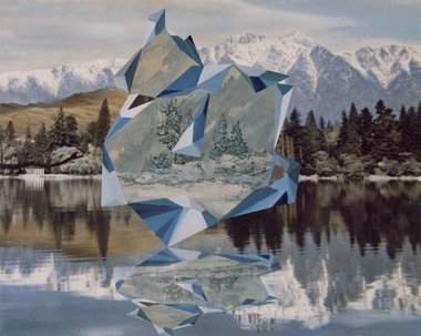
Woods' prismatic crystalline forms change in the way they can be interpreted. In the hoardings they become more like folded pirate hats or snapping paper dragons. They even appear to be peeling back the photographic plane itself as if it were paper, losing their metallic silver sheen in the process.
Auckland
Kate Woods (Billboards)
Non-Site
24 May - 20 June 2010
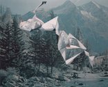
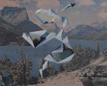
Three new billboards recently installed on Reeves Rd across from Te Tuhi, feature enlarged photographic collages by Kate Woods. Woods is known for her chocolate box scenes of forests, mountains and lakes, disrupted by bizarre chains of pyramidal forms floating through the picture plane. In these small hoardings, the flying diamondlike shapes, vaguely similar to the stainless steel sculpture of Gregor Kregar - or something Peter Trevelyan might make - encircle different landscapes some of which are lifted from oil paintings. In other words, the linked angular forms frame new inserted vistas.
Woods’ photographed collages were originally much smaller, and framed under glass, but enlarging them really suits her cheesy landscape subject-matter. It becomes less delicate and crass, and gains punch. The panoramic space becomes more enterable, even though enlarging it makes her cut edges look rougher and less tidy.
Something else happens too. Woods’ prismatic crystalline forms change in the way they can be interpreted. In the hoardings they become more like folded pirate hats or snapping paper dragons. They even appear to be peeling back the photographic plane itself as if it were paper, losing their metallic silver sheen in the process.
So there are several things happening. One is a kind of science fiction scenario where different locations and different time periods are presented in a juxtaposed fashion as equivalent portals. Another is that scenes appear to be bursting through the paper, advancing towards the viewer as if they cannot be contained by the medium or picture plane - as if in an odd sense, they are defying the artist.
Intriguingly such wilderness-based images look natural in a public space because they could at first glance be mistaken for advertising - say for air freshener or European travel. They are not obviously ‘art’ - they could be an enigmatic promotion that eschews words but which is still obvious in its pitch. They signify outdoor ‘wholesomeness’ but are contradicted by the ambiguous necklaces of geometry which appear to stand for something invasive.
These images can be interpreted many ways, yet in an odd sense they are not mysterious. The prisms are too abstract and unintegrated for that. The work doesn’t feel surreal - only coded -and you are not drawn into a beckoning immersive world, even though it does hold your attention and it is cerebrally fascinating.
As non-sites, their titles reference the rock-filled geometric containers of Robert Smithson, and so can be seen as vaguely two-dimensional versions of his project. However their images are from print culture, tourism and art, not the ‘natural’ outdoors directly, so they are a sort of ‘non-site’ even before Woods sees them. In fact through their recycling, it is a telescopic non-site-non-site process she is perpetuating, one non-site incorporating another.
With these enlarged collages, it is really their outdoor location that lets their recontextualised forests and rephotographed water speak - under real dribbling rain and direct sunlight. By placing them outside the gallery Woods’ images oddly reverse Smithson and create a non-non-site-non-site. Maybe even an ‘authentic’, newly discovered ‘natural’ site?
These sampled representations of wilderness, with their clever (perhaps ironic) title, might also be a convoluted and mischievously nihilistic gesture about art history and culture rather than transferred referents of nature. Whatever the case, they intrigue.
John Hurrell
 Advertising in this column
 Two Rooms presents a program of residencies and projects

This Discussion has 0 comments.
Comment
Participate
Register to Participate.
Sign in
Sign in to an existing account.