Erin Driessen – 15 December, 2011
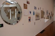
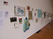
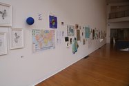
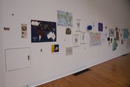
There are a lot of images and media here, so many that my first response to this work was that I had none. There were just an abundance of pictures. And objects. And they were all interesting, if somewhat novel at first in their corkboard layout. Each image or object is pinned to the wall, creating the impression of a work room or studio.
Dunedin
Ruth Watson
Myriad worlds
Curated by Aaron Kreisler
22 October 2011 - 1 April 2012
The Big Wall at the Dunedin Public Art Gallery currently displays Ruth Watson’s Myriad worlds. It is a selection of her personal cartography collection, amassed over more than two decades. Objects on the wall range from drawings to advertisements to textiles, all of which include an image of the globe. The artist has deliberately chosen as a focus point, in her words, “the image of the world in its increasing form as a symbol or leitmotif for globalisation.”
The form of the world as a globalisation symbol started in the 1960s with McLuhan’s ‘global village,’ and the first images of the Earth as a whole planet as seen from space. McLuhan features here in a section entitled, “Birth of the Global Village” on a poster claiming to depict the millennium’s events in maps. A small holographic postcard shows planet Earth ‘in the round’ beside a caption, “Earth from Outer Space.” Amongst these images (even framing them, if one believes the layout of this large and loud collection is systematic) are homeotheric and polycylindric map projections, from the sixteenth century onwards. They are planets, warped and dissected, heart-shaped and elongated.
I think the inclusions of these older interpretations of the world are essential to whatever success this exhibition has. The more contemporary images - green land masses and blue water projected onto a briefcase and a hand grenade in magazine advertisements; green and blue beads and an Earth balloon; a businessman climbing a ladder leaning against the globe - are not jolting. We have seen them time and time again. Planet Earth has become an image as appropriated as the Mona Lisa (hence Watson’s deliberate lowercasing of ‘worlds’ and lack of labels distinguishing between source material and what I assume is her own work; there is not just one ‘earth’).
The older images or ideas presented here bring forth historical narrative pre-dating the sixties: colonisation, industrialisation, war (one newspaper headline reads, “The world in Hitler’s eyes”). This dialogue between past, traditional depictions and contemporary, commercial ones forces the viewer to think about the world in new ways. Watson is suggesting we take the repeatedly served and swallowed earth-as-image, which is becoming bitter and tasteless, and heave it onto a new page on which it can be spread and reexamined.
There are a lot of images and media here, so many that my first response to this work was that I had none. There were just an abundance of pictures. And objects: a handkerchief and a jacket both printed with maps; a gold football with raised land masses on its skin; a Hoyt’s popcorn box depicting a reel-wrapped world. And they were all interesting, if somewhat novel at first in their corkboard layout. Each image or object is pinned to the wall, creating the impression of a work room or studio. There is also a small table on which academic articles and research material are spread. One walks the linear path (gratefully: a circular layout would have been too schoolroom) viewing the worlds on the wall and in the middle finds oneself between the wall and this smaller collection of writings. Perhaps the viewer is the intermediary between images and cultures which have been respectively commercialised and intellectualised, both practices that can distort and objectify.
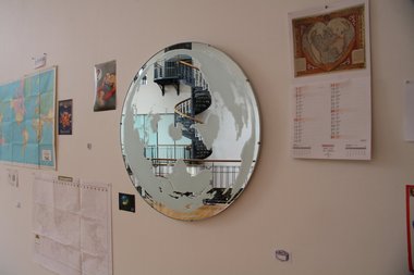
I had questions about, but no strong response to, this work. This may be exactly what Watson intended: there are so many earths, that the viewer forgets to what globalisation is usually meant to refer. To me, it refers to intercommunication, technological and educational development, and geopolitics worldwide. But which ‘world’ is this now? We have a hierarchical system of worlds: First and Third (and no one knows where exactly the Second is). We have inequalities within the First world. Most worlds within worlds experience crossover with others, and this is not always productive. These worlds look at each other - into what world was I looking when I stopped at Watson’s eye-height globe-frosted mirror: my own, the lands on my face’s periphery, the space between? The mirror is an obvious device here (as may be my reaction to it), placed on the wall right in the middle of everything, but it works to break the repetition of the images and serves as a spot for pause. It also reminds us of the art context in which we view these “real”-world images.
As I stood in front of this exhibition and walked the length of it a number of times, I couldn’t figure out how to rethink the globe as a symbol. Watson herself hopes that the truth of maps needs little deconstruction, conceding that each world map is made and added to with a particular purpose in mind: global warming statistics, surveillance and privacy monitoring, airline routes. These images were just images to me, used for advertising or to send one particular message, not to be read into too much.
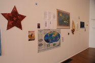
I think Watson could have used what I presume are her own drawings, to her advantage in getting a stronger message across. They are elegant and engaging, delicate depictions of a cracked earth as seen from above; the land masses are dark, the surrounding space light and fading. Her star-shaped red Earth, made from different pieces of paper which have been pinned together, is also an appealing work. These pieces could have been separately off-shot or placed together at one end or in the middle. The strategy of mixing everything up is described by curator Aaron Kreisler as deliberate, but a highlighted presentation of her work may have created more of a dialogue between the images that in turn may have instilled in me a stronger desire to understand and review my own response. (If they are not her work, I still think the exhibition would have been enhanced had some identified examples of which been included).
So, this work essentially moved me in no particular direction, a response by which I was surprised. I like maps and generally like artworks that deal with earth and its representations. The DPAG’s website blurb for this exhibition says, “Forget grass-green, royal blue and sparrow brown world maps and what they usually depict.” I had already forgotten this long ago. All of these images were familiar to me; I have seen the globe used as a symbol for the expanding world over and over. These are the usual maps. This work is thought-provoking in the sense I thought about my lack of thought - and that’s not a criticism. It is very interesting to be confronted with such a loaded symbol which has been misused and appropriated so much as to not initiate a response, and the work is a success in how it raises these issues of expansion, appropriation and passivity.
Erin Driessen
 Two Rooms presents a program of residencies and projects
 Advertising in this column

This Discussion has 0 comments.
Comment
Participate
Register to Participate.
Sign in
Sign in to an existing account.