Megan Dunn – 16 December, 2011
Prospect is an exhibition with nerve. The overarching theme or mode is abstraction, not just in the visual sense, but also in terms of thought. Everywhere there is the space of the gallery, surrounding and holding the art in its limbic system. The recurring echo seems to be emptiness and the afterlife of the object; the vacuum and the vacuum packed.
Wellington
Group show
Prospect: New Zealand Art Now
Curated by Kate Montgomery
26 November - 12 February 2011
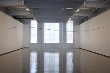
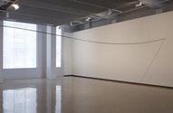
Prospect is a brainy show, or an austere show, or perhaps both in equal measures. It’s an exhibition that’s confidently curated, a strong sense of restraint evident in both the practice of the artists and the juxtapositions of their work on display. The tone is set in the foyer. John Ward Knox‘s sculpture runs from wall to wall like a washing line. The line of this sculpture contains a wave, a swivel as the piece of tensile steel meets a linked stainless steel chain. This is a bold curatorial display that suits the sculpture, the void of the gallery punctuated by just one work of art, like an exclamation mark on an empty page.
Montgomery knows how to edit, she appreciates the maxim ‘less is more.’ Prospect contains just 16 artists, the smallest selection so far in the series, but this isn’t a skimpy exhibition. Each artist’s work is showcased well. Most of the artists in Prospect were born in the early eighties or late seventies, they are the curator’s generation and there’s that synergy, that sense of closeness, in ideals and aesthetics.
The exhibition doesn’t have plaques on the wall naming the artists or their works. Several people commented on this at the opening and I noticed a complaint in the gallery comments book saying the show was difficult to navigate and the print in the catalogue was too small for ‘senior citizens.’ These are valid points for an exhibition at a public gallery that has as part of its agenda, ‘the creation of space for shared conversation and debate…’ about contemporary art. However, I can also imagine this was a calculated decision not to disturb the aesthetic of the work on display.
Prospect is an exhibition with nerve. The overarching theme or mode is abstraction, not just in the visual sense although the only ‘painters’ on display, Foote and Lundberg are working in abstraction, but also in terms of thought. Everywhere there is the space of the gallery, surrounding and holding the art in its limbic system. The recurring echo seems to be emptiness and the afterlife of the object; the vacuum and the vacuum packed. Several artists, particularly Newby, Mitchell and Buchanan also deal (perhaps at times subconsciously) with the neuroses of contemporary art and our relationship to it. Where is it? What is it? What does it smell like? How do we read it?
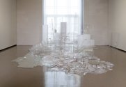
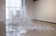
Downstairs, the colours of the exhibition are taupe, grey, tan, beige. Transparency and plastic are placed centre stage. Eve Armstrong’s Taking Stock spills out from one wall of the East gallery, an avalanche of clear containers, plastic sandwich boxes, liquid soap pumps, a Frappucino cup, without straw.This work reminded me of the epic cascade of the white terrace. On my gallery visits there was always a viewer skirting its edge, sometimes looking down into the mirrors that form part of its overflow. Armstrong’s nearby collages continue to fetishise discarded objects, including the kitchen sink. Her colour palette is acute, her work always recognisable. Yet despite the social relevance of recycling in-organic rubbish, Armstrong’s installation didn’t grow in the mind for me when I went away. Like Selina Foote’s abstract geometric paintings displayed in the same room, Taking Stock works best in person, but both remain well worth seeing.
In the adjacent gallery Fiona Connor displays a multitude of empty news stands, local and international, giving us the opportunity to take the pulse of print media. Meanwhile Fiona Jack’s nearby black and white photograph Election Day In New Plymouth captures the first women voters in New Zealand, as the current general election plays out its death throws. The architecture of each news stand is interesting from an anthropological point of view and the skeletal frames complimented Trevelyan’s pencil point sculptures round the corner.
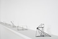
Trevelyan‘s work is impressive, an easy win with the public. His small graphite sculptures are placed along a ledge, each depicting a different theory about perspective. In the gallery comments book before I left I read, ‘Really, Really loved the pencil work!’ On my second viewing there were more comments in the book specifically complimenting the ‘pencil sculptures’ and I overheard a man asking the gallery assistant if he could take a photograph of Node. Sometimes it’s just enjoyable when ‘the others’ (the non-art insiders!) are able to appreciate a work of contemporary art. Trevelyan’s sculptures have achieved that synthesis between the medium and the message. People get the point.
Lundberg’s practice is intentionally oblique - the endgame of an elaborate process with fellow artist, Roman Mitch. The works are small in dimension, sanded back, layered, abstract, the colours muted, white, grey and blue. A piece of broken glass is taped onto the gallery wall. The incised paintings are on rectangular pieces of board the works flow around a corner, opening up to lines of scribble - again - directly applied to the gallery wall. More sanding. One painting on chipboard dangles from the ceiling: art on a rope. Lundberg’s coveted ‘shoelace’ works were noticeably absent from Prospect.
Visiting the show on the first day I wandered up to the gallery assistant standing next to Lundberg’s work.
‘What have people been asking you about today?’ I said.
‘Not very much,’ she said. ‘But they’re meant to be approaching me, because I have an artwork in my pocket.’
The gallery assistant opened her palm to reveal a small collection of stones, a tiny brass hand, a button, the ring pull from a can of soft-drink. This collection of trinkets is one of Kate Newby’s works in Prospect. I stumbled upon this work by accident but the viewer is meant to be searching for it: the exhibition map reads in tiny font, ‘Please ask a gallery host.’ This artwork made me think about Jack and his handful of magic beans, once flung out the window the beans grow into a beanstalk. However I’m charmed but not convinced by Newby’s offering of trinkets. Is she expanding or contracting the perimeters of our art experience? The reality is sometimes she’s probably doing neither.
Without the framing device of the gallery Newby’s two outdoor sculptures in Civic square are also incognito. One work is effectively a puddle, a dip in the pavement where the brick work has been cut up. Newby has set golden stones, an Allen key, another soft drink seal into the concrete. On top of the ‘art’, rainwater has collected, cigarette butts, the red loop of a discarded ‘Aids’ ribbon, pin still attached. I wouldn’t have known this puddle was part of Prospect. However, it endears me more than the slope of ‘water permeable’ pebbles nearby, an artwork that frankly, just doesn’t seem suggestive enough of anything in particular. It might be the small scale. Newby is an artist much respected by her peers, yet I find her titles a trifle whimsical for my liking. Just enough to feel stronger and a little bit fond - these sentence fragments can seem tacked on to the works, at worst an affectation.
Buchanan has three multimedia pieces in Prospect, all clearly demonstrate her interest in the intersection of art and writing and offer plenty of ‘smarts.’ However her best realised work Older Lovers etc is on display in the auditorium. I was in the position of being perhaps the ideal person to see it. I studied art history when the slide show was in full throttle, I’ve made art videos and now have a Masters in writing. The intersection of the text and the ‘slides’ is sophisticated, the adjacencies are not literal and the work is full of wry humour and surprise. From the opening frame of the video its apparent that Buchanan is telling us a story about the complications of making and viewing art, slides of representational landscapes (Mt Cook, Toss Woollaston) wobble in and out of focus, sometimes Buchanan shows us just the white fuzzy blur, the empty slide, the glitch in the carousel, like the horror of the blank page!
I suspect this video won’t be everyone’s cup of tea. I watched a young couple enter the empty auditorium as I was leaving. Barely a minute later I saw them wander blank faced through the news stands. The couple were probably born in the eighties, like many of these artists. At the after party, I’d also spoken to a guy at Mighty Mighty who was non-plussed about Prospect, conceding maybe he just wasn’t smart enough to understand most of the work. That’s always the risk with the brainy show, the art that alerts us to its own world of signs and signifiers.
But does art have to reach out and hold the audience’s hand? Is the artist even responsible for producing a work that is engaging? How do we measure the success or failure of an art work? These are old questions, but they remain perennially relevant, Duchamp’s fountain is still in full flow. The text of Older Lovers etc became my preferred catalogue to the overall exhibition. I could stop and pause at virtually any artwork and ponder lines like…
The object can become arrogant giving little signal if any as to how to behave towards it.
Each generation has something different at which they are looking…
One must allow the object its private life.
Enough pontificating for now. On Monday we go upstairs to look more closely at the work of Robert Hood, Dane Mitchell, Ava Seymour, Sriwhana Spong and Jacqueline Fraser …
Megan Dunn
Recent Comments
Warren Feeney
To state that the catalogue is 'slight' is an understatement. It consists of 36 slim pages with somewhere between 250-280 ...
Mark Amery
The 'emotional weight' must surely be based on movement, for this is what this show seems very much about the ...
Megan Dunn
I don't think the curation is neccessairly obsessed with the cerebral elements of the work on the display, it's clear ...



 Two Rooms presents a program of residencies and projects
 Advertising in this column
This Discussion has 42 comments.
Comment
Erin Driessen, 12:22 p.m. 16 December, 2011 #
Seems an extremely well-thought out exhibition. I love that the works, and therefore the viewers, are given so much space. Great job in expressing the tension between object and concept. Your "afterlife of the object" comment made me think about David Shirey writing in the 1960s that the art object was "anxious about its dignity." I think maybe it still is...
John Hurrell, 2:49 p.m. 16 December, 2011 #
Is there any dignity left with the art object? What about the art concept? Can we assume all ideas are good, or is there a distinction between ideationally dry and barren underpinnings and fertile evocative ones? John Ward Knox's work seems like a symbolic threshold that artists and curators, as well as other visitors, need to cross.
Erin Driessen, 3:37 p.m. 16 December, 2011 #
Yeah, I like the threshold idea.
The distinction I guess can only be made subjectively, but maybe barrenness is required. The object and the concept are much more dignified when they co-exist.
John Hurrell, 8:28 a.m. 17 December, 2011 #
Everything coexists, does it not? 'Co-existing' is a bit on the vague side, surely? Opposing elements can coexist - ie. put up with each other's presence. You mean a strong sympathy, a type of commonality I think.
Erin Driessen, 1:19 p.m. 17 December, 2011 #
Sympathy! Yes! Thanks John.
Megan Dunn, 3:10 p.m. 16 December, 2011 #
An interesting observation on the Knox work as a symbolic threshold John. An artist mentioned to me the other night that he would have liked to have seen this work placed lower down - so it's not literally above the audience's heads. I thought that would have changed the experience of the sculpture substantially, however I was aware it would probably pose a health and safety threat if it was low enough to walk into...or bang your head on!
John Hurrell, 8:39 a.m. 17 December, 2011 #
The group of artists seems really focussed as a selection. The only puzzle is Fraser. Odd that she is included and not say Richard Frater with his amazing films. (Others might say Tahi Moore.) I guess the variation in age makes the line up much healthier and less incestuous or claustrophobic.
Megan Dunn, 9:22 a.m. 17 December, 2011 #
Yes, it is a very focussed show and it works well because of that. There's great style in the presentation of the artworks - Mark A has made some good observations about that in his Stuff piece - particularly the way the Armstrong and Connor installations balance one another on oposing sides of the downstairs galleries. The Fraser inclusion is interesting and I think that particular videowork deserves more consideration...it's an intriguing piece, a conundrum.
Andrew Paul Wood, 8:10 p.m. 19 December, 2011 #
Fraser does stand out rather among the younger and emerging names, also (yes I know, how provincial of me) but aside from Rob Hood (an excellent choice) there's very little South Island love going on, which given Kate's long tenure at The Physics Room, seems a bit peculiar. It's not THAT s**t down here!!!! (is the Big Brother profanity alarm a new feature? How very un-NZ vernacular)
@ John: It's still fairly incestuous, regardless of Fraser's curious inclusion - but the same can be said of any contemporary group show curated in New Zealand because that's the nature of the community - still, it would have been nice to see a few older artists as well.
John Hurrell, 8:45 p.m. 19 December, 2011 #
I can't comment, Andrew, as I haven't seen the exhibition, but I admire the tautness of the selection. In fact I'd be happy if it were more so and ALL the same age group - but then again Fraser might be perfect. When I visit I could find it too dry and lacking in sensual hooks (even imagined mental ones) for austere solo shows that are good in isolation might be too similar in bulk - but this might work. It is all very well to have a clipboard so you can tick off different categories and locations but the real test is the gallery experience - whether it is satisfying or not.
I thought Emma Bugden's Prospect was very smart in its juxtapositions but a few incongruous inclusions like Hotere, Driver and Frizzell (if my memory is right?) didn't fit in at all well.
Megan Dunn, 8:30 a.m. 20 December, 2011 #
Andrew, it's not so much Fraser's age that made her stand out for me - although she is of course a different generation to most of the artists - it was her use of very pop cultural content that she would not be the target market for - I mean, I could be wrong here, but I doubt Jay-Z was speaking to Fraser as his ideal audience when he wrote 99 problems. However, great to see his song used in a surprising context.
BTW - the Big Brother profanity alarm came from me! Slightly uncouth perhaps, but I must 'own' it.
Is there a mandate for Prospect to balance inclusion of Nth and Sth Island artists? Or is this just desirable?
Andrew Paul Wood, 9:31 p.m. 20 December, 2011 #
Prospect is mandated to present the best in contemporary New Zealand art (at least as I understand it), and it is my profession to know what the level of quality is in my bailiwick, therefore I find it quite surprising that Rob is pretty much seen as the only Southerner worth including. That's not balance, that's just acknowledging a statistical unlikelihood. Conservatively I would guess that slightly over half all practicing artists of significant reputation in New Zealand were/are Ilam graduates, and there is an exceptional population of artists in both Christchurch and Dunedin ably supported by two nationally important galleries and several major dealers. One can only pause and raise an eyebrow. It's a trend I also seem to detect in things like the Walters and the Wallace.
Megan Dunn, 7:19 a.m. 21 December, 2011 #
Several Wellington artists have commented on this to me too - perhaps more along the lines of Prospect being a show with a focus on Aucklanders...
I did think Rob's work was extremely good and was suprised I had not come across him before but that will owe more to the fact I have only been back in NZ a year or so.
Andrew Paul Wood, 7:41 p.m. 22 December, 2011 #
Yes, I think Rob is phenomenal, but is the Auckland thing just my imagination, and if not, why is it happening? New Zealand's artistic strength is the diversity of the scenes in the different centres.
John Hurrell, 7:57 p.m. 22 December, 2011 #
Dream on Andrew. Auckland has a huge percentage of working artists actively presenting shows, many of them Ilam grads now teaching up here. That Aucklanders dominate is no mystery.
The thing is there no point in moaning about Kate M unless you sincerely believe in a quota system - which would be naff. She in her past role as Physics Room director is most qualified to assess what has been happening nationally. The show is not a 'best of' anyway, but a shaped curated selection to emphasise (I imagine) a tendency that is of interest to her. I haven't seen the show, but that is how it appears to me.
Warren Feeney, 8:30 a.m. 24 December, 2011 #
John, Your point about Prospect 2011 not being a 'best of' survey is critical to its success. To me it looks like a reconsideration - and a model for the future - of survey shows of New Zealand art. It feels very timely. Everyone I have spoken to sees Prospect 2011 as austere and sparse and these are adjectives in praise of its curation and installation. The fact it is more selective in its focus provides an example to all curators in New Zealand and its public galleries. The issue of whether or not South Island artists are adequately represented seems beside the point. (I am sure it never occurred to Kate Montgomery).
If Prospect 2011 reveals any bias in its selection process it would seem to me to reside in the fact that all participating artists are well-known to the arts community through their representation in the exhibition programmes of the Physics Room,Objectspace, Enjoy and/or the Blue Oyster - all arts institutions funded by Creative New Zealand. On one level, this makes it difficult not to read Prospect 2011 as an exhibition that celebrates a kind of central government ‘house-style,’ for the visual arts. And this is not to suggest this is a bad thing. It simply emphasises that this is a survey, rather than the survey of NZ art. It is also worth noting that only one of the sixteen artists in Prospect are in Warwick Brown's 'collector's guide' of 100 up and coming NZ artists- Seen this Century (2009).
John Hurrell, 12:49 a.m. 25 December, 2011 #
That last sentence Warren. This show is not aimed at interesting collectors in these artists is it? I think most (not all) of the work is probably too difficult for that, and fascinating for that point - that they are 'up and coming' and uncompromising.
Andrew Paul Wood, 7:14 p.m. 28 December, 2011 #
Uncompromising? On the contrary, it's all rather bland, safe, and straight out of the International Contemporary Art playbook 1990-2005 to the point of perhaps even being a tad derrivative. I have nothing against "cerebral" art per se, but I'm crying out for something genuinely retinal and visceral. A tight selection perhaps, but one that is rather rarified for my tastes.
John Hurrell, 9:43 a.m. 29 December, 2011 #
Well it will be interesting to see what Mark Amery makes of Emma Bugden's Local Knowledge show at The Dowse, in a couple of weeks.
http://www.dowse.org.nz/en/News/Latest-News/A-Time-and-a-Place-for-Everything/
This notion of being 'cerebral' or 'brainy' - it's very hard to determine what that means, what it's indicators are. It's a bit like being 'expressive' in its vagueness. Does the presence of language indicate the work is clever? Or do philosophical or literary references? Or formal qualities like unmodulated colour, geometric shapes and clean edges? That's hooey too. Academic sensibilities are just as prone to hysterical ravings as anyone else - aren't they?
Megan Dunn, 10:57 a.m. 29 December, 2011 #
I guess that's the point - it is quite hard to determine what it all means. When it's hard to instantly 'digest' or understand an artwork does that automatically mean it is profound? Of course the answers and the questions don't have to be this black and white.
But I certainly don't think a lot of the art was in a hurry to 'communicate'...not neccessairly a criticism, but when the conversations perenially return to politics of inclusion/exclusion or curatorial stance - we miss really looking at the art in all its strangeness. These works were not made to be displayed together - they work very well together - but what do they say about our society, our moment in time, right now. Or at the very least what do they tell us about the artists who made them...
Andrew Paul Wood, 8:48 p.m. 29 December, 2011 #
In part because I have a museological as well as an art historical training, I believe the role of the curator is to illuminate and provide context, not to try to usurp the creative role of the artist by aiming for some kind of ambiguity or private schema. I am, for example, less interested in playing along with et al and "their" obfuscations than I am in examining You Know Who's use of distinct creative heteronyms, if that makes any sense...
Andrew Paul Wood, 7:05 p.m. 28 December, 2011 #
Not a moan, John, merely an observation, and the whole notion of imperial art centres is soooooo last century. But thanks for reassuring the rest of the country that it need not bother anymore - I'll organise the euthenasia committee. I am not convinced that a disposable blob of chewing gum on a wall (1990s London called and wants its idea back) is more interesting than, say, Roger Boyce's "History of Painting" or a Kushana Bush painting, or a Zena Swanson Heath-Robinson-esque installation, or any one of a number of things made by people who choose to live in the Mainland. But then what would I know, I'm only a South Island goy forbidden to see even Jehovah's hinderparts.
Megan Dunn, 7:25 a.m. 29 December, 2011 #
Andrew, you do make me smile, especially that line about 1990's London wanting its ideas back.
I had to comment on the cerebral tone of the show as it was a striking feature. I guess I was interested in considering how the art might function with an audience who didn't know (or care to research) its references. And I thought at that moment that some - not all - of the questions raised really do come back to that Duchampian moment of the readymade, where the context of the gallery remains fundamental to recognising the art. Maybe this is a banal point - I am not beyond banal - but I think it's vital to contemplate the effect this show has/might have on a non-specialist art audience (given that prospect is shown in a public gallery, not an artist run space) it's so easy for everyone to lapse into internal politics, which are not of course irrelevant...
Sometimes I think we can under-estimate the intelligence of the audience. For me Newby's outside works (perhaps inadvertantly) took this risk - I am sure many people appreciate the humble, genuine puddle all the time. I don't need to look at an 'art' puddle - gasp - to appreciate my enviroment more closely...however, that's just one opinion. If it is what the artist is moved to make then they must produce as many puddles as they like and pay no attention to naysayers.
Andrew Paul Wood, 8:42 p.m. 29 December, 2011 #
I think a general audience would appreciate Eve Armstrong's installation - it's spectacular and she has an instinct for the theatrical flourish even with the most humble of objets trouve.
I like the puddle, but then I am mentally equipped to make connections with land art and situational aesthetics (which I think is going out of fashion in favour of the welcom return of Romanticism) - but it's not an exceptional puddle except that it is in the environs of an art gallery, and do we really need to be flogging that one trick pony a century later?
I do wonder how much of a dialogue is being had between the work and the public, especially as the lack of wall texts seems almost arrogant given the difficulty of much of the work involved.
Megan Dunn, 8:14 a.m. 31 December, 2011 #
The lack of wall texts is interesting, I imagine the show simply looked better without them. Yet at the opening evening several people I knew were trying to navigate around with the map or the catalogue and they were asking earnestly 'who's work is this? 'Who is this?'
During one of my subsequent gallery trips I was very impressed to see an elderly couple at the info desk asking the attendant where Kate Newby's work was. They had their gallery map in hand and were obviously fully engaged in the pursuit of seeing each work on offer.
The marketing of the show has been quite good really. There's a huge banner outside saying free entry - this may be a response to the fact that people complained about the entry fee for Oceania.
Also there's a designed A4 sheet of paper that lists the word prospect vertically down the page, allowing the viewer/gallery goer/who-ever to make a completely new set of words using each of the first letters to describe NZ art now. e.g. Pragmatic, Responsive, Original etc etc These completed sheets of paper are now being postered around town as banners to advertise the show. One poster says simply Pretty Flowers and has lots of little flower drawings all over it. Arf! Arf!
John Hurrell, 1:31 p.m. 31 December, 2011 #
The catalogue is a bit slight, don't you think? A proper hardcovered book would have really given this show clout. Something with classy photographs and detailed discussion of the hang.
Warren Feeney, 3:41 p.m. 4 January, 2012 #
To state that the catalogue is 'slight' is an understatement. It consists of 36 slim pages with somewhere between 250-280 words on each artist. In terms of the response and discussion about this exhibition online, on National Radio and in the country's newspapers it seems like a serious oversight. I would have thought that Prospect 2011 would have easily accommodated a catalogue on the scale of the Christchurch Art Gallery's Debuilding exhibition by Justin Paton in February 2011. Was the curator provided with the opportunity to draw Prospect's numerous threads and conundrums together or did time simply run out?
Roger Boyce, 12:06 a.m. 30 December, 2011 #
Curators are subject, of course, to the same international(ly) acculturating forces shaping artists. And, like artists are participants (with varying degrees of voluntarism) in a system of aesthetic imperialism.
That is to say, that within the bounds of a curator's (or artist's) position and institutionally afforded power, they inevitably "organize, create and/or maintain unequal economic, cultural, and territorial relationships."
Economic, cultural, and territorial inequalities in the arts are, in my observation, based on how well or poorly artworks and exhibitions approximate imperial style. Those that do it best are the most 'equal'.
The trick, when one is geographically far from capitols of style, is for (both curators and artists) to keep a robust and ongoing chain-of-supply. The supply being accurate and up-to-date information. Sometimes mis- labeled as zeitgeist.
Curators and artists are valued (literally) for the quality of their information and what they choose to do with that 'intelligence', once gathered.
The combination of - art world intelligence & its intelligent use permits artists and curators to not only approximate imperial style but to also anticipate it.
The exclusive (and unequal) NZ north/south divide, accurately highlighted in this thread and others by Andrew Paul Wood is little different, in structure and function, than the divide (say) between LA & NYC. The fact that lots of folks now know that LA produced some of the United States' most original and influential artists did little to expedite the LA practitioners' slower emergence to international recognition than lesser lights located in the art publishing center of Gotham.
The fact that Megan Dunn comes late to an appreciation of south island based Robert Hood ( who to my mind is the smartest of NZ installers) illustrates the realpolitik comparisons of my previous paragraph.
In the end there's nothing much to be done - nor would I wish to if I could - about the magnificently archaic 19th century-like style-politics of art making and curating.
If in fact Kate Montgomery's approach to curating Prospect is akin to that of a film making auteur (which I reckon it is) then I would expect a certain amount of necessary ruthlessness in her decision making. And questions of 'whether' would be more properly addressed to whether the exhibition adds up to anything... as opposed to the self-consuming question of whether or not a visual arts curator should ever assume to selfishly discriminate rather than social-scientifically include.
Frankly, I don't know.
John Hurrell, 4:22 p.m. 30 December, 2011 #
I personally think that issues about the show being 'brainy' are much more interesting than the geographical location of the participants. Mark, in his radio review <http://www.radionz.co.nz/national/programmes/artsonsunday/audio/2503544/prospects> uses the term 'pointyheaded' - yet I wonder why that loaded expression? Does it mean a denial of sensuality, or an embracing of literary references beyond its own experiential nature? Perhaps it means that the artists appear to be trying to show off their intelligence, a sort of 'try hard' affectation where intellectual layering is expected to bring richness to their practices? Is it a term attacking academia and post-graduate mindsets for example?
John Hurrell, 11:34 p.m. 1 January, 2012 #
There is also the research of neuroscientists like Antonio Damasio and Joseph Ledoux who believe that feeling and logical analysis are far closer in terms of brain functionality than what we have previously supposed. That presents the possibility that a curator like Montgomery might work from feeling and intuition, and not necessarily be fixated on the cerebral or intellectual aspects of these artists at all.
Megan Dunn, 8:04 a.m. 2 January, 2012 #
I don't think the curation is neccessairly obsessed with the cerebral elements of the work on the display, it's clear there's a strong sense of style at work - a strong visual aesthetic that is linking the exhibits.
However, the terms of the artworks are sometimes quite cerebral - case in point would be Buchanan's video projection of the back of her own head, as she conducts research into/done by Virginia Woolf at the British Library.
If we engage with this work on its own terms, then we are considering/contemplating a set of ideas, some of which are not highly visible in the work itself. I for instance would not have been aware that Buchanan was researching Woolf, or was at the British Library etc etc just by looking at the work.
There's definitely some kind of emotional weight that emenates from the show as a whole, what exactly it is, I am not sure! Back in reference to the Buchanan work above, the viewer has no 'face' to engage with in this video, you are looking at the back of someone's head. It's quite an inward looking work - which is interesting in itself.
Mark Amery, 1:03 p.m. 2 January, 2012 #
The 'emotional weight' must surely be based on movement, for this is what this show seems very much about the more I consider it. Movement in space. And emotionally I equate this with dance - the emotional weight that movement can carry lightly as an abstraction. As you say Megan that doesn't limit it at all to the cerebral. Movement equates to elegance, perhaps.
And this perhaps is where the whole does work so well as a piece of curation. The work is not only given space it moves you through the space and often seems about this movement.
Megan Dunn, 5:16 p.m. 30 December, 2011 #
Me again!
I have a fundamental problem with the word 'challenge' in relation to contemporary art shows - I think it can be quite patronising to assume that a show is challenging for an audience. I am being a bit contrary really - as I am sure it is challenging, but a challenge must be risen to or at some level accepted by all participants.
Sometimes an audience blithely glides over an artwork and it is invisible to them, rather than a challenge...just a thought...(not specific to Prospect either...)
Mark Amery, 5:41 p.m. 30 December, 2011 #
Ah John. I regretted the term pointy-headed as soon as I put down the phone. Such is the live radio interview. It was flippant and I think it's inaccurate and misleading, so you're right to highlight it. What I was getting at most inelegantly was that this was a show that asks the viewer to engage intellectually as well as viscerally. The viewer rather than the artists need to adopt some 'pointy-headedness' in terms of questioning their preconceptions.
I've enjoyed the comments in this thread and agree with most. Yes the show presents (as I think perhaps I alluded to in the radio review also) a different model, and shows what can be done dynamically with the white cube - in contrast to the grab-all bags often of past years. And yes, in this case its to those in the know a mostly safe set of artists, but not to Wellington viewers who don't see enough of these artists. What the show's model welcomes I'd hope is others to now come in and provide their own quite distinct spins on 'art now' which challenge this particular view.
Andrew Paul Wood, 8:22 p.m. 30 December, 2011 #
"...but not to Wellington viewers who don't see enough of these artists."
Which really does make one wonder what the hell City Art Gallery and Te Papa are doing?
John Hurrell, 11:02 p.m. 30 December, 2011 #
Getting back to Warren's comment on Xmas Eve. He talks about 'the Physics Room, Objectspace, Enjoy and/or the Blue Oyster - all arts institutions funded by Creative New Zealand,' and goes on to say it is 'difficult not to read Prospect 2011 as an exhibition that celebrates a kind of central government ‘house-style,’ for the visual arts.'
Is that fair? Just because CNZ funds those institutions doesn't mean there is a house style. CNZ could be consciously encouraging diversity, not one single approach.
Andrew Paul Wood, 12:24 a.m. 31 December, 2011 #
No, but it perhaps suggests that CNZ favours certain institutions on the circuit and their somewhat closed game of musical curators. Homogenity ensues.
John Hurrell, 12:28 a.m. 31 December, 2011 #
I don't agree. How does Objectspace fit in that list? What a crazy mix.
Warren Feeney, 9:28 a.m. 31 December, 2011 #
I am not suggesting there is a conspiracy theory here in regards to Objectspace or any other CNZ funded arts institutions and the selected artists in Prospect. I mention the premise of a 'house style' as indicative of where the curator's interests reside and their collective presence in the programmes of these non-commercial gallery spaces. If, for example, Warwick Brown, Francis Pound, Edward Hanfling or Michael Dunn had curated Prospect it would have been an entirely different creature and revealed alternative agendas and 'house styles'. Would that be such a bad thing? The more I consider Prospect 2011 the more its success resides in its strong curatorial focus. Kate Montgomery is the 17th active participant in this show - alongside the 16 artists she has selected - A curator with a knowledge and understanding of their practices, she demonstrates a commanding use of the gallery's spaces. In this sense, it should also be noted that the conspiracy theory of a North Island bias in this show is equally questionable. There may only be one South Island-based artist in Prospect but Robert Hood has more square metres of space for his work than any other participant and again, I am sure that this is a curatorial decision about the best allocated use of space for a body of work deserving of the attention.
Mark Amery, 5:06 p.m. 1 January, 2012 #
In reference to Warren's points on artist selection critics often pretend to be blind to the sheer practical factors that influence artist selection. Zina Swanson and Kushana Bush from the SI were both in Ready to Roll at CGW last year (though they don't fit this show's focus, that show may have in its own way ruled out a whole pile of artists from the curators wishlist, as might have artists appearance in previous Prospects). Would the gallery have been happy to feature them again, or does it feel the need to share the love around as much as possible? Spong, Trevalyan and Armstrong have all had previous project shows at CGW, but its been some time...
Roger Boyce, 11:39 p.m. 30 December, 2011 #
@ John H.
Interestingly enough I believe this was (at least) the second instance - since I've been browsing Eyecontact - I've seen you employ the euphemism 'try hard', in regard to artworks.
The origin of that pejorative figure of speech can be traced back to the jerry-rigged foundational lexicon of the so-called 'pickup artist' sub-culture.
In that connection the term 'try hard' speaks to an impeachable personality-type whose strategically unsuccessful pick-up approach is characterized by persistent and coltish courting. Would those same characteristics be fairly worn by artworks described by you as try hard?
The Try Hard's enthusiasm (eagerness being the antithesis of cool) is viewed by pickup adepts as counterproductive to setting in motion a subliminal chain of causation leading to successful seduction. Does the inability of a artwork to seduce you usually stem from a demonstrative eagerness (trying hard) to do so?
I'd suggest that the more opaque, stand-offish (or "challenging" )type artworks function in similar ways to successful pick-up artists and salespeople ... by setting in motion a (for want of a better word) feckless question-set.
Sometimes referred to as a yes-set - at the end of which relationships (i.e. linguistic, literary, intellectual, emotional, professional) are implicitly established. And through their seeming establishment a primary customer (meaning a dealer or curator) is convinced to get their patrons to provide the intellectually currency to (in the end) 'pay' for what the artist is (so to speak) selling in the first place.
I'm on my way north in the morning for some fishing and may or may not be able to read, if any, your answer(s) to my convoluted questions. Good night.
John Hurrell, 12:23 a.m. 31 December, 2011 #
Hi Roger. The term 'pickup artist' is new to me. I however yesterday was using 'try hard' to indicate a sort of over-laboured thinking process that is unsuccessful in hiding its effort and accompanying sense of desperation. It fails to create an appearance of ease and simplicity that great art tends to achieve.
Participate
Register to Participate.
Sign in
Sign in to an existing account.