John Hurrell – 13 December, 2011
If you like me are sympathetic to formal qualities as a component of any artwork, then the question arises about the visual dynamics Lundberg exploits. Some paintings attract because of their simplicity and apparent quickness of thought. They embody decisions that are not prolonged. Others I consider over-laboured and too visually fiddly. They seem mannered.
Down in Wellington Kate Montgomery’s Prospect show is generating considerable discussion and many of the catalysts she has selected come from Auckland. One of these, Patrick Lundberg, is well known for his carved archaeological wall incisions, portable paintings hung off vertical lines of cord, and infinitely repeatable, squiggly pencil wall drawings.
This Ivan Anthony show is a cleverly selected mini-survey of his current approaches to making (putting it in austere terms) lines and dots - even though other key formal properties like shape and colour interact within them.
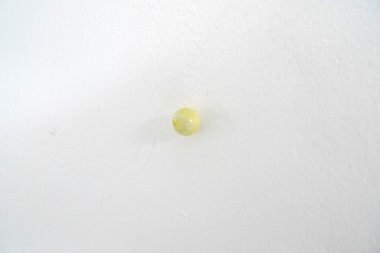
For example this exhibition has one item that consists of fourteen ‘dots’: tinted gesso balls built on thumb tacks that can be positioned anywhere on a wall - in any formation, or dispersed.
There also eight ‘line’ paintings, four of those consisting of retrieved sections of wall, fragments of painted plaster or chipboard that have thin lines meticulously cut out of the top paint layer found on one side only. Two of these oddly shaped chunks are hung from the ceiling with cord that is sometimes also painted, and two are mounted on the wall.
There are also four other drawn upon or painted shoelaces that are pinned vertically to the wall. Some of these have colours that are eye-poppingly intense, others are delicately tinted with regularly positioned cross-lines as in a tailor’s measuring tape.
Then there are the tracing paper transferral drawings where a repertoire of seven linear pencilled patterns or wiggly alignments is used so you can recognise the different duplications on different walls. These, like the gesso balls, are ‘dematerialised’ and exploit memory - forcing you to compare by looking closely at colour in one and micro-nuances in line direction in the other.
Probably the most well known exponent of such ‘minimal’ linear mark making is Richard Tuttle who in New York in the early seventies deliberately combined pencil line, wire and shadow. In Aotearoa Rob Gardiner and John Ward Knox explore variations of that. With Lundberg, he like his colleague Richard Frater, is interested in the historical traces discovered when outer layers are removed. (Frater has peeled carpet off the floor). That variety of work, though not at Ivan Anthony’s, is part of the Prospect show.
If you like me are sympathetic to formal qualities as a component of any artwork, then the question arises about the visual dynamics Lundberg exploits. When I look at a show like this some paintings attract because of their simplicity and apparent quickness of thought. They embody decisions that are not prolonged. Others I consider over-laboured and too visually fiddly. They seem mannered as if the artist is compelled to keep adding complications. The cut-off point that separates one from the other is of course hard to determine, as are questions about which found surfaces for example are valued and which are rejected, or why say a painted shoelace might be expected to hold your attention?
What is impressive about this show is the way the different methods of ‘painting’ or ‘drawing’ interconnect. Lundberg mixes them up so some line drawings are found on the plaster and paint fragments, and some of those are ‘quoted’ outlines for line drawings. The incised lines on the paintings have resemblances to the shoelace works, as do the painted cords from which the occasional sections of wall hang from the ceiling. Even the gessoed balls can be seen as an extension of the painted thumbtacks that hold up the shoelaces. It’s all very carefully placed around the small inner rooms of the Anthony gallery (Michael Harrison is in the K’ Rd part). All important work that any serious lover of art cannot afford to miss.
John Hurrell
Recent Comments
Erin Driessen
Any installation such as this, which is essentially ABOUT line, colour and space, can't really be deemed anti-art. (I have ...
Owen Pratt
I agree some art is hybrid and/or quite confused but rely heavily on institutional practice to render it so.
Owen Pratt
I tend to agree with this John but "not remotely connected"? I think kissing cousins at least; and the shoelace ...


 Two Rooms presents a program of residencies and projects
 Advertising in this column
This Discussion has 11 comments.
Comment
Erin Driessen, 9:24 a.m. 13 December, 2011 #
Hi John,
Did you have any thoughts about architecture and blueprints? This work reminds me of Gordon Matta-Clark's house-splitting and holes in buildings, and I don't know why. Hanging lines and tacks on the wall, like it's a plan for something more major and sculptural. This is like a painterly version of that somehow; and at the same time it's like a sculpted drawing...
Wish I could see it.
John Hurrell, 10:34 a.m. 13 December, 2011 #
Yes Erin, well some of the bits of wall do have rectangular drawings that are like floor plans, and indeed the cord I think is window sash cord.
In other installations of the transferred pencil drawings I got a sense of referencing wall edges, but in this Anthony show I didn't get that at all. They seemed more random.
The work in Prospect apparently is a collaboration with Roman Mitch - working directly on the walls. I haven't seen that show. Have a 2 part Megan Dunn review coming up.
Owen Pratt, 11:06 a.m. 13 December, 2011 #
Patrick Lundberg, Untitled, 2011, gesso, thumbtacks, acrylic, varnish. Detail
Image 1 of 9
I suppose this kind of attribution, dating, listing of (Art) materiel and the description of the component within the whole helps to force these bits of stationery into an aesthetic forum.
But to say "All important work that any serious lover of art cannot afford to miss." suggests a hard sell. I CAN afford to miss this exhibition, as I can see the world in these terms any time I choose, without the inconvenience of visiting an art gallery in Karangahape Rd.
John Hurrell, 11:18 a.m. 13 December, 2011 #
You are right about the hard sell, Owen, but wrong about 'the forcing (of) these bits of stationary into an aesthetic forum'. The experience is not a list of named objects, but transmuted materials incorporated into a gallery space. That is why you CAN'T afford to miss it.
Owen Pratt, 2:18 p.m. 13 December, 2011 #
Not so sure about that John, praps the materials are transmuted by the curatorial framing and the gallery.
As an aside; I wonder why this kind of effort, that has its roots deeply in anti-art, is so prevalent in art galleries at present (for other examples just trawl this web site for examples of Duchampianesque gestures); is it irony or are these shows loss leaders?
Saw a Martin Creed show in Edinburgh recently with a similar light handed throw away feel but the gallery was publicly funded and well staffed, the book shop and cafe were full; more a theatre event than plastic arts.
John Hurrell, 2:33 p.m. 13 December, 2011 #
Owen, there are big audiences for so-called 'anti-art' as well as 'art'. Some - like me - enthuse over them both. It doesn't have to be either/or. It is all Art.
Owen Pratt, 10:23 p.m. 13 December, 2011 #
I agree some art is hybrid and/or quite confused but rely heavily on institutional practice to render it so.
Andrew Paul Wood, 5:09 p.m. 13 December, 2011 #
For some reason I thought of Olitski when I saw the images, which perhaps chimes with your "referencing wall edges", John.
Otherwise art has many mansions, art, anti-art (whatever that is), things in-between. Not all of these categories engage me all of the time, but so what?
John Hurrell, 5:26 p.m. 13 December, 2011 #
Owen I think is mistaken in linking this show with anti-art. That particular tradition is part of Dada and not remotely connected to this work which is about understatement using marks in space, but not anti-bourgeois or against museums. It's experimental but not ferociously sardonic or lampooning.
Owen Pratt, 10:22 p.m. 13 December, 2011 #
I tend to agree with this John but "not remotely connected"? I think kissing cousins at least; and the shoelace works which do seem to be of the school of sardony.
Erin Driessen, 8:29 a.m. 14 December, 2011 #
Any installation such as this, which is essentially ABOUT line, colour and space, can't really be deemed anti-art. (I have trouble using 'anti-art' as a term now anyway as anything Dada-esque or Duchampian now is easily accepted as art). This isn't Dada or Duchamp (even if one might want to suggest that the shoelaces are 'readymades'). In terms of its treatment of space, it's Calder, it's Mondrian, it's definitely a bit of Olitski, Andrew. There's a dialogue here with precedent work, to which this installation is not a challenge.
This work may be a hybrid of sorts; painting/drawing and sculpture, modern and postmodern, visual and experiential. But I don't think there's any spirit of anti-art here.
Participate
Register to Participate.
Sign in
Sign in to an existing account.