Peter Dornauf – 8 August, 2014
Touted as “an exhibition, a memory bank and a game”, the show's impetus and construction came from the personal archives of Xavier Meade (Raglan), John Mandelberg (Hamilton), Chris McBride (Auckland) and John Phillips (London) and involved a “game” of put-up and respond, where each participant collector, in turn, produced a poster to which the others had to respond in kind by reflecting on its thematic content.
Poster. The poor man’s art! That kind of loose talk is liable to get you lynched if you happen to stray too close to the graphics department enclave. The thing is, the various techniques employed by both the artist and designer overlap considerably.
The biggest difference would have to be the propaganda quotient involved and the element of directness, but apart from that, all the tricks engaged in are common property. Indeed cribbing from one another is a game long practised. Technique has travelled in both directions, the classic case being Pop Art where Warhol deliberately mimicked product and package, keeping it poster flat and sharply clean-lined to give a slick machine look.
Lichtenstein took his starting point initially from advertisements and then moved to comic books, paying homage to the graphic designer in his make-over of romance and war genre forms. Interestingly an early piece of his called Girl with Ball that began as an ad, was subsequently transformed into art which was then later translated back into a television ad for the confection, Pineapple Lumps.
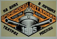
The Russians, of course, during the revolution, took abstract art as their jump-off point to create some of the strongest and most enduring images to belong to the discipline. How influential these designers were is demonstrated by the Books poster of Rodchenko, 1924, taking on a new lease of life in the 2005 album cover of the Scottish indie rock band, Franz Ferdinand, in which the designer, Matthew Cooper, depoliticized the utopian Constructivist aesthetic by incorporating a reworked image of Lilya Brik calling out the name of the band in an ersatz graphic style of the Russian avant-garde.
The poster has been around for centuries but it was the twentieth century that saw the great age of the medium come to fruition, the preeminent examples of which seemed to coincide with periods of social and political upheaval - the Bolshevik Revolution, the social transformation during the deco period and the uprising and revolt of the Sixties. New energy was injected into the format in the late Eighties with Wolfgang Weingarts postmodern playful liberation of typography.
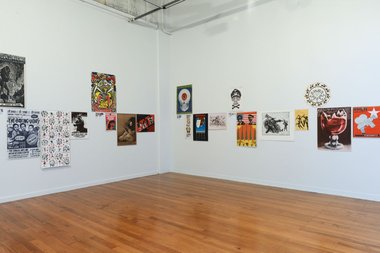
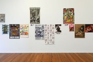
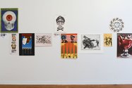
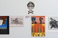
4x3 at Ramp, a look at some twentieth century posters, forty-eight in total, is the brainchild of Xavier Meade (Raglan) and John Mandelberg (Hamilton) in collaboration with Chris McBride (Auckland) and John Phillips (London). Touted as “an exhibition, a memory bank and a game”, the show’s impetus and construction came from the personal archives of the above four and involved a “game” of put-up and respond, where each participant collector, in turn, produced a poster to which the others had to respond in kind by reflecting on its thematic content.
The exhibition begins with an environmental theme and immediately the fine arts link is demonstrably present in a work entitled Mining Sucks by Nigel Brown, using an image scanned from an original acrylic and ink work on paper. This is then matched with a recent work by Tessa Laird called Cosmic Tree which has slight echoes of the early tree motif used by Shane Cotton. This “tree of life” is then paired with one from Hundertwasser - You Are a Guest of Nature Behave that illustrates his quintessential art nouveau style, printed in Germany in 1981.
This presentational format is replicated a dozen times and includes material that covers themes and topics related to dance, feminism, fascism, Maori land rights, capitalism, the cinema and the anti-Apartheid movement among others. Some of them incorporate famous images, like Che Guevara and a naked Christine Keeler sitting on a reversed chair in 1963. Others, like Turksib by Russian artist Semion Semionov recall the graphic style of Rodchenko and Lissitzky.
Often the simple and singular images are the ones that work the best. A favourite that exemplifies such an approach would have to be a work by London designer, John Phillips, entitled, We are a little worried about our landlord, made in 1984, in protest at the sale of social housing to private developers. The frisson captured in the sinister image is enhanced by a direct allusion to the work of Belgian surrealist, Rene Magritte.
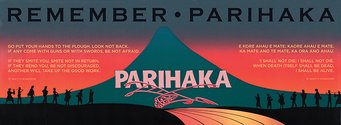
The show covers a period of four decades from the 1970s through to the present and reflects the social shifts and ideological preoccupations over that time, from the Black Panther movement in the Seventies, the anti-Apartheid protests of the Eighties, through to the current environmental concerns. A large number in the exhibition congregate around the Eighties - police brutality, 1981, CORSO, 1982, Waitangi, 1984, Parihaka, 1985, El Salvador, mid 80’s, and Socialist censorship, 1989, being a representative sample.
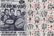
This show is a sheer delight both in its variety of themes and method of printing - linocuts, screen-print, offset, lithograph and digital. The diversity in compositional format, and creative use of text, font, colour and imagery provide a feast for the eye and fuel for thought. Added bonus is the large free poster which incorporates every image from the show on one side and a blow-up collage of a selection on the reverse.
Strangely enough, with one or two exceptions, there is little humour or satire and no great subtlety, but that, I suppose simply reflects the nature of the beast.
Favourite text - “The slut nation is here and we are pissed off!!! Run and hide you misogynist, crusty, fuck heads!” No ambiguity there.
Peter Dornauf





 Advertising in this column
 Two Rooms presents a program of residencies and projects

This Discussion has 0 comments.
Comment
Participate
Register to Participate.
Sign in
Sign in to an existing account.