John Hurrell – 11 December, 2014
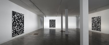
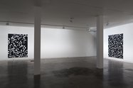
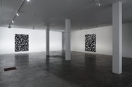
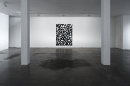
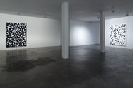
Shin's three dark paintings dominate this show with their sense of cavernous space and descending fluttering leaves or birds. The single pale work though has a very different feeling, being so much brighter and less cluttered. It is also more complex in its tonal structure, having five or six nuanced varieties of white, made with various layers systematically reapplied, while the black works have what appears to be only one variety of dark gray.
This show of four large works, all the same size, in the large lower Two Rooms gallery, seems to be a continuation of the moves Jeena Shin made in the planning and execution of her two murals that were presented to the public of downtown Auckland last April at Herald Theatre and Peach Pitt. Her compositional processes - using repeatedly overlapping scalene triangles that hint at folding - are much more overtly intricate now, with the observant viewer attending to small details such as little isolated islands of triangular shape or abrupt changes in (masked off) edge direction. The paintings with white backgroounds are more complex than the dark ones.
As is often said, Shin’s canvases are fiendishly difficult to photograph, the information they exude being so dependent on raking light’s (especially natural light) effect on traces of tape edge, the sheen of carefully incorporated varnish, and very thin overlays of acrylic. Each work has its own compositional ‘personality’ in terms of tumbling or (more) static movement, though three are dominated by black background fields and the fourth - much airier - by white.
So studying their flickering angular forms, with their ubiquitous sharp corners and splintery slivers - swirling like broken shards accelerating out from exploding windows - they appear to have a barely detectable underlying structure of long beams or diagonally extended planks, now camouflaged beneath various layers of overlapping hovering triangles that often seem to be sinking towards the bottom of the stretcher. Jumbled afterimages in your overheated retinae float out over the adjacent white walls.
Shin’s three dark paintings dominate this show with their sense of cavernous space and descending fluttering leaves or birds. The single pale work though has a very different feeling, being so much brighter and less cluttered. It is also more complex in its tonal structure, having five or six nuanced varieties of white, made with various layers systematically reapplied, while the black works have what appears to be only one variety of dark gray.
It would be interesting to swap the ‘white’ work - which is positioned on the wall nearest the entrance doors and windows - over with the dark one on the opposite (most ‘interior’) wall, just to see what would be revealed in terms of tonal subtleties, even when the room is also awash with electrical light. Natural light - and each work’s position to it - appears to be crucial, for these don’t seem to be discrete objects where our experience of them can be separated from their location in the gallery, and repeatable anywhere. Location inside ‘art-friendly’architecture, in relation to instreaming or deflected natural light, is paramount.
John Hurrell


 Two Rooms presents a program of residencies and projects
 Advertising in this column
This Discussion has 0 comments.
Comment
Participate
Register to Participate.
Sign in
Sign in to an existing account.