Peter Ireland – 10 December, 2014
Just as the Ian Athfield Wellington Public Library turned out to be a dry run for his later Public Library in Palmerston North, the Tauranga project seems to have served the same purpose for Mitchell & Stout's Te Uru. What both buildings have in common is three-fold: a series of practical larger-to-small spaces, an easy sense of pace between them, and the conveying of a sense of the whole building no matter what part of it you're in. Tauranga was merely exciting: Te Uru is simply brilliant.
Apart from Te Papa and the Christchurch Art Gallery, art museum projects throughout this country over the past two decades have been either extensions to existing buildings or the refitting of old ones. In the past few years there has been a rash of both: Lower Hutt, Auckland, Gisborne and Napier being examples of the former, Tauranga and Whakatane of the latter. A combination of both is happening in Nelson right now and might yet happen in Whanganui. The most recently opened extension/refit has been Te Uru in Titirangi, the former Lopdell House Gallery - a structure architecturally being Waitakere’s answer to the Flatiron building, given its commanding presence on an angled corner site.
As with many such institutions in New Zealand, Lopdell House Gallery grew like topsy, its origins in the combination of a building looking for a use and pressure from a bunch of local artists wanting a venue for their wares. Throughout the 1970s and ‘80s, from one end of New Zealand to the other, these amateur outfits slowly but surely “professionalised” - local body budgets, trained staff, the national exhibition circuit - often alienating their creators in the process. Nothing can harbour resentment longer or more fiercely than a spurned local art group.
Lopdell House began life as a hotel in 1930 but was never a commercial success. The building was taken over by the then Education Department in 1942 for use as a School for the Deaf, then later, in 1960 it became an advanced training location for teachers, this role ceasing in 1982. The place was then bought by the local authority and opened as a regional gallery in 1986. While it’s an immensely attractive building it was never suited to any exhibition requiring visual coherence, and its practical back-of-house facilities were minimal to non-existent. And yet, despite these limitations, Lopdell House Gallery gradually carved out a name as a happening place, retaining its local links while extending its sights to the regional and sometimes national.
In 2002 a Development Trust was established to upgrade and extend the building, and two years later architects Mitchell & Stout were commissioned to design an extension. A period of quake-strengthening, site investigation, fund-raising and refinement of the concept followed before actual construction began in 2012. In March this year the upgraded and refurbished Lopdell House reopened, and at the beginning of November the new building alongside opened as Te Uru: Waitakere Contemporary Gallery.
Mitchell & Stout did the conversion of an old bank into the Tauranga Art Gallery, which opened in 2007 and is perhaps the most successful series of exhibition spaces here since Whanganui’s Sarjeant Gallery opened in 1919. But, just as the Ian Athfield Wellington Public Library turned out to be a dry run for his later Public Library in Palmerston North, the Tauranga project seems to have served the same purpose for Mitchell & Stout’s Te Uru. What both buildings have in common is three-fold: a series of practical larger-to-small spaces, an easy sense of pace between them (but ruling out neither surprise nor delight), and - perhaps more architecturally important - the conveying of a sense of the whole building no matter what part of it you’re in. Tauranga was merely exciting: Te Uru is simply brilliant. Brilliance implies light, but we’ll come to that later.
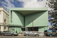
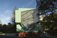
Although Te Uru is largely physically separate from Lopdell House (1), the entrance façade replicates the scale and proportions of the older building, but stating its difference by the sometimes controversial green cladding. The facades on the other side, though, couldn’t be more different. Lopdell House’s neo-Georgian proportions and Spanish Mission detailing (this unlikely combination works!) are challenged by the sheer confidence of an enormous glass-housed stairway facing the Manukau Harbour, the fenestration angled as if to repeat the diagonal patterns of some of McCahon’s kauri paintings of the 1950s, created half a kilometre away down the hill towards French Bay. How OSH didn’t squash this structure’s plan is a miracle, because actually using the stairway is not for the faint-hearted. It’s like rock-climbing for art-lovers. But it affords spectacular views of Titirangi, the Manukau Harbour and beyond as well as providing access between the three main gallery floors.
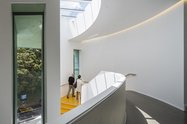
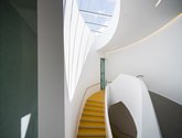
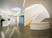
For the faint-hearted the same access can be gained via a squashed-oval staircase ascending from the foyer just to the left inside the main entrance. This mirrors perfectly the circular staircase just to the left inside the main entrance to Lopdell House, the new thus acknowledging the old. Rather like the Mahia Peninsula, the new staircase is impossible to describe accurately: it has to be experienced. Borromini-meets-Gaudi-meets-Louis-Kahn travels some of the distance, but not far enough. Get out to Titirangi and do it, OK? (2)
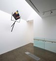
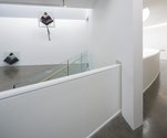
The staircase is, however, probably the most concentrated instance of the new building’s signature style. While buildings are made of stuff like concrete and glass, what distinguishes Te Uru is a marriage of space and light, and it’s the conversation between these two ethereal qualities that characterises the architecture. Each of the five galleries has its own distinctive character as an exhibition space, but the architects’ intellectual imprint ensures total coherency throughout, and in observing the way the style is both maintained and subtly varied in the transitional spaces one can only marvel at the skilfulness of the resolution (3). While the spaces and feel are quite formal, there’s a very subtle organic quality operating too; not much is quite square, the minimal angles shoe-horning passage from one space to the next, the continued development of the detailing both reassuring by recognition and surprising by playful change. None of this is in any way decorative or an instance of those seemingly clever but actually tedious “architectural statements”: the detailing exists only to reinforce the building’s raison d’etre and in no way interferes either with the staging of the shows or visitor engagement with them.
As at Tauranga, there are frequent - and often unexpected - glimpses of other parts of the interior: on the same level, above and below, so that while you’re nosing around the art you’re being subversively educated into the nature of the building. And, like any effective education, it not only feels good but can be exhilarating. As earlier remarked, Te Uru‘s success is a marriage of space and light. Titirangi is known for its bush - especially its noble kauri - and the way trees can mediate light is replicated within the new gallery. The subtle filtering of it washes the walls from often hidden sources, no two solutions the same. Examining this feature from floor to floor is nearly as good as encountering a kickarse Bill Culbert.
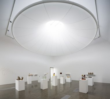
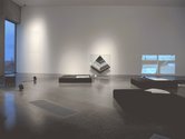
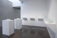
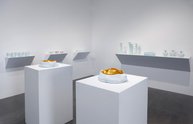
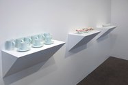
The crowning glory of this architectural strategy does in fact resemble a crown. In the largest gallery on level 5 the (sort of) square space has suspended above it a very large circular white object resembling a botanical version of a crinoline hoop almost filling the room’s dimensions, the small aperture at the top aligned with a window in the ceiling. The way this spectacular but graceful object both directs and diffuses the natural light is pure magic. This gallery is at present host to part of the Portage Ceramic Award exhibition. Installing such shows is akin to herding cats - with their volume, range and need for plinths and shelving - so that mostly they end up looking like a dog’s breakfast. It’s a test of Te Uru‘s success that the two quite different galleries the show’s spread through not only present the disparate objects with style and clarity, the exhibition itself has a quite astonishing coherence.
The perhaps smallest gallery, at the top on level 6, exhibits recent domestic ware by the Portage Award‘s judge, Japanese-born, UK-resident Takeshi Yashuda. Such a pairing indicates a conceptual coherence in the exhibiton programme paralleling the building’s unity, which is a hopeful sign. The space is a perfect showcase for these fragile and meditative objects in terms of its scale and light.
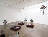
The other gallery on level 6 is devoted to the work of the current McCahon House resident, Amy Howden-Chapman, a show entitled They Say Ten Thousand Years, another meditative experience, but not so much about beauty as the long-term prospects of nuclear waste. Te Uru may be a regional gallery, but in showing the work of McCahon House visitors - artists from beyond the region - the institution links a neighbourhood with the world, offering stimulation and challenge not just for the locals but attracting an audience from beyond its natural cultural catchment. This potentially rather bleak show occupies a space with perhaps the largest window area, revealing from a significant height swathes of local bush, the sweep of the Manukau Harbour and wide skies above - the very contrast reinforcing Howden-Chapman’s urgency more effectively than any earnest extended label could.
Bestowed by local iwi Te Kawerau a Maki, the institution’s new name ‘Te Uru’, means wind blowing from the west, a title linking local geography with institutional ambition. The entry-level gallery hosts an exhibition Te Hau a Uru: A message from the West, and according to the Gallery’s publicity it’s “the first of many to acknowledge the stories of local iwi.” Its curation was a collaborative undertaking between staff and local iwi, and, rather like the camel being a horse designed by a committee, it’s the least coherent exhibition in the building. No amount of goodwill, good intentions and worthiness can turn a collection of objects into an exhibition. Te Hau a Uru thus has echoes of Te Papa’s 2011 exhibition E Tu Ake: Standing Strong (4) where the last consideration brought to it, apparently, was: what would ordinary visitors make of it? Even for informed and sympathetic visitors to Te Uru the answer had to be “not much”. It was a missed opportunity, and when further stories are to be told there must be consideration given to the hearing of them. Telling and hearing is the best collaboration of all.
Lopdell House itself has been thoroughly upgraded and extensively refurbished as part of the project. Structurally the interiors are little different than they were before, but their function has changed radically. Apart from the Titirangi Community Arts Council’s Upstairs Art Gallery on the first floor, Lopdell House is now given over to offices (including the McCahon House Trust) and meeting rooms, and where the former main galleries were a restaurant is being installed. The architects, however, have imbued this refurbishment with the colours and light of the new building in a sleight of hand that both respects the old and welcomes the new. The Waitakere region is so damned lucky to have this wonderful new facility.
Peter Ireland
(1) There are two bridges linking the two buildings: one a service facility at level 5 and one right at the top to allow public access from Te Uru to the large open roof deck now crowning Lopdell House.
(2) With the curving white walls, curving steps clad in a mustard/gold lino, plus the pervading quality of light both artificial and natural (some of the former coming from the inside of the handrail) it could be said Balthasar Neumann has finally reached New Zealand.
(3) The new building has six levels, three of them below the entry level, which is level 4, and which contains gallery 1. Galleries 2 & 3 are on level 5, and galleries 4 & 5 on level 6. Levels 1 to 3 contain offices, service areas and a gallery devoted to educational purposes.
(4) See this writer’s piece on E Tu Ake in Art New Zealand 139, Spring 2011, pp 64 - 69.
 Two Rooms presents a program of residencies and projects
 Advertising in this column

This Discussion has 0 comments.
Comment
Participate
Register to Participate.
Sign in
Sign in to an existing account.