
John Hurrell – 2 February, 2015
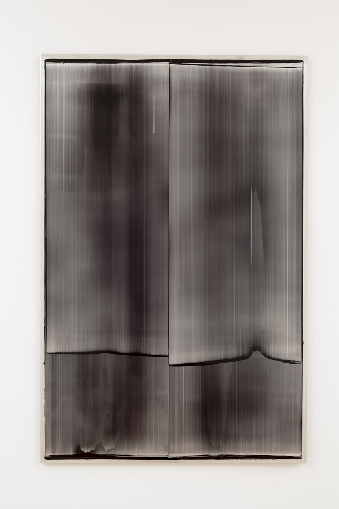
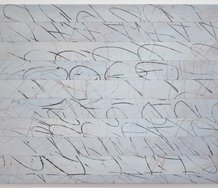
When looked at and not through, one starts to see groups of islands on horizon lines, or desert landscapes, despite the rectangular format being portrait-based. Ultimately though these paintings are akin to monoprints. Like many prints, they celebrate the flickering mixing of light and darkness, in this case, where shimmering glowing metal meets dark filmy oil paint.
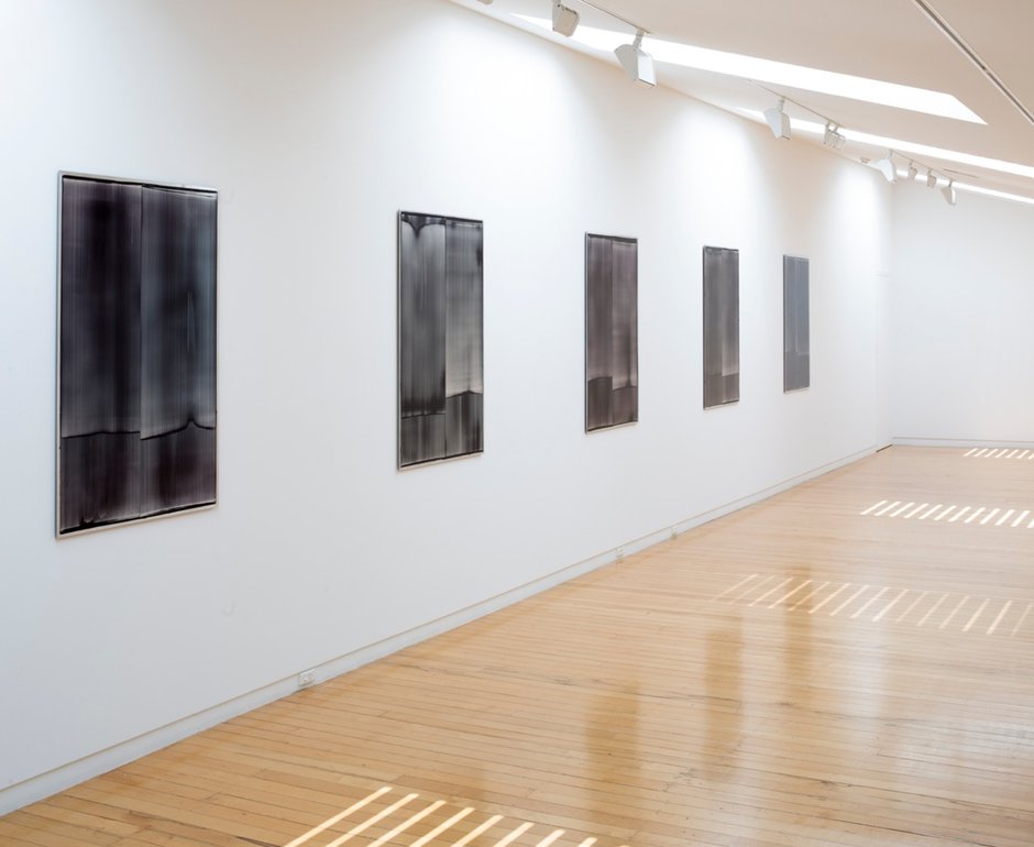
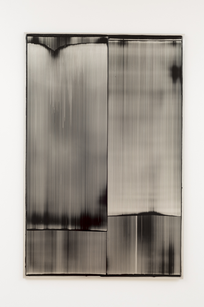
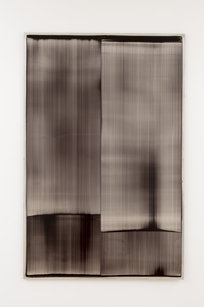
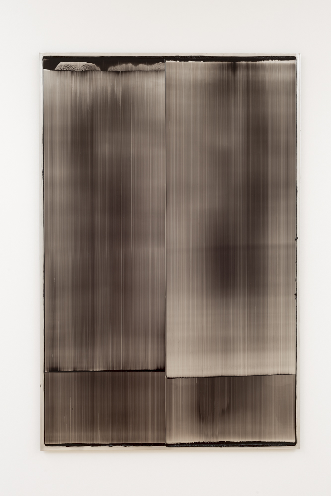
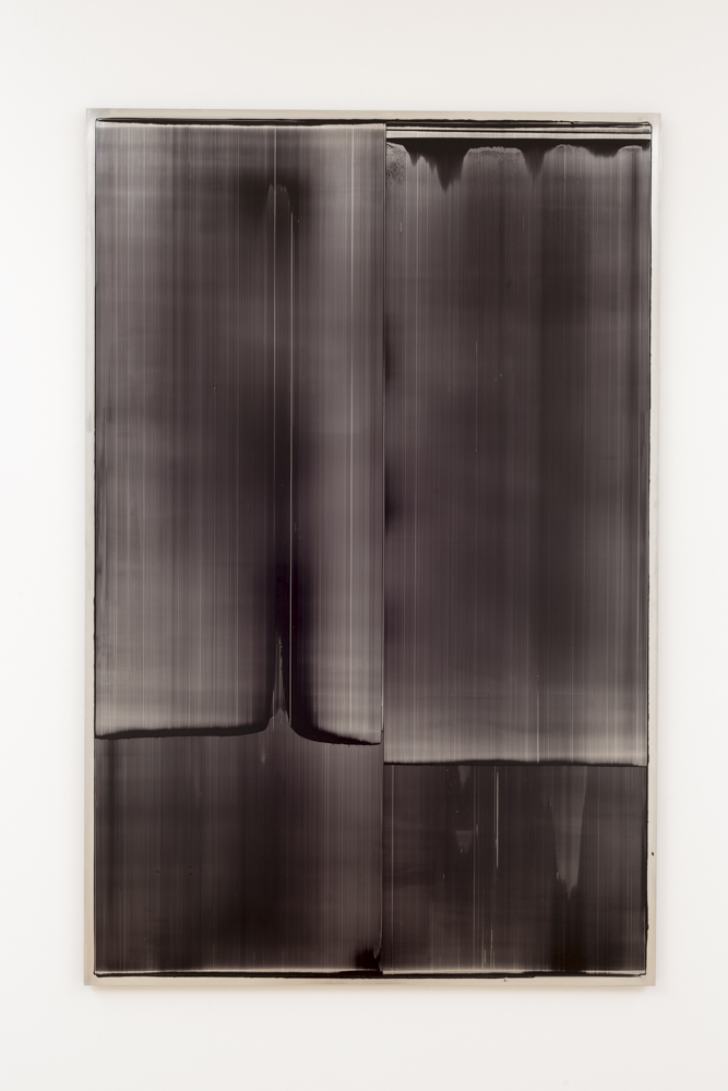
With this exhibtion Ivanoff continues a method demonstrated with earlier orange paintings, that of grinding up pigment - mixing it with oil on aluminium panels - to then vertically spread its streaky consistency on that support with a wide squeegee, adjusting its lateral borders. He is aiming to provide a sense of the activity of preparing the pigment, locking it into the state of the image as you finally see it - pondering how its elements and qualities came to get there.
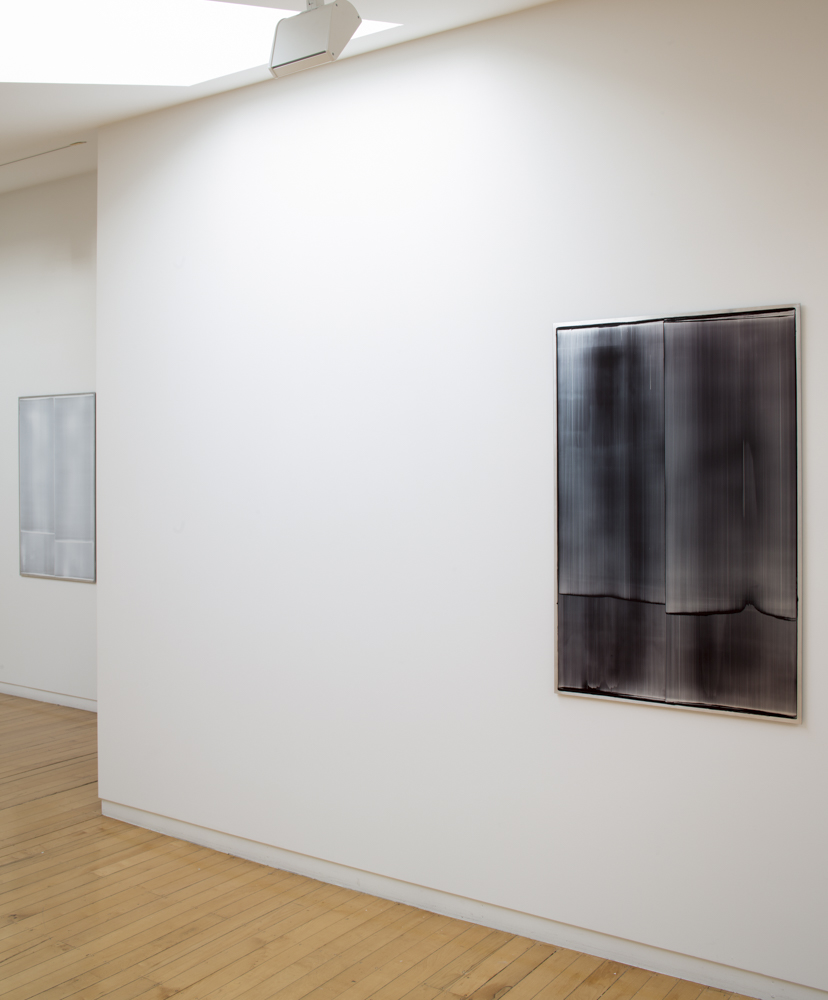
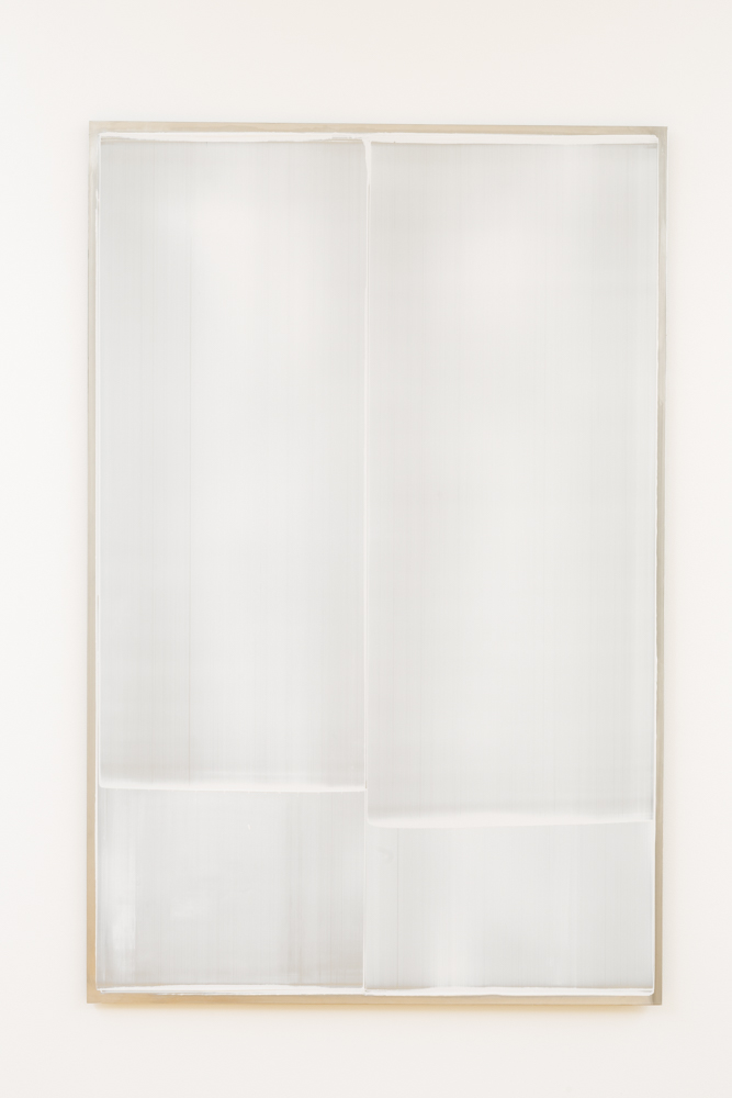
Split down the middle with a resolutely straight buffering division, the downwardly pushed paint on each side creates a spatial ambiguity, a smeary veil you look through to compare left with right. The shiny under-surfaces beckon you to come closer, to see where thin liquid advances into a thicker opacity.
In Ivanoff’s arrangement of these hovering but firmly locked-in fields, there is one milky white work on one wall and five identically sized ‘black’ images lined up in a row on another. If you let your eyes adjust you will see the black in some transmute into dark blue or purple or very deep green.
The scraping of the thin wet paint allows directional striations (like hanging hair) to appear along with the suggestion of half-obscured forms. Looking across from the side highlights the thickness of the built up, viscous paint. Lines of low hillocks on the outer edges, and bushlike feathery clusters that take on the suggestion of clouds. They seem like paired up hanging scrolls or warped stiffened sheets of plastic.
When looked at and not through, one starts to see groups of islands on horizon lines, or desert landscapes, despite the rectangular format being portrait-based. Ultimately though these paintings are akin to monoprints. Like many prints, they celebrate the flickering mixing of light and darkness, in this case, where shimmering metal meets dark filmy oil paint.
Personally, I think I prefer the earlier orange works. I like their emanating optical heat and greater sense of bodily involvement, the way the butted/split plane advances toward the viewer. The dark paintings seem more overtly cerebral, and despite the central edge, are about actively penetrating space away from the viewer - engaging with and entering it.
However I think I can see why Ivanoff moved in this direction. Fluorescent orange is so ubiquitous a hue these days, especially around council roadworks, that its emotional impact has waned - even though it stands for caution. We are over familiar with it. The dark colours on metal - of the new works - on the other hand are nuanced. You have to look carefully to see their chromatic properties.
Plus the ambiguity of these vertical marks has strong hints of mirages or ghosts, as if the surface were living - and with entities trapped. In an odd way, the dark paint added to these aluminium sheets accentuates their metallic properties, far more than if they were left alone. They become more allusive (and elusive), hinting at something that is hard to elucidate - for like the blurred flesh in a Bacon painting or orgasmic shudder of a kinetic Lye sculpture, these suggest something on the verge of being graspable. Fleetingly mysterious movement that perhaps one day might be contained.
John Hurrell
 Two Rooms presents a program of residencies and projects
 Advertising in this column
This Discussion has 0 comments.
Comment
Participate
Register to Participate.
Sign in
Sign in to an existing account.