

Peter Dornauf – 27 May, 2015
At its most frustrating and even annoying is the tag, “untitled”, which gives nothing away, says nothing, leaving the viewer with no entry point at all. Ambiguity might be the name of the game, but at some point along the way that ploy simply descends into obfuscation. Naming and helping to know are intertwined here.
The title given to any art work can sometimes open or close the door to an understanding and appreciation of the piece. Labels can be a delicate, elusive, flimsy and awkward business. How much to disclose, how much to keep back? How hard should the artist make it for the viewer? How easy?
At its most frustrating and even annoying is the tag, “untitled”, which gives nothing away, says nothing, leaving the viewer with no entry point at all. Ambiguity might be the name of the game, but at some point along the way that ploy simply descends into obfuscation. Naming and helping to know are intertwined here.
Sometimes a title can open the gate but lead one up the garden path. An obtuse game can be deliberately played out which skirts around the edge of pretension or simply refuses to disclose. There are, however, those who just simply want to enjoy looking at the garden, where any form of elucidation is merely a spoiler.
The most minimalist titles were those used first by Kandinsky who simply ended up numbering his abstracts; number 12, number 47. There was nevertheless method in his ‘madness’, given that the best title for an abstraction is perhaps an abstract notation like a number. It also suited his theosophical leanings, wanting to deny the corporeal. In the same way that the object, as he claimed, harmed his paintings, so the world, that he so desperately wanted to keep at bay, would have been brought into the picture by conventional naming and thus ‘damage’ the work.
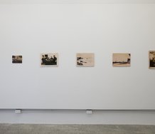
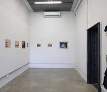
It’s All in the Title, is the provocative headline given to a small boutique exhibition on at the Wallace Gallery, Morrinsville. Six artists engage with the conundrum of naming and thus denoting their subject. It has to be said at the outset that contrary to belief, denoting does not preclude connotation. It in fact can enhance the allusive qualities and symbolic resonances of any work.
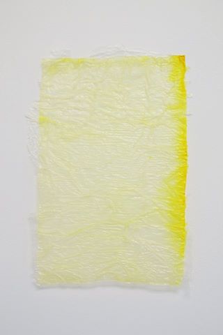
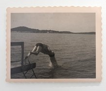
Nonetheless, Chelsea Pascoe has chosen, perhaps perversely, to up the ante and provide the ubiquitous Untitled to her tissue and polyurethane creation, although she does provide some clue by offering a sliver of information about the source of the work, which in this case is (from “yellow stack”).
Yellow Stack one assumes, is from more of the same - and indeed that is the case if one knows her work. She is the tissue and polyurethane queen where layering is de rigueur. But Pascoe is also the empress of ambiguity, or at least the mistress of laying false trails.
Her recent exhibition somewhat tantalizingly called Hard Candy, at the Casbah Gallery, Hamilton, played mercilessly with sexual innuendo, teasing the viewer with all kinds of erotic allusions. This might have got your average gallery goer all hot and bothered if it hadn’t been for the fact that it was very obviously a bit of a tease.
Untitled in relation to her A4 tissue blithely and ‘innocently’ hanging on the wall, sees her deliberately cooling things down and having the last laugh. The title here, which is not a title, becomes a knowing and significant title.
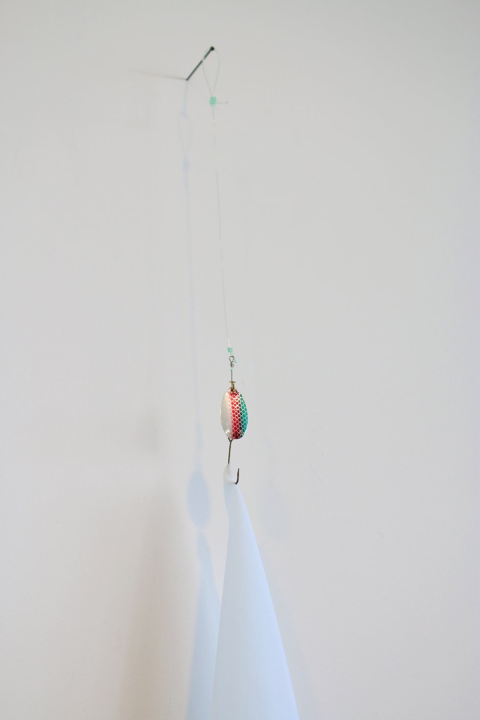
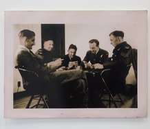
Fell in Raro, the name of Karl Bayly’s work, is as puzzling as is the piece itself. Composed of nylon, a fish lure, fabric cloth and Raro, the viewer at least is given a heads-up, but whether this adds or subtracts initially, is another matter. First one needs to know that “Raro” is a coloured drink, employed here as a blue dye in which the fabric has been soaked to create a subtle and luminous glow. The drink itself, a cheap sugary beverage, comes in sachet form with loud graphics on the packet alluding to tropical island paradises and promises held out of sun, sand and sizzling passion. Indeed Raro is short for Rarotonga, touted as a great Kiwi getaway with cheap holiday deals in the offing and perhaps escape into a world of romance and eroticism.
The composition of Bayly’s work takes the form of a large fishing lure to develop a critique of the bogus dreams that serve as lures via corrupted language and exploitative images. Fell in Raro becomes an updated version of the old story of the “fall of man” chasing false dreams to be banished from the Garden - a mythical fabrication. In the end a great title, pregnant with allusive resonance.
Cement Composite #1 & #2 is one of those banal titles that tell us nothing other than the materiality of the work. Cilla McIntosh goes minimal here. Her small concrete compositions which she describes as “acrylic on paper”, are in fact a decoy. They certainly look like the description offered but what she has done is devise a trompe l’ oeil. The title is true but the added description is false. Her squiggles and notations, little hieroglyphs in orange and brown, act as semaphores of a new language played out on concrete like some modern yet undecipherable script; a new Rosetta stone.
Alice Alva provides us with a juicy title, Pillow talk and Interrelations, for her small brightly coloured abstract impasto canvases that recall something of the Abstract Expressionists. The fact that these appear in a minor key, in terms of dimension, provides a comment on the grand macho gestures of the Americans. The title adds to that evaluation, speaking of small and intimate conversation at a domestic level, in contrast to the grand metaphysical dialogues set up by men in the 50’s.
The marks on the canvas are in the manner of de Kooning or Twombly, but at much quieter level - blotches, dots and dashes forming tracks in pink and orange and greens that saturate the ground. Translated, these signs are part aboriginal and part sixties dress patterns, with a smattering of Kandinsky splodges. Pillow talk indeed.
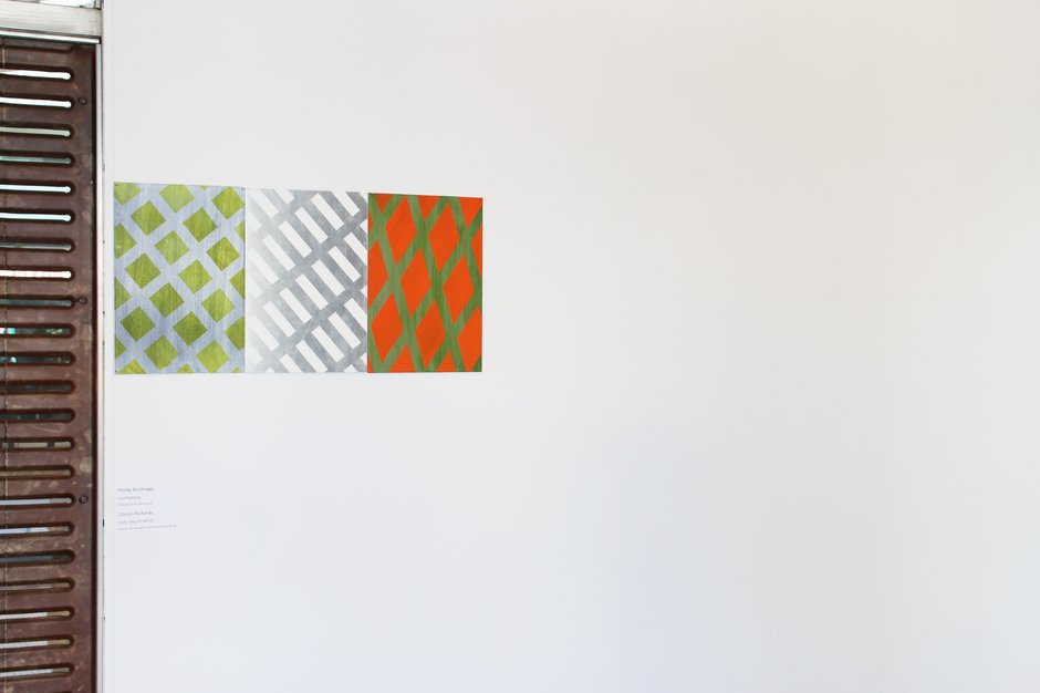
Phillip McIlhagga also assumes a smaller voice with his oil on aluminium pieces. The title he provides for these gridded abstracts, Lost Highway, could take the viewer somewhere off the beaten track. The two triangular grids and third lattice-like shape recall a more modest and reductive Ian Scott, playing off local weaving patterns against van Doesburg or Mondrian.
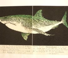
Fishy Flag is a rather literalist title provided by Clinton Richards for a tactile fabric creation that is somewhere between a sculpture and a wall hanging. Part heraldic, it catches the light on its scales as it floats in the air. With its metallic hues it takes on the appearance of armour so that the title assumes connotations that move beyond the literal, thus proving that for much of the time it is all in the title.
Peter Dornauf
Recent Comments
Owen Pratt
If you are Martin Creed perhaps, but it's not really visual art then - it's more a form of poetry. ...
John Johnston
These days any title is interpreted in relation to the long history of the use of titles in Western art, ...
John Hurrell
The thing is, Owen, a title is not analogous to a cover; it is considered by many to be intrinsically ...
 Advertising in this column
 Two Rooms presents a program of residencies and projects

This Discussion has 5 comments.
Comment
John Hurrell, 2:03 p.m. 27 May, 2015 #
Do artworks require titles? Do titles need artworks? Can a title (by itself) be an artwork? Can an exhibition's name be an artwork?
One example of the latter is QUOBO, an exhibition presenting Art in Berlin 1989-1999, that was sponsored by the Goethe Institut in NZ. This show was curated by Gabriele Knapstein and Ingrid Buschmann and it came to WMAH in Hamilton in the early 2000s. The title was created by Adib Fricke (The Word Company) as a commissioned artwork.
Owen Pratt, 5:39 p.m. 28 May, 2015 #
Do artworks require titles?
Do you judge a book by its cover?
John Hurrell, 7:54 p.m. 28 May, 2015 #
The thing is, Owen, a title is not analogous to a cover; it is considered by many to be intrinsically a part of the artwork, embedded in it - inseparable.
Owen Pratt, 2:32 p.m. 4 June, 2015 #
If you are Martin Creed perhaps, but it's not really visual art then - it's more a form of poetry.
It's when a title is a bit more separable than a Creed that the trouble starts, and hints to theory wheedle their way in. Then artworks are very much judged by their titles. In many instances the works would simply be detritus, without the support of title, theory and institutional display.
John Johnston, 5:02 p.m. 31 May, 2015 #
These days any title is interpreted in relation to the long history of the use of titles in Western art, so not using one is a statement of sorts.
When I see "Untitles" it's usually on a work that could be called formalist, and there's still a lot of that kind of work around in galleries.
After conceptualism, yes of course a title can by itself be an artwork. Anything can be art.
Participate
Register to Participate.
Sign in
Sign in to an existing account.