John Hurrell – 3 September, 2015
There is a lot of variation in painting type. The category (and time) shifts are refreshing, ranging from the later jewel-like explorations of saturated colour to the earlier recontextualised, art historical (Suprematist) appropriations. Some of the larger simpler works from around 2002, are too simple - and plain dull - by themselves, but in this compositional array, within a new context, they become dynamic elements that are crucial.
It has been some time since Australian artist, John Nixon, last exhibited in Auckland, and although he has had solo and group shows at Sue Crockford (and a Ben Curnow-curated exhibition with Julian Dashper at Gus Fisher in 2004), he has never had the equivalent in this city of the spectacular EP & OW (Experimental Painting & Object Workshop) survey (curated by Allan Smith) that came to Wellington and Dunedin in 1997.
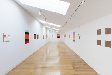
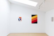
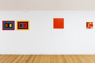
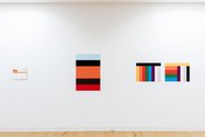
This current Two Rooms exhibition, a selection of eighteen different sized works (including two pairs of striped horizontal panels) made between 1989 and 2015, is - as always with Nixon - unapologetically ‘early modernist’ in ethos, and here, disarmingly intimate. The photographs on the right exaggerate the spatial depth, for being domestic in scale, the show makes clever use of the narrow upstairs space, its two long parallel walls and the dominant presence of many hot (advancing) oranges and reds. There is a vivid sense of the two sides of the room conversing, with different motifs, rhythms and formal properties selected from 26 years of work reflecting and ‘hailing’ each other, and your own bodily presence - within a sort of catwalk - being immersed in all this cross-connecting ‘chatter’. It’s physical, pulsing, and loud.
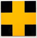
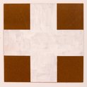
And very exciting. There is a lot of variation in painting type. The category (and time) shifts are refreshing, ranging from the later jewel-like explorations of saturated colour to the earlier recontextualised, art historical (Suprematist) appropriations. Some of the larger simpler works (using shapes that seem oddly to allude to Elsworth Kelly) from around 2002, are too simple - and plain dull - by themselves, but in this compositional array, within a new context, they become dynamic elements that are crucial.
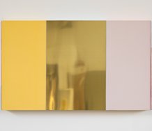
Two works (Pair(s) of Polychrome Painting(s)) provide panels you compare - with pleasure - side by side, looking at the position of sequentially predetermined coloured stripes. In one, a vertical sequence is altered when some bands are flipped horizontally and stacked inverted; in the other, a telescopic sequence frames a squat vertically sequenced centre where mid-positioned colour stripes are reversed to become outer and peripheral.
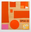
Others use cut-out geometric shapes of thin MDF that have been painted (or left unpainted) and carefully glued onto glossy painted panels. Some more recent works take the interest in physical projection even further, so that clusters of diagonally aligned wooden strips cast shadows by extending over the edges of the backing block they are fixed to. In one, Nixon celebrates the labour of the making process by diagonally incorporating a blue carpenter’s pencil and a narrow orange saw blade into the work itself. In a third relief, he glues on a diagonal row of five multi-coloured beer and water bottle tops, a tip of the hat to Picasso, Braque, Gris - and of course Schwitters.
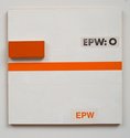
Another painting, a collage featuring lettering, includes part of the packaging of the paint application roller involved in its production. This is one of a couple of small square paintings that feature the sans serif block lettering of the EPW title itself, that consequently become functional, serving as an austere form of accentuating ‘poster’ for Nixon’s project.
There are also two monochromes that feature thick coarse hessian which has been coated in silver metallic paint, one with chunky coloured glass beads scattered across its surface. This would normally seem to be a comment on the decorative role of painting in architecture except that Nixon’s practice does not embrace irony or espouse self-critique. If a work is decorative it is because that attribute is regarded positively.
This is logical, for with Nixon’s paintings in general there is a strong sense of manual tactility, a knowing rhythm in the application of thin paint. The image is made embracing some looseness and ‘imperfection’ of edge - depending on whether the support be metal, MDF, wood, canvas or hessian. The works are never impeccable in their surface, or industrial looking, for Nixon’s visible labour is the point, its manuality underpinning a certain ethos that originally blossomed over a century ago, and which the artist obviously regards as of great relevance (certainly for him) today.
The upstairs gallery at Two Rooms has rarely looked as good as it does now with this show. It’s a special, very vibrant installation that’s exhilarating.
John Hurrell









 Two Rooms presents a program of residencies and projects
 Advertising in this column
This Discussion has 0 comments.
Comment
Participate
Register to Participate.
Sign in
Sign in to an existing account.