John Hurrell – 30 August, 2016
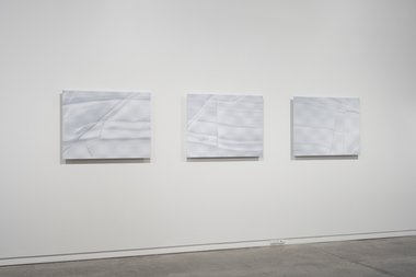
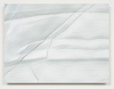
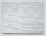
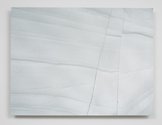
With the three Mahia rockface panels, there is enough visual detail to consistently hold your attention, plus a wit that references the compositional structure of landscape painting such as that of Bill Sutton in Canterbury, for the geological seams can be coincidentally compared with, say, Macrocarpa hedges or windbreaks. The images are enough on their own: they don't need dissolving ‘egg carton' surfaces (a superfluous distraction) or glass beads (mercifully absent). The flocking brings a nice soft tactility.
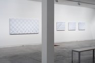
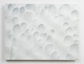
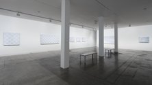
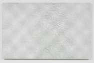
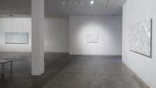
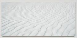
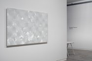
The ten pale Elizabeth Thomson works here continue her exploration of contoured and shaped wooden panels, combined with nylon flocking, or glass spheres and landscape photography, to make double images that change as you move around them. Variations of white dominate, and because they sparkle and pulse with their gridded undulations, associations with snow, ice or white sand, abound.
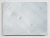
However there is an awkwardness with much of this work, either through the proportions of the narrow horizontal panels that reference rippling dunes, drifts or clouds, or the illusionistic dissolving of the picture-plane through receding perspective. The better items, usually in the form of squat rectangles, instead exploit the picture plane, showing images of splitting rock faces - taken around Mahia Peninsula - that are at right-angles to the camera. They also are not so optically busy with the different treatments of support and surface. Thomson’s unusual technique tends to be a gimmicky distraction, not an asset that is spatially coherent with the photographic depictions.
However with the three Mahia rockface panels, there is enough visual detail to consistently hold your attention, plus a wit that references the compositional structure of landscape painting such as that of Bill Sutton in Canterbury, for the geological seams can be coincidentally compared with, say, Macrocarpa hedges or windbreaks. The images are enough on their own: they don’t need dissolving ‘egg carton’ surfaces (a superfluous distraction) or glass beads (mercifully absent). The flocking brings a nice soft tactility.
Other works in contrast seem bland and trivial, especially the rippling sand/snow ones which aren’t saved by their technical complexity. They suffer by being too close to insipid wall decorations commonly bought in designer furbishing shops. The gridded undulations (when seen from certain angles) create an effect like that of a softly out-of-focus wirenetting fence, hovering between the viewer and the landscape vista, but unless the work is intended as a clever political statement about land rights or issues of accessibility, the methodology seems gratuitous and inconsequential.
There are also two other images of interest related to the Mahia works: Dark Zona, Thomson’s photographed version of a Boyle Family soil sample, and Ghost II, a wind (and sand) scoured cliff face featuring blobby organic indentations and which, as its title suggests, is like a grid of comic-strip (sheet-covered) ghosts. The amusing title is a nice touch; a clever understatement - unlike the prevalent overlayered technology.
John Hurrell
 Two Rooms presents a program of residencies and projects
 Advertising in this column
This Discussion has 0 comments.
Comment
Participate
Register to Participate.
Sign in
Sign in to an existing account.