
John Hurrell – 13 March, 2017
At the advent of night - when looked at from some distance so that the silhouetted building shape starts to dissolve into the darkness behind - the flashing neon that crosses the inner window frames merges with the spidery squiggles on the other side of the room. They compress spatially and combine, while the distance across the floor shrinks and weblike linear relationships between the twitching neurons constantly alter.
Auckland
Michael Parekowhai
The Lighthouse
The arrival of a substantial new public artwork in the downtown centre of New Zealand’s largest city is always an exciting occasion, but the ‘opening’ of Michael Parekowhai’s The Lighthouse on the waterfront - on Queens wharf, at the base of the main street - is such that you would have to be made of solid rock not to get a real thrill. The work’s colour, movement, cultural gravitas and wit will make this site a mecca for artists, locals and tourists from all over the country, and beyond.
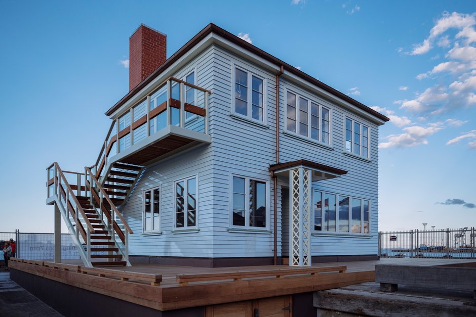
Generously donated to the city by Barfoot and Thompson (S1,000,000), and some anonymous patrons ($500,000), this imposing, spectacular work - based on a two story ‘50s state house in Mt Roskill, and the same size - is really two works in one, according to whether it is day or night. The same building (to be looked at, into and through) is experienced very differently according to the natural light’s impact on its outer and inner surfaces, and the background sea and sky.
Because of it representing a state house, this architectural sculpture was attracting a lot of attention even before it was built. These buildings are loathed by some New Zealanders (as a symbol of low income) and aesthetically adored by others for their ‘basic’ form. As a state sponsored variety of cheap housing, they are now highly controversial in Auckland because of hundreds of forced evictions in the eastern suburbs (there is a chronic shortage of housing in Auckland anyway) where the buildings are being sold off, and apartment blocks built on the land (if at all).
In daytime, Parekowhai’s distinctive weatherboard sculpture - coated with tough, glossy, pale marine paint - can be analysed by virtue of its staircase, balcony, porches, fireplace and alcoves. There is lots of nuanced chromatic variation in its exterior, especially with the pastel trimmings outside around the window frames and under the overhanging brown lip of the roof.
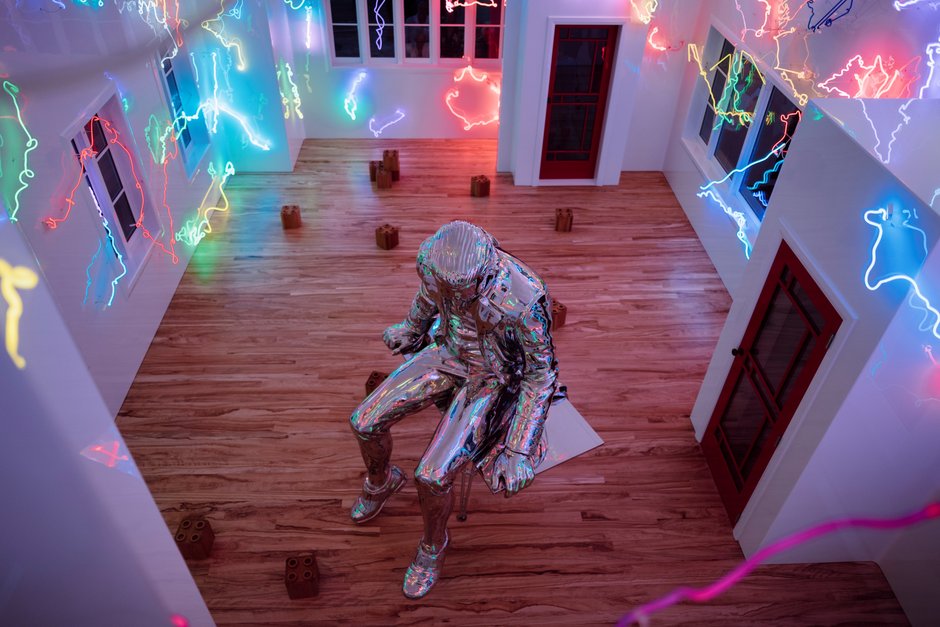
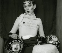
On different timers there are several hundred pieces of strategically positioned neon tubing within the gloss lined white box inside (the floor and a dozen scattered Lego blocks are wooden), with a large stainless steel Captain Cook inside, looking apprehensive while seated precariously on a swivel easel/table fixed to a tripod in front of the fireplace. It bears his weight: His feet are not touching the ground.
At the advent of night - when looked at from some distance so that the silhouetted building shape starts to dissolve into the darkness behind - the flashing neon that crosses the inner window frames merges with the spidery squiggles on the other side of the room. They compress spatially and combine, while the distance across the floor shrinks and weblike linear relationships between the twitching neurons constantly alter.
When you stand closer to the windows and peer through, the windows on the other side of the building have double parallel lines in their reflections, because they are double glazed. The reflections from the glossy white paint however are single.
Parekowhai’s coloured lines are incredibly inventive in their allusions. These flashing glowing lines can - one at a time - be interpreted in several ways. Some seem to be parts of coastline from maps made around the Pacific. Others could be improvised doodles or stick figures, or (self-reflexively) represent the eye movements viewers make when contemplating an artwork such as this - the different points within or on the house that viewers visually return to over and over again, and which can be charted or tracked by social scientists.
Others still refer to constellations in the southern night sky. (There are several of animals such as dogs, fish and pigs, for example.) And apparently in the months ahead, Parekowhai intends to install on the wooden floor, neon versions of the chiefs’ signatures from the Treaty of Waitangi, dominant in the lower part of the building below the ground floor window line.
This spectacular political work can be seen from lower Queen Street, as well as from local ferries passing in the harbour. By bringing together the nation’s founding document and the controversial issue of the sale of these houses, through using seductively coloured line in conspicuously placed (very public and provocative) architecture, Parekowhai is generating debate about governmental corporate actions and the communities they affect.
John Hurrell
Recent Comments
Ralph Paine
Figure I did suggest that there’s a certain “trippy funhouse” vibe to be gained from The Lighthouse Experience—and somewhat tangentially, ...
John Hurrell
Maybe Ralph, you should wait until the next stage of the Parekowhai work is completed, before you start chucking critical ...
Ralph Paine
Hyper-connected and securitized, downtown Auckland has become a Pacific rim commercial zone par-excellence. Tourism, real estate and gentrification, port facilities, ...
 Advertising in this column
 Two Rooms presents a program of residencies and projects
This Discussion has 3 comments.
Comment
Ralph Paine, 2:47 p.m. 16 March, 2017 #
Hyper-connected and securitized, downtown Auckland has become a Pacific rim commercial zone par-excellence. Tourism, real estate and gentrification, port facilities, local transport routes and hubs, shopping, banking, telecommunications, events and entertainment... It’s all about speculative money and logistics, about “growth” and development, climate change denial—there’s a carbon-fuelled fever in the air, it’s boom time, everything ripped apart only to rise up again, better by design, all creative-destruction a la Schumpeter. Day by day rendered more and more restrictive (limited/limiting), what's left of public space in this zone is monitored and controlled by the state-capitalist machine 24/7.
Given these conditions the term “public art” seems way anachronistic, a misnomer. Maybe “post-pop pop-up” is a better descriptor. Or Warhol’s “business art/art business”. In any case, Mr Parekowhai’s “The Lighthouse” feels to me like just another downtown pop-up. Just another trippy fun house on the end of a wharf, another display box full of kitsch lighting effects and over-designed products (there’s even a creepy silver mannequin). Nothing here then of any real significance, no aesthetic point of difference to experience. The structure-thing blends seamlessly with its context: same same, bling bling, site-specific.
So why the sycophantic PR tone of all the various commentaries I’ve read (including the one above)? Why the false history lessons (this ain’t no monument to indigenous rights) and faux-provenance (this ain’t no state house)? Why this broadcast of bad symbolism? I dunno, perhaps total over-sell is what’s required downtown these days. Perhaps it’s always been required.... Well, since 1840 I guess.
John Hurrell, 9:51 p.m. 16 March, 2017 #
Maybe Ralph, you should wait until the next stage of the Parekowhai work is completed, before you start chucking critical 'rocks' at it. You seem to have a chronic aversion to pleasure in art, where anybody who states they enjoy qualities like light or colour in Parekowhai's sculpture is accused of being sycophantic, and where only puritan wearers of hairshirts or nettle underpants know how to pick good art.
Ralph Paine, 3:44 p.m. 19 March, 2017 #
Figure I did suggest that there’s a certain “trippy funhouse” vibe to be gained from The Lighthouse Experience—and somewhat tangentially, I compared this vibe to that of window shopping, display boxes, and pop-ups. Thus from my perspective, and as stated in my comment, The Lighthouse blends seamlessly with its downtown context.
My use of the phrase “sycophantic PR tone”, however, was in reference to the various journalistic accounts I’ve read (Barr & Barr, Byrt, Hurrell, Lopesi, Wilson, et. al). In other words, the phrase “sycophantic PR tone” was intended as a descriptor of much of the discourse, many of the back-stories, the talk. For example, in the article above you make these claims: the philanthropists are “generous”; the site is “a mecca”; this is "a spectacular political work"; this is an "imposing, spectacular work"; the work possesses "cultural gravitas".
Why these el grando claims John? And why the total over-sell in the discourse? Given present conditions, my guess is that el grando claims and total over-sell are what's required "downtown".
No doubt in my mind about art's pleasure-pain nexus being way more nuanced than yr making out. Isn't critique an important aspect of this nexus? Or have you lost the plot too?
Participate
Register to Participate.
Sign in
Sign in to an existing account.