


John Hurrell – 21 October, 2020
It is fun to see an artist research paint application within blocks of work this way; thinking about pigment and medium control. There is nothing new historically going on with method, but that doesn't matter. Some work is interesting because it unconsciously references in its shapes really old linear art forms. Mixing those overlaid genres with ‘windows' into much later artists is pretty intriguing.
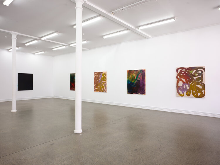
Gemma Smith is a Sydney artist currently having her first NZ solo show of paintings at Starkwhite. She presents eight canvases in the large downstairs space.
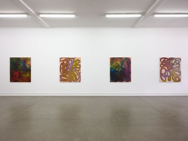
Essentially this exhibition presents four varieties of painting, each exemplifying a distinctive method of paint application and optical research. They vary in the number of examples for each.
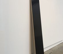
In the centre of the main wall (on the right) is Field, a single work ostensibly painted in black. However if you let your eyes adjust over several minutes, you can detect other very nuanced hues such as raw umber, maroon and dark blue. It is not really a monochrome at all. (Some of Ad Reinhardt’s subtly gridded ‘black’ paintings provide a similar experience.)
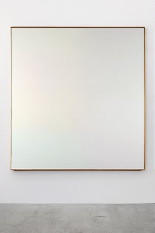
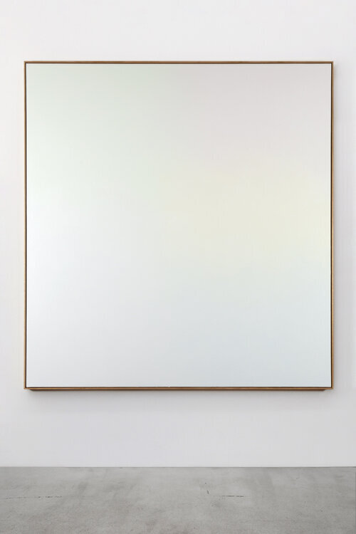
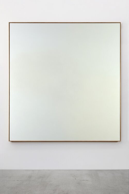
On the opposite wall are three works in the Threshold Series: Accumulate, Thin Air, and Melancholia (Five Greens). At first glance they seem to be white. However around the corners and outer edges you become aware of very pale tints of green, pink or yellow; in faint patches. I suspect the detection of these hues is not so much about the benefits of time as the benefits of changing light during the day—in conjunction with the works’ surface. A different perceptual process from that of Field where you might have an advantage standing close.
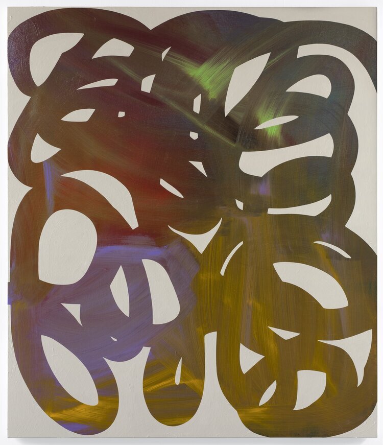
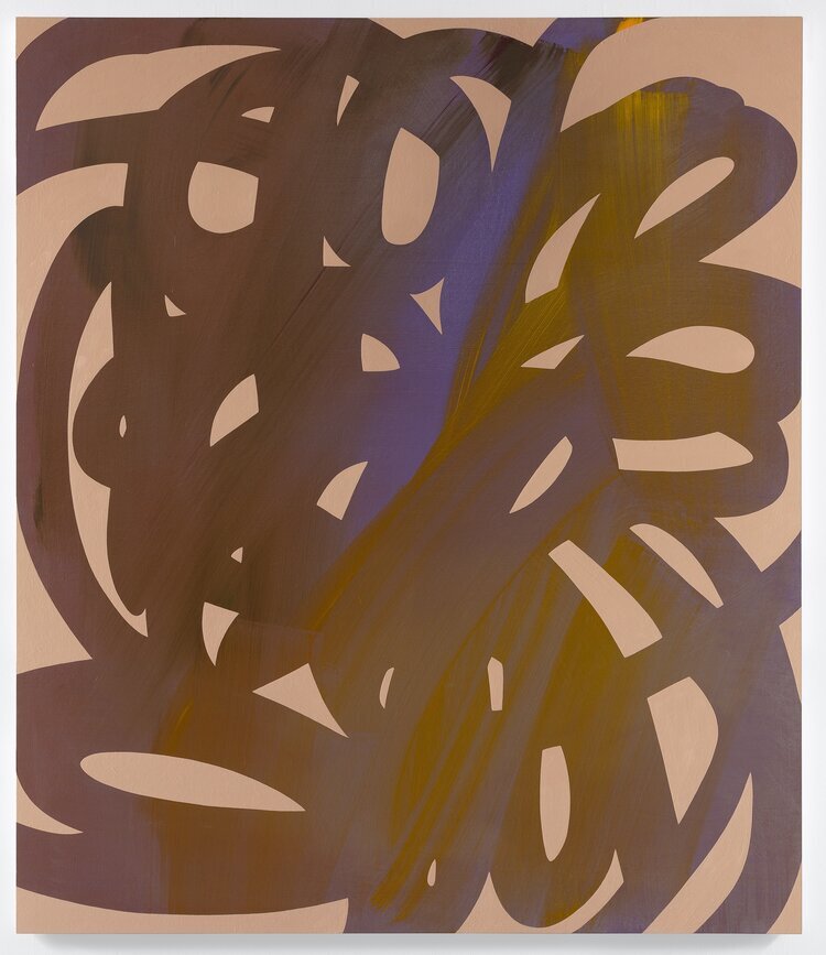
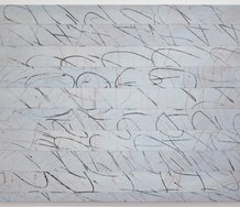
The other two types have two examples of each. Double Time and Follow of the Shadow Series, with curving ribbonlike bands, show a masking process where sweeping loops show (within their parallel edges) all kinds of glowing and cascading mark movements from streak-generating wide brushes. The softly luminous underpainting darts across the pathmaking widths of the top-layered arabesque ‘glyphs’. It is a clever tension: unrestrained violence below, fastidious restraint above.
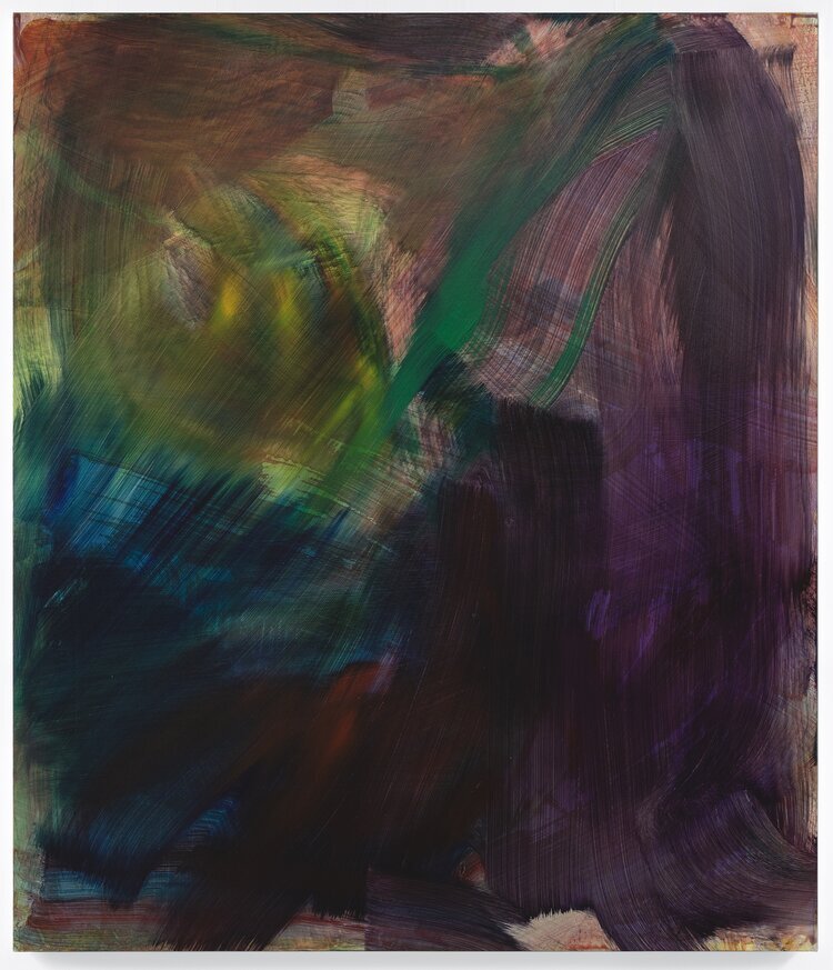
Smith’s last variety features explorations of very thin paint: richly varied pigments frenetically mixed with large quantities of medium, seemingly on top of a pale ground. In Between Seas and Flex, paint layers are left to dry and further transparent coats partially positioned on top. The vectoring bristle marks are vigorously gestural but often small sections of wet colour are removed with a cloth, so more saturated portions can peek through and glow. There is a watery look to the works, as if we are peering down onto the colourful weed-covered bed of a lake or running river.
It is fun to see an artist research paint application within blocks of work this way; thinking about pigment and medium control. There is nothing new historically going on with method, but that doesn’t matter. Some work is interesting because it unconsciously references in its shapes (I’m thinking of the Shadow Series) really old linear—but super-entangled—art forms, like Norse or Celtic art or illuminated manuscripts. Mixing those now compressed and overlaid genres with ‘windows’ into much later artists like Ab-Exers de Kooning or Kline is pretty intriguing.
John Hurrell
 Advertising in this column
 Two Rooms presents a program of residencies and projects
This Discussion has 0 comments.
Comment
Participate
Register to Participate.
Sign in
Sign in to an existing account.