John Hurrell – 18 September, 2022
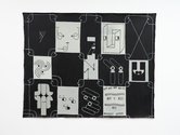
The larger canvases (Noxii, TV Diva, Glossolalia), incorporate several types of austere linear drawing alongside the shape-oriented logo-motifs, positioned within rectangular formats, and implying a sort of syntactical structure with different parts of speech. They also can be seen as a curated exhibition of pictures, not one picture. A collection of entirely separate components, or one large, single, complicated component.
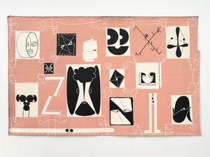
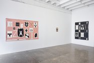
Julian Hooper’s nine paintings of varied size feature logo-like images that as elegant glyphs seem like butted-together rebuses. Most are in black and white, emphasising carefully organised shape and positive /negative interaction. However, one large unstretched work is in pink and white and a smaller stretched painting is in red and black. As signs, they attempt to entice you to ‘de-code’.
The large works have a vaguely grid-like structure with repeated framed scrolls that in their corners become facial profiles. They seem to allude to ornate writing paper, and sometimes the motifs appear on more than one painting.
Years ago, Hooper used to make wonderful surrealist paintings and these (though an array of formally organised signs)—with titles like Glossolalia—are definitely connected, as if speaking in tongues is a form of automatic writing. Only the optical space and the painting style, with its graphic sensibility, is different.
The larger canvases (Noxii, TV Diva, Glossolalia), incorporate several types of austere linear drawing alongside the shape-oriented logo-motifs positioned within rectangular formats, and implying a sort of syntactical structure with different parts of speech. They also can be seen as a curated exhibition of several pictures, not one picture. A collection of entirely separate components, or one large, single, complicated component.
The five small single-image works in comparison have a more direct emotional impact because of their compositional simplicity. They are like council signs you might encounter on the street, that are there for you to decipher. As part of their design dynamic, they all seem to have two eyes and/or a mouth.
Cavity is an A-shaped tooth with a large cavernous hole so it looks like a mediaeval helmet. It could also be a skull-based section of a Henry Moore sculpture.
Diesel has four bits of connected curly ribbon hovering in space, that look vaguely like hooks beautifully aligned. The striking pulsing ovals are cleverly arranged in horizontal and diagonal lines.
The crossed (but lit) matches of Seer become eyes that see into the future, and the tindersticks a furrowed brow.
Marsyas refers to the unfortunate musician in Greek legend who was flayed alive for trying to upstage Apollo. The scrolled triangle and curled trapezium allude to bloody pieces of his peeled off hide. Note the curly eyes and mouth.
Scream could be a window that doubles as a screaming face. (‘Screen’ as ‘Scream’?) The three black semicircles are cleverly positioned as two eyes and a mouth. One of the glass panes is lowered as a ‘painful’ visual pun.
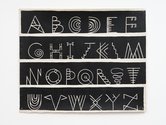
There is also a designed alphabet where wirelike individual letters breed mini-replicas of themselves, hanging on their ‘branches’ like fruit about to drop. Language is thus constantly perpetuating more language, just as art is always perpetuating more art.
More works from Hooper can be seen in the excellent Chartwell exhibition (Walls to Live Beside; Rooms to Own) currently on the top floor of Auckland Art Gallery Toi o Tāmaki.
John Hurrell






 Two Rooms presents a program of residencies and projects
 Advertising in this column
This Discussion has 0 comments.
Comment
Participate
Register to Participate.
Sign in
Sign in to an existing account.