John Hurrell – 8 October, 2023
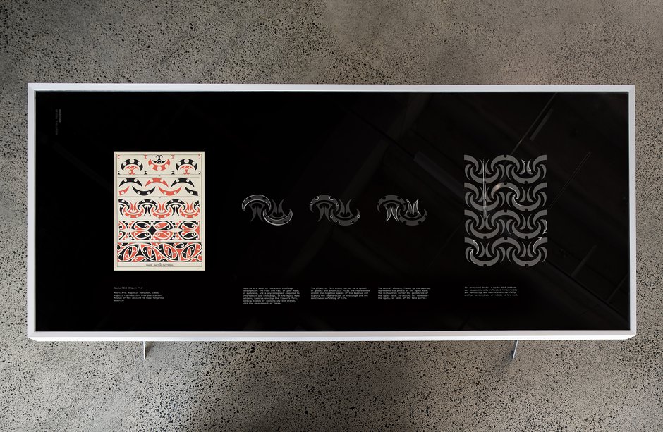
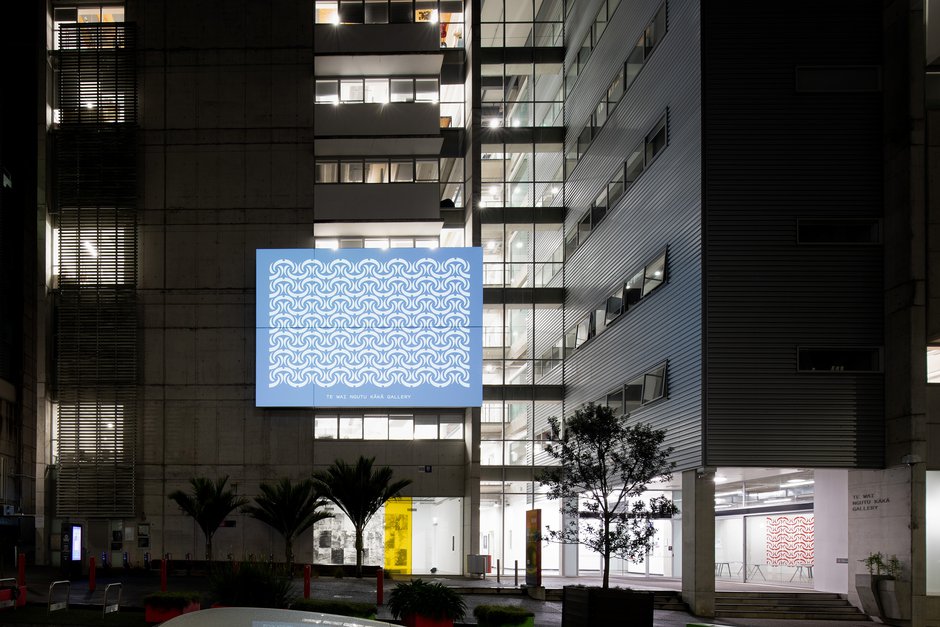
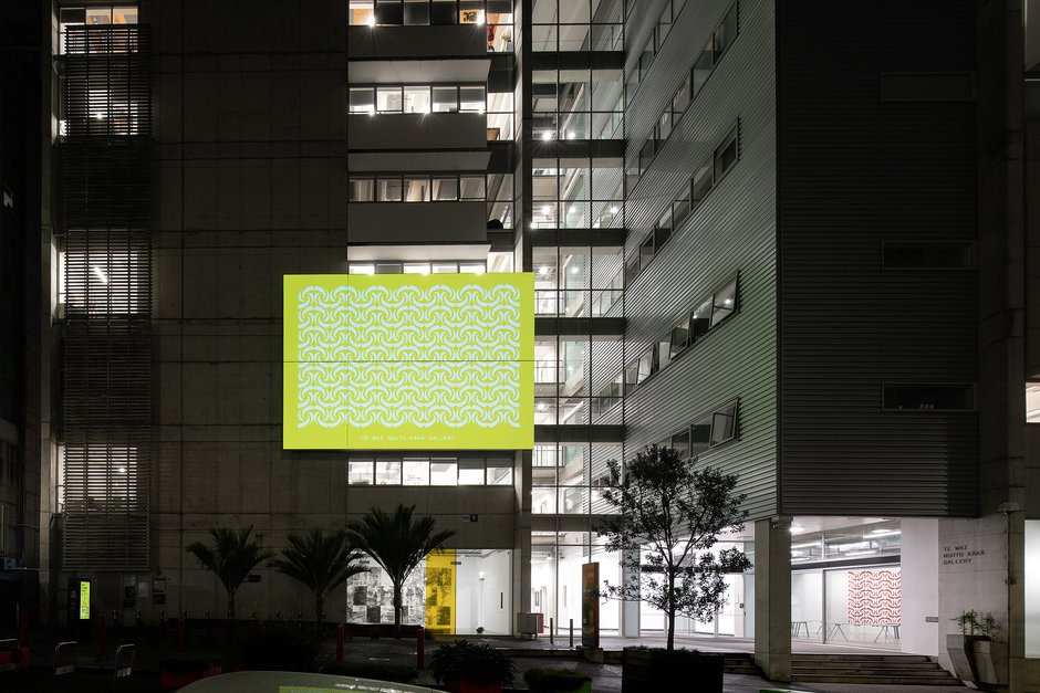
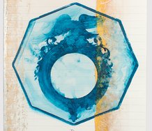
The distinctive unit can be internally broken down into three symbolic components: (a) A curved horizontal crescent shape representing an arched human eyebrow (kaperua), symbolises the excited acquisition of knowledge. (b) The single circle in its centre is a pītau, a growing fern frond, standing for the development of the student. (c) The two vertical comma shapes descending below the circle allude to the beak of the kākā and the associated dangling red petals—symbols of the wider natural world that human culture is embedded in.
Tāmaki Makaurau
Haumi designwork, with the name gifted to AUT by Ngāti Whātua Ōrakei
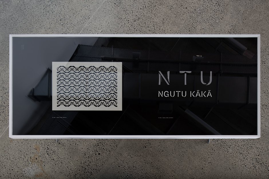
Te Wai Ngutu Kākā Gallery Identity presentation
Curated by Stephen Cleland
22 September - 4 November 2023
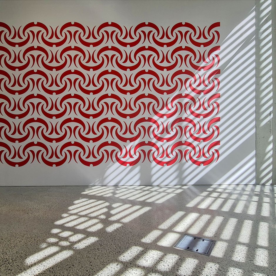
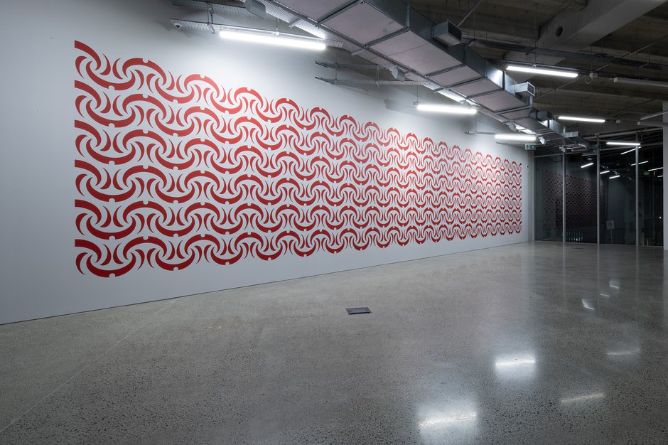
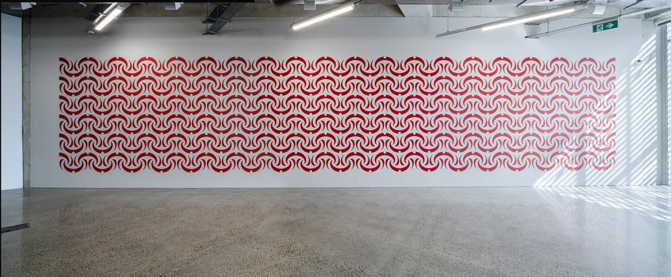
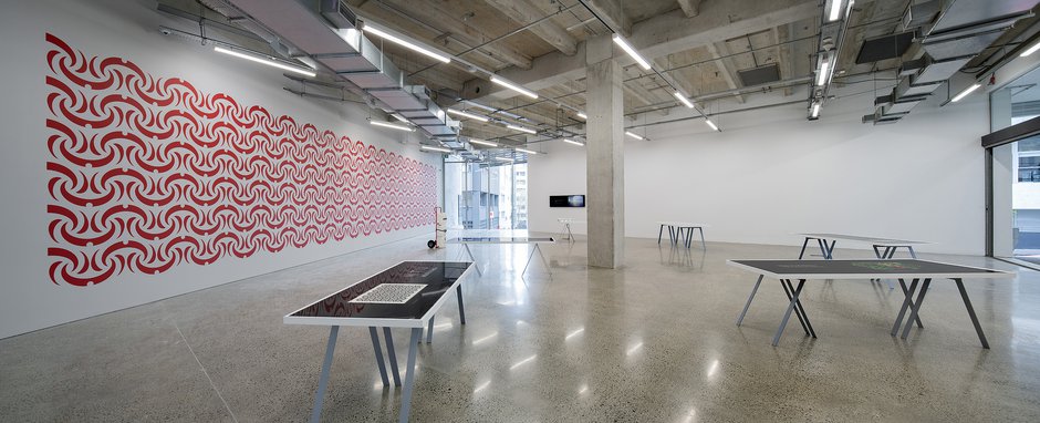
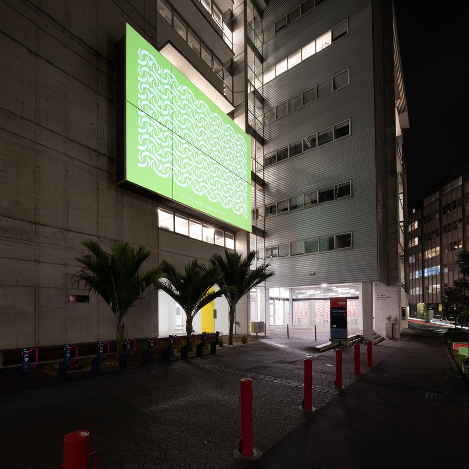
For the launch of this gallery’s new name and its repeatable branding logo, here presented as a striking frieze on Gallery One’s long wall (the logo can also serve as signage, a letterhead and repeatable page decoration), the Haumi design firm has modified a traditional Ngutu Kākā rafter pattern, a modified flip-flop motif based on the Kākā Beak flower, changing it so only one colour (red) is used throughout (instead of the original two, and one circle used in each module, instead of several.
The distinctive unit can be internally broken down into three symbolic components: (a) A curved horizontal crescent shape representing an arched human eyebrow (kaperua), symbolises the excited acquisition of knowledge. (b) The single circle in its centre is a pītau, a growing fern frond, standing for the development of the student. (c) The two vertical comma shapes descending below the circle allude to the beak of the kākā and the associated dangling red petals—symbols of the wider natural world that human culture is embedded in.
Hypnotic as a 6 x 38 modular frieze—each row starting and finishing with a half horizontal-upper unit—it presents in each module (alongside the above physiological, ornithological and botanical links) what also can be interpreted as a sharp curved blade with pointy stabbing tips at each end. The viewer is bombarded by a seething swathe of rhythmically inverting arabesque crescents advancing along the high wall.
In its piercing demeanour (an uber-prickly tactility), this exceptionally bold work has some coincidental affinities with a few of the projects of Richard Wright, an English artist who came out to Wellington as part of Pictura Britannica in 1997. He makes wall paintings in the ‘dead’ parts of modernist galleries, that occasionally feature spiky, sharp shapes that serve as architectural interventions. Wright won the Turner Prize in 2009.
This agitated spiky piercing quality also has links to NZ artist Kathy Barry.
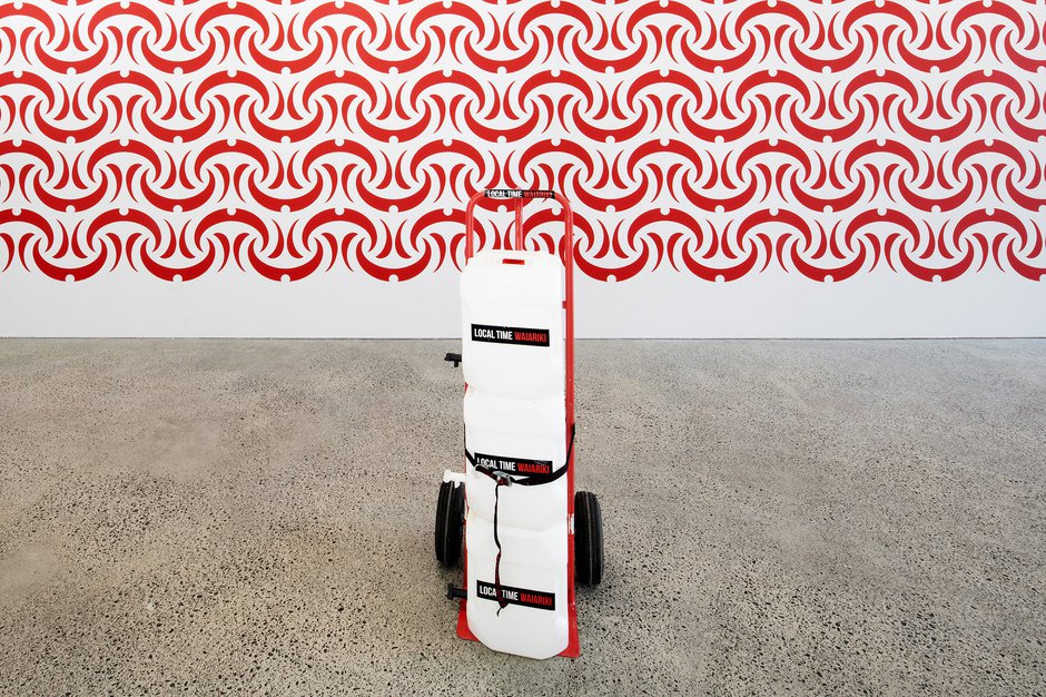
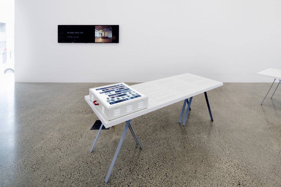
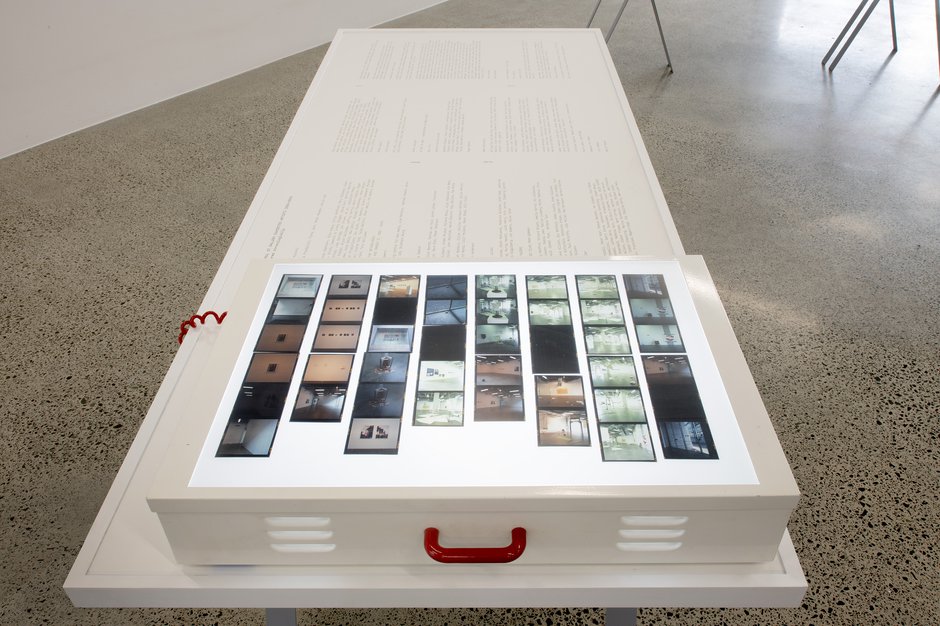
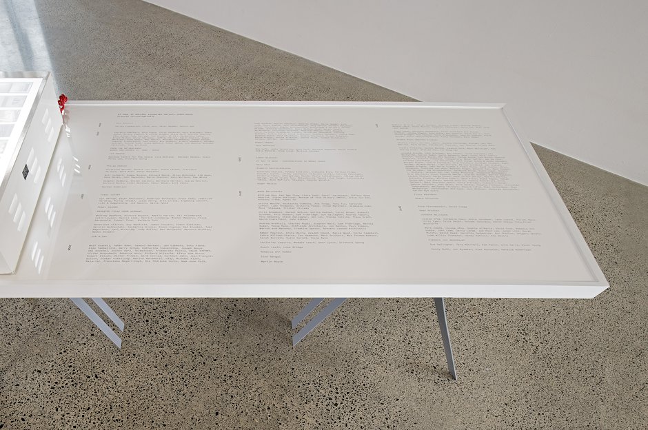
Besides presenting the rationale behind the choice of elements within the construction of this logo, and their combination, there are informative vitrines on trestles, lists of all the international and local shows presented at ST Paul St (over 2004-2023), and a slide show of exhibition images. Outside at night-time in ST Paul St is Te Wai o Ngutu Kākā, Tae Kanorau Colour Palette, a colourful projection of four seasonal variations of the curtainlike frieze high up on the WM facade wall.
Conspicuously included (here and in the outside street-front window) are also some artworks from the Auckland collective Local Time, that were part of their ‘pure water’ project in the Fifth Auckland Triennial, curated by Hou Hanru in 2013.
It is tragic that the local council is no longer supporting an international Triennial for this globally significant city—a big loss for artlovers and those who love vibrant culture-focussed visual-art debate. (Perhaps that will change?) The current challenge though is for Te Wai Ngutu Kākā (in future years) to surpass the remarkable achievements of ST. Paul St Gallery by somehow resurrecting—and cranking up further—a greatly respected international and local exhibition programme. Time will tell.
John Hurrell
Recent Comments
Ralph Paine
A few decades back Jean Baudrillard suggested that “today what we are experiencing is the absorption of all virtual modes ...
 Two Rooms presents a program of residencies and projects
 Advertising in this column
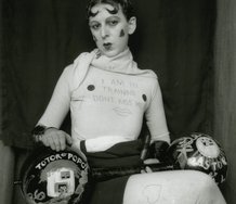
This Discussion has 1 comment.
Comment
Ralph Paine, 9:45 a.m. 11 October, 2023 #
A few decades back Jean Baudrillard suggested that “today what we are experiencing is the absorption of all virtual modes of expression into that of advertising.” What did he mean? And does his thesis still hold? Doubtless we continue to experience an accelerating and radical blurring of the distinctions between art, craft, design, curating, fashion, entertainment, etc. etc., but what Baudrillard emphasizes is the directionality of this transformation. In other words, today all modes of expression are taking on the form of advertising (and thus of branding) and not the other way around. Here is how he describes advertising’s defining characteristics: a “triumph of superficial form, of the smallest common denominator of signification, degree zero of meaning . . . a simplified operational mode, vaguely seductive, vaguely consensual,” and possessing a “characteristic translatability.” For Baudrillard, then, everything is being produced as sound bite, bullet point, re-run, logo, catch phrase, stereotype, headline, cliché, etc., and therefore everything is effortlessly relayed and adapted for any cultural/corporate purpose whatsoever—easily produced and consumed in other words. Baudrillard links the form of advertising directly to that of propaganda.
What this exhibition affirms, then, is the accomplishment of a globalized cultural market (inclusive of an education market), a market which has completely displaced any notion of art-as-ultimate concern.
It’s as if Hegel’s dialectic of aesthetics—his theory of the ascendancy of arts and crafts from sensation toward concept—has finally come true and completed itself in the form of today’s advertising, marketing, PR, design, and media firms large and small. The owners, executives, creative directors, copy-right holders, consultants, and technical specialists of these firms have not only stolen all operability of sensation from artists, but also all feasibility of concept from philosophers. Art and philosophy have reached a limit and crisis here, a limit and crisis internal to their ongoing sensual-conceptual viability. This limit and crisis now define what art and philosophy always-already were; it defines their present measure and calculation as pre-given forms. Paradox: the now accomplished non-viability of these forms provides the very condition from which fresh viability will be created—is being created. To figure things in this manner is to incorporate a time wide open to the coming of different formations of aesthetic and philosophical flow and possibility.
Participate
Register to Participate.
Sign in
Sign in to an existing account.