John Hurrell – 16 June, 2011
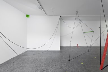
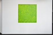
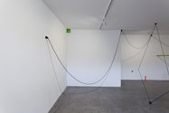
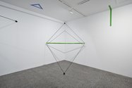
The green ‘pastoral' rectangle outside by the entrance declares the installation's link with painting so that the green 'half-box' tucked into a far corner, right-angled strips crossing from walls to floor, and horizontal green tubes are part of that - as spread out fragments of an expanded green field.
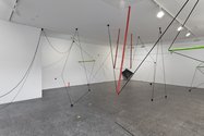
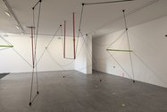
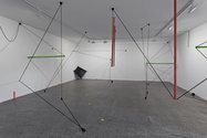
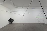
Presented in the separate square room on the right of the entrance in the Te Tuhi community centre, this Rob Gardiner installation continues the methods of projects recently developed at the Crockford K’ Rd window, Two Rooms and Window at the Auckland University Library. Now he has his characteristic projecting elements pinioned to the ceiling and walls functioning as dynamic components of a walk-through painting. Thus the room obviously is not strictly a white cube but more a white horizontal tray.
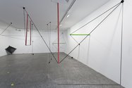
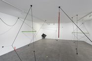
It is in essence a walk-through drawing dominated by taut elastic lines, real and fake linear shadows, pinioned plastic tubes, stretched vinyl fabric and scumbled green painted rectangles and strips. The experience of wandering through it is more claustrophobic than what the photographs here indicate. There is no clear sense of indicated walking trajectory as there was with the Two Rooms exhibition, and despite the photos here the sense of material presence is encroachingly dense. You don’t feel you have too much room to bodily manoeuvre.
Instead you are surrounded by spatially hovering ‘marks’ that rapidly change shape, length or angle according to your smallest movement. Black knotty blobs anchor on to the room’s planes and from these stretch, hang or droop an open net of straight or parabolic lines, and various suspended or fastened coloured tubes. The green ‘pastoral’ rectangle outside by the entrance declares the installation’s link with painting so that the green ‘half-box’ tucked into a far corner, right-angled strips crossing from walls to floor, and horizontal green tubes, though spatially dispersed, are part of that - as spread out fragments of an enlarged green field. All these skeletal components become linear obstacles that impede any easy traversal of the space.
Compared to the earlier works, this exhibition is comparatively diffuse, lacking zones of spatial intensity; it is more holistic with all the components running into each other and interlocked. I prefer the earlier more concentrated isolated forms that were in discrete formations, Gardiner’s more decisive projecting forms then being more intricate and complicated.
That means this show is more 3D ‘drawing’ and less sculpture. The bigger picture dominates over the detail, but as something to walk through the experience is not as exciting as the earlier entangled clusters of cluttered lines that you could stand alongside and contemplate. Gardiner’s expanded field here I think is too even, lacking the contrasts of contraction/expansion or distillation/dispersal needed to bodily cajole the visitor into states of mental excitement.
John Hurrell
 Two Rooms presents a program of residencies and projects
 Advertising in this column
This Discussion has 0 comments.
Comment
Participate
Register to Participate.
Sign in
Sign in to an existing account.