Peter Dornauf – 29 August, 2012
So Parr and Blaine are, it would appear, simply talking to themselves or at best, the 'in' group, the little cabal of art aficionados, an audience of about 0.1 percent. One can easily see why the judge chose it. Ironically, the charge the postmodernists laid at the door of modernism was that it had alienated its audience. What has changed?
Hamilton
Group show
National Contemporary Art Award
Sponsored by Barry Hopkins
Curated by Caterina Riva
17 August -18 November 2012
I wish art award judges of contemporary art shows and museum directors and whoever else is out there and faced with a potentially sceptical, even hostile audience, would stop saying, as a sort of first defence or fall-back rationalization , “we welcome controversy as it gets people talking about art”. Please. No more. Desist now. This is not the purpose of art. Because the kind of “talking” you are going to get about a bus shelter winning $15,000 in prize money is the stuff encouraged by a newspaper headline (Waikato Times) that says, ‘National $15,000 Art Prize Goes To….. This?’ after which, at the bottom of the column, there’s a ‘Have Your Say’, with the newspaper’s email address.
Hi. My name’s Murray, first time caller. This piece of shite…’
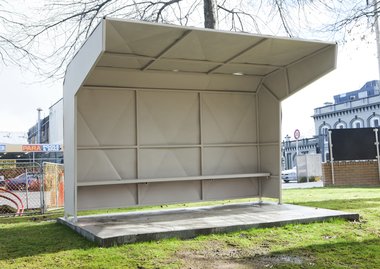
Yes, it’s that time again folks, the National Contemporary Art Award, this year curated and judged by Caterina Riva, Director of Artspace. And yes, the ubiquitous controversial choice goes this time to a bus shelter, built by Michael Parr and Blaine Western and entitled Parallel of Life and Art, constructed in the style of the late 50’ and 60’s brutalist manner.
I suppose the first question that comes to mind is, when does a piece of architecture become art? The answer Messrs Parr and Blaine might give is, when it becomes a sculpture. And how does that happen? The answer to that thorny issue was of course addressed by George Dickie and his famous/infamous institutional theory of art whereby various members of the art establishment by virtue of their vested authority, give the Midas touch to any artefact, transforming it, ipso facto, into art.
Ignoring for the moment the circularity of such a construction, the joint artists, in their blurb, make it clear that they are interested in “design politics”. “We are interested in the relationship between the intent of design in objects and how they exist and operate currently.” A worthy enough cause. But one could see the newspaper journalist caught in a desperate attempt to load some other more graspable meaning onto the thing, some real human matter of gravity and substance, some even personal drama, by providing the bi-line, “Gimme Shelter”, and tried to supply a human interest angle by mentioning that the homeless of Hamilton were already using it, since it is parked outside the Museum building itself, on the grounds adjacent to the main street.
One can only have sympathy for the general public who are not really interested in the world of rarefied aesthetics as such; only the anal arty types are. Who gives a monkey’s about brutalism and its politics? Is there in fact any politics involved in such matters? I suppose there is if one wants to mention post-war modernism and warble on about Bauhaus, Le Corbusier, honesty, raw concrete etc.
The sad thing is, only architectural/design historians and sniffy art history types would know about this.
So Parr and Blaine are, it would appear, simply talking to themselves or at best, the ‘in’ group, the little cabal of art aficionados, an audience of about 0.1 percent. One can easily see why the judge chose it. Ironically, the charge the postmodernists laid at the door of modernism was that it had alienated its audience. What has changed?
A second question one might want to address to this bus shelter, is, where is the art? There certainly is craft in the construction. But what we have here is simply a replica. This is just a ‘photo copy’. The standard reply would be that the art is in the idea. It’s conceptual, stupid. And that would be correct. But this idea of replication is a very old one, as old as Duchamp, updated a little later by Warhol and his Brillo Boxes. The point is how many times can this trope be trotted out before we start to yawn? And is exact simulation, at this juncture, simply a question of imaginative sloth? Of course it may be only marginally related to any of this.
It’s been suggested that what it’s really about is “relational aesthetics“, the brainchild of French theorist, Nicolas Bourriaud. Artist as ringmaster: put something up, and ‘watch’ the people interact with it, generating a “social experience” which itself becomes the art. Artist becomes stage manager/designer, generating openended responses, democratic communal and collective ripostes, the art market crushed, art is free as a bird, hurrah!
The goals are admirable of course: the end to the fetishization of the object, end of the passive consumer, become the collaborator, real democracy, community and collectivism. Wonderful. But here’s the rub. Will putting up a replica of a Brutalist style bus shelter promote, even communicate any of these ideals? Given the public reaction, the answer would seem, no. Instead of fostering egalitarianism, it has alienated and angered the very people its message is directed at. Is this simply the curse of the avant-garde? Whatever it is, Marx would not be pleased. At the moment the practice unfortunately smacks of elitism which is contrary to the theory. The “interaction”, given the context, was fairly predictable. General hair pulling and gnashing of teeth. And yet how avant-garde is all of this really? I vaguely remember something called “Happenings” back in the sixties, courtesy of Allen Kaprow in which the boundary between the art work and the viewer was to be eliminated.
Apparently the artists, in their best relational aesthetics mode, are not averse to having people graffiti the piece and already within a day, some individual has started the conversation by scrawling the word “Jerk” on the inside wall of the shelter. No mention of Brutalism yet. So far, so foreseeable.
There is in fact a good deal of ‘wankerism’ going on in the various artists’ statements in the exhibition itself, my favourite being a piece of verbosity by Maria Walls in reference to her photograph Cones/Fags - Ground Floor Gallery 111. The “un” tag gets a good workout; un/mastery, un/dignifies, while others chime in with un/monumentally, alongside every other piece of current art jargon - signs, signifiers, recontextualization and the rest. The Artspeak is an art form in itself. It would be wonderful to have a show devoted exclusively to Artists Statements, framed, curated and hung.
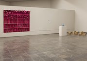
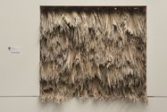
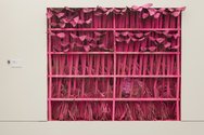
My prize for an actual art piece would go to Sam Thomas’s Pink Batts, mercifully without any artist statement. And the thing is, it didn’t need one; the art work spoke for itself and that’s how it should be, otherwise the object/artefact is not really the art, it’s just an excuse for a blurb. Not that explanation should be discounted. It’s useful, often even necessary for it to be there, but as aid, not as prime suspect. From a distance the draped palm leaves Thomas uses in his piece, looked like a Maori cloak but up close it took on the characteristics of a sort of raupo roof, while through the wall and on the other side, the underside of the palm leaves were spray-painted in pink. A very clever witty idea and perfectly executed.
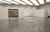
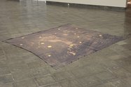
Another contender was NGO, by Nicki Wynnychuk. He has a great idea to work with: Papua New Guinea and the modern equivalent of the Cargo Cult mentality, but whether a stained drop-sheet lying on the gallery floor sufficiently articulates the idea is another matter.
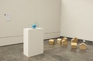
I do not wish, however, to see another collection of ‘my stuff inside my studio/room’ with scattered random or otherwise carefully placed items looking random across a gallery space, whether it’s recontextualized or not or whether it’s the latest trend or not. Artist’s studio’s are marginally interesting, the engine room as it were, but elevated to art status seems a step too far, close enough to fetishism or worse, narcissism. Roman Mitch’s Studio Shot, with a price tag of $42,000 seems to underline the point.
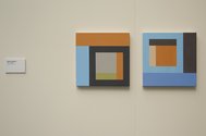
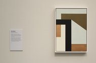
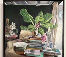
Of the few paintings in the show, two are rehashes of modernist abstraction. Adrian Jackman and Jessica Pearless both look as if they share the same studio so similar are the works. The link with Josef Albers is made explicit in the Pearless work: yet more variations on Homage to the Square. This plays off against a faux ceramic by Natalie Guy, called Meet Me Inside #2.
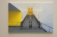
Two satirical pieces on suburbia are included: Day in and Out, a sculptural piece by Meiling Lee and Travelator by Ruth Cleland. It’s obvious the curator is interested in playing the thematic game here which sort of works against the nature of the beast. Is this an art competition or something else?
There were two hundred and thirty entries which Riva whittled down to nineteen. That’s a big cull on top of the fact that some of the works included are merely repetitions of each other.
With only eighteen works in the large top gallery at the Waikato Museum, it presented a little on the thin side, but it was at least good to see the space being used for what it was built for after a hiatus of ten years. Hopefully this is a sign of better things to come at the institution.
Peter Dornauf
Recent Comments
John Hurrell
Thanks for clarifying that, Jessica. Your original artist's statement didn't specify which Albers you were thinking of. Your addition makes ...
Jessica Pearless
Regarding Peter Dornauf's reference to my painting, After Albers, the work pays homage to Josef Albers wife, artist Anni Albers. ...
John Hurrell
Luke, it will be interesting to see if Claire Bishop's book gets much serious discussion. I suspect it will get ...


 Two Rooms presents a program of residencies and projects
 Advertising in this column

This Discussion has 12 comments.
Comment
Nickolas Wynnychuk, 12:20 p.m. 31 August, 2012 #
Peter your lack of openness to look at the work within the show is just sad.
I could not disagree more with you attitude towards this show and Riva. Art awards are generally stupid, this is not Riva's fault she was just trying to make good using the very average platform at hand.
If you want to contradict yourself a little less you could read my statement (again), use it as an explanation (don't discount your privilege) and discuss the work rather than an idea you recognized in the wall plaque.
Peter Dornauf, 8:25 p.m. 31 August, 2012 #
Yes, Nickolas, art awards are a little stupid, as you say, but it doesn't stop us entering them, does it?
The old, "you're not open" ploy. Actually I'm open to a lot of things, things that are clever, intelligent, engaging, well wrought, astute. Need I go on? What I'm closed to is stuff that's dull, dead, ho hum and tedious, especially when it comes to art. Your work, I was politely trying to say, was boring. Sorry about that. But then, that's just me.
Owen Pratt, 7:19 p.m. 3 September, 2012 #
What a c--t.
John Hurrell, 7:38 p.m. 3 September, 2012 #
Who is Owen? Nickolas or Peter?
Anna White, 7:19 p.m. 17 September, 2012 #
Well, not Nicki who is inaccurately described in the review as a girl. (Now corrected. Ed.) Nonetheless, this is the best review and most entertaining discussion in ages. Thanks PD.
Luke Munn, 12:43 a.m. 1 September, 2012 #
It's interesting to compare the approach of "Parallel of Life and Art" with another recent, and also controversial piece, "Cinderazahd: For Your Eyes Only".
The former work seems deeply rooted in a site-specific practice, with many typical traits: a thorough researching into the area's history, an examination of previous landmarks or cultural touchpoints (in this case the bus shelter) and a kind of 'reactivation', which seeks to highlight or remember this trait, juxtaposing it with the current site or space. In this sense there should be a familiarity with the resulting work, even if out of context, a type of memory in physical form. This kind of process naturally threatens at times to become a type of superficial, shorthand social practice, taking the forms and touchstones of a community, a city, a space, and reflecting it to imply a familiarity which doesn't exist, a relationship which perhaps is more scholarly than social, an outsider's view imparting a resonance onto an object. While the charge here of elitism I find quite dangerous in encouraging a 'dumbing down' tendency, there's something to be critiqued in a work operating in this site-specific mode which draws so heavily from the broad everyday life of the area but somehow sidelines or elevates this into a conversation about modernism, archetypes and architectures that by definition has a limited audience. If the work is more relational, as implied in this review, then it should be judged, as Bourriaud suggests, by the paradigm and model it offers us, assumedly as a future vision, which is realizable and improved by the artists service or situation (never utopian). In this sense the site of the work is extremely important as it defines the dialogue to a great extent. For many probable reasons (legal, safety, budget constraints) the work isn't in public space but instead on the gallery grounds, not integrating with the street/bus system but yet asserting a type of 'publicness'. While this gives it a nice tension in some ways, as a social work it seems to share traits with the 'artificial hells' that critic Claire Bishop writes of (though the latter word is too strong in this case), where tools of community and conversation are relegated to a private space which sustains a temporary group or spectacle.
....
John Hurrell, 11:16 a.m. 21 September, 2012 #
Luke, it will be interesting to see if Claire Bishop's book gets much serious discussion. I suspect it will get sidelined in the art media.
One question..Is the Western/Parr work not in a public space? If the city-owned 'Gallery grounds' are not a public space, how does that alter perception of conversations held within it?
Luke Munn, 12:45 a.m. 1 September, 2012 #
"Cinderazahd" in contrast comes from a completely different mode, offering a view of the 'other'* to women only, staged in a traditional gallery context. It's interesting to me that this obvious exclusivity paradoxically opens the work up to wider audiences, allowing the concept (and naturally controversy) to travel far beyond those who can physically view the work. For me it immediately draws up any number of issues, touching on intimacy in the age of YouTube self-sharing/voluntary transparency, image and model rights, and private/public space, as well as the wide-ranging themes picked up on by the mainstream media: religion, gender and privacy. It reminds me of a quote from Felix-Gonzales Torres: "You know, a work inside a gallery, in a so-called ‘private space’, will sometimes be more public because it can relate to the public much more than anything that is outdoors." It also asserts a more problematic idea of participation, not simply interpreting any contribution, discussion, or viewing of the work as positive. A woman can venture beyond the veil, her male partner must remain outside, relying on description and never witnessing the intimacy depicted within. This problematizing of participation - who is privileged with it, who not, when does contribution become counterproductive - is one aspect which Bishop highlights as a potential avenue in her lecture "Participation and Spectacle: Where Are We Now?" (http://vimeo.com/24193060) and an acknowledgment and inclusion of this more 'uneasy' participation seems to weave through many of the more interesting projects in this field.
*Muslim population in NZ as religion is at about 1% as of 2010 Pew Report, http://en.wikipedia.org/wiki/List_of_countries_by_Muslim_population
John Hurrell, 7:03 a.m. 1 September, 2012 #
Here is a link to Cam McCracken of The Dowse talking about the issue of sexual segregation:
http://www.gg-art.com/news/newsread/artnews103947.html
Roger Boyce, 3:53 p.m. 5 September, 2012 #
“With these I consider myself pretty lucky that they did come out looking like art.”
- Richard Prince
Michael Parr and Blaine Western's bus-stop collaboration smells something like the unattributed 1980's partnership between the singularly infamous Colin deLand and Richard Prince.
John Dogg (their putative nom de plume) fashioned Mail-order car hoods detailed with sanded primer and bondo....which were literally dumb and dumber. Meaning they were dumb (refused to speak and were thus language resistant) and dumb (as in purposefully and blissfully stupid).
Muscle car minimalism.
I quite enjoy (at least in reproduction) the Parr/Western which is, to my mind's eye, less a critique of modernism than it is of minimalism and mass movement. And of its (intentional/unintentional) critique of minimalism I'd opine it's an affectionate one.
Just as Richard Prince's romance with "Spiritual America' is a genuine but complicated affair.
Good work fellas.
Jessica Pearless, 11:47 a.m. 17 October, 2012 #
Regarding Peter Dornauf's reference to my painting, After Albers, the work pays homage to Josef Albers wife, artist Anni Albers.
The painting is an acknowledgement to, rather than, a rehash of, the work of Anni Albers, specifically her groundbreaking work and contribution to the field of abstraction in textiles.
John Hurrell, 12:26 p.m. 17 October, 2012 #
Thanks for clarifying that, Jessica. Your original artist's statement didn't specify which Albers you were thinking of. Your addition makes a lot of sense.
Participate
Register to Participate.
Sign in
Sign in to an existing account.