John Hurrell – 9 February, 2013
So what of sculpture in this location, on the ground and lower walls? There are eight artworks here. Do they have a ghost of a chance?
Auckland
Eight projects
Silo 6 Installations
1 February - 22 February 2013
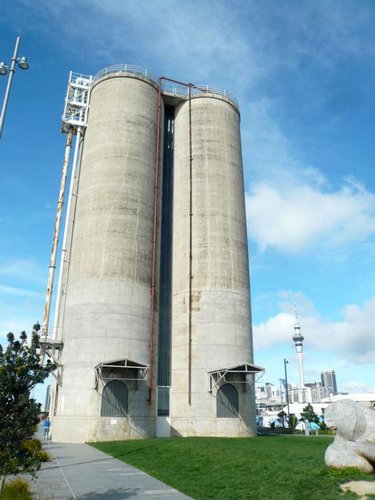
In terms of architectural treats around the inner city of Auckland, there can’t be much competition around, if at all, to match the extraordinary Silo 6 structure in the Wynyard Quarter. Inside - in the middle of the day - it is truly something to experience via the natural light; towering curved concrete walls raked with soft grey beams - streaming in from delicate ladderlike windows separating the six gigantic cylinders.
So what of sculpture in this location, on the ground and lower walls? There are eight artworks here. Do they have a ghost of a chance?
Oddly the most confident work is in darkness, and largely aural, Phil Dadson’s three channel video The fate of things to come - a conversation with stones. The three separate, but tightly coordinated screens, suspended in a triangular formation in the centre of one of the six circular spaces, show Dadson simultaneously playing different pairs of wet river stone: tapping, grinding, scraping and clicking, changing the shape of his palms and grip to vary the pitch while controlling the rhythms and the volume. The concrete ‘shell’ in which Dadson’s work is presented seems to acoustically suit it, and it is rivetting.
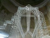
Louise Purvis’s imposing steel gridded architectural form seems designed specifically for the space we see it in, yet like all the works here, it was made last year. It fits so well, especially with the metal roller door behind it, that it can’t be imagined on another site: it’s thoroughly thought out. Part skeletal building, part fairground complex and part industrial machinery, Silo Construction looks as if it could have been designed by Sol LeWitt, for its repeated cube module has an intricacy that holds your attention.
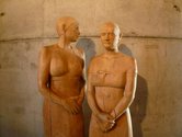
In a narrow corridorlike space between the much wider cylinders, the two wooden carvings by Richard McWhannell are almost lifesize, showing two young women in earnest conversation. The devotion of the friendship is suggested by the precision of the figures’ body language and the orientation and two heights of the heads. Their faces are carved with great sensitivity (almost Buddhalike in their simplicity and fine detail) while the patina of small chisel marks seem like brushmarks in its dappled rhythms. These accomplished macrocapa carvings easily hold their own.
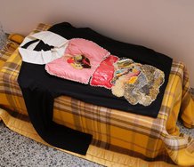
Chiara Corbelletto’s group of different sized plastic sculpture, cut out with circular contours, bent, buttoned up and suspended, work nicely collectively, although they seem slightly squeezed into the space. They seem like offcuts made into strange fashion garments, or burst reptilian egg casings that can join up. Though they are too close to the wall Corbelletto has some forms quite high up and this generates considerable impact. Gives them extra clout.
Nearby - also high up - a heavy brown-paper tube, made by John Radford, folded and pleated like a concertina, advances up the wall like some crazed awol air conditioning vent. It isn’t till you move through an adjacent door that you realise that it is a huge paper bolt ‘screwed’ through the wall, so that its head is on the other side.
Fiona Garlick has used a jig-saw to cut out various dangling forms and chain links that make up a giant’s bracelet that is suspended horizontally under a comparatively low ceiling. The carefully planned, chunky plywood shapes look bold and compelling - unpainted in the circular space - though some narrative elements, like a sheep’s head, seem crass and too obvious. The thickness and solidity of the ply brings a nice quality to her contours.
Christine Hellyar’s three lily-like bronzes don’t really work in this space. They struggle to provide presence in a space dominated above by an enormous chute used for loading up trucks. She needs more items so the project doesn’t look like a last minute throw-in. It looks too physically insubstantial.
Melanie, Ahilapalapa and Keva Rands have a similar problem with their installation which is in essence floor-based. Wrong call for this site. The work’s horizontality with objects and printed poem laid out on pallets, and projected image of the Pacific, renders it practically invisible. The best part is a series of delicate clusters of Futurist-like letter formations stuck to the curved walls. Because they are at eye-height, they engage.
There are five works here well worth spending serious time with. Silo 6 is a marvellous space to move around in, enjoying these projects and the venue’s vertical tubular forms. Hopefully as a facility it will continue.
John Hurrell


 Advertising in this column
 Two Rooms presents a program of residencies and projects
This Discussion has 0 comments.
Comment
Participate
Register to Participate.
Sign in
Sign in to an existing account.