John Hurrell – 23 July, 2013
For the talented individuals here, each has their own approach to colour manipulation, its focus and guiding purpose. The architectural reference of the title seems to allude to the interaction between vertical and horizontal components in most of these works, as well as the meeting nearby of wall with ceiling or floor.
Auckland
Knoebel, Sandback, Rae, Roeth, Umberg, Nikolic, Vary, Martin
The Architecture of Colour
16 July - 23 August 2013
Eight artists with thirteen varied, often complex, works: this cleverly installed exhibition presents colour as something almost indistinguishable from shape, form, structure, field and line. For the talented individuals here, each has their own approach to colour manipulation, its focus and guiding purpose. The architectural reference of the title seems to allude to the interaction between vertical and horizontal components in most of these works, as well as the meeting nearby of wall with ceiling or floor.
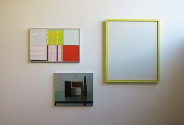
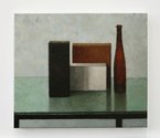
Most of the items here are non-objective paintings, the exception being a ‘realistic’ Jude Rae canvas of a thin bottle and three blocks on a glass table that has a black metal rim and legs. In this new context, due to its explicitly abstract neighbours, it flattens out and takes on a Mondrianesque ambience.
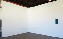
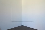
Some works hover in a middle conceptual space between the two poles. The Fred Sandback with its two right-angles of purplish black yarn, has the enclosed gallery corner as its ‘content’, blending aspects of Rae (though not illusionistic) with aspects of Tomislav Nikolic with its obviously thicker and more complex painted ‘frame’.
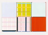
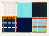
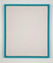
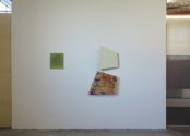
Nikolic’s subtly surfaced paintings are really a form of relief sculpture where you need to peer closely between the ‘painting’ and the ‘frame’, as well from the sides. You examine slivers of partially hidden planes, as you also do with the adjacent Imi Knoebel with its tartanlike paper strip grids. Knoebel’s sumptuously hued images are full of surprises for the observant, making good use of unanticipated tones and tertiary colour combinations.
The angular two-panel works of Elisabeth Vary and the singly vertical rectangle of Gunter Umberg both have deep receding bevelling that makes the front surfaces appear to mysteriously float in space far from the supporting wall. Yet they are very different in emphasis. The Vary pair (one form plain and pale, the other with organic but linear marks) has quadrilaterals of two heights and tilts that align along a continuous lefthand edge from a certain righthand position, while Umberg’s gorgeous blue-green field chromatically melds the sea - as an association - with snookertable felt.
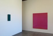
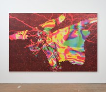
Of the remaining types, fields that you look into or through, the Winton Roeth work on paper with gridded dark blue lines has a tight geometric precision that vividly suggests skyscraper windows and industrially processed architectural modules. It’s foil, in the form of two of Leigh Martin‘s poured resin paintings, has viscous but delicate shifts of hue, and faint granular textures that inflect the plane - within vivid synthetic colours rich in fruit flavour associations.
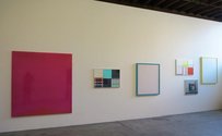
The whole exhibition has a nice feel to its hang, playing on linear and internal qualities of the rectangular frame, the line-up’s punctuating elements positioned with unpredictable spacings. On the long wall especially there are paired colour interactions going on between the Knoebels and the Nikolics. This is a clever stock show, and because the Sandback, Umberg and Knoebel works are quite exceptional, any one single example from them alone is worth a visit.
John Hurrell



 Advertising in this column
 Two Rooms presents a program of residencies and projects
This Discussion has 0 comments.
Comment
Participate
Register to Participate.
Sign in
Sign in to an existing account.