John Hurrell – 21 November, 2016
Henry's visually austere project is very much about proportion and elegantly balanced subdivisions of planar space; the pleasure of a Classicism you can walk into as well as pass as a contemplative object on the wall. It is also a sly reference to the absent doorway (an entrance now replaced by a blank wall) that used to face the descending Billy Apple staircase. The divider marks the spot.
New Plymouth
Matt Henry
Long Division
Curated by Sophie O’Brien and Chloe Cull
27 August -27 November 2016
A New Plymouth native who after doing post-graduate study in Melbourne and (now living in Auckland) has done a series of shows at Starkwhite and various institutions like Te Tuhi, Matt Henry here continues his long running interest in minimalist sculpture / meticulously refined painting that has affinities with office furniture and architectural fittings. The ground floor and the adjacent mezzanine of the Govett-Brewster are both used.
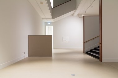
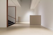
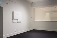
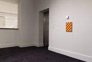
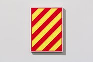
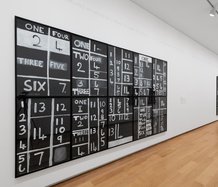
The show consists of four wall paintings (three with butted relief panels that have links to light switch cabinets and metal fuseboxes; one other single panel work with garish red and yellow diagonal stripes that are linked to fire warning signage), and three much larger, floor based ‘screen’ paintings that are like freestanding office dividers and wall based office pin boards.
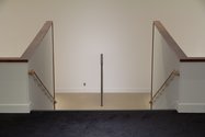
The ‘dividers’ are perpendicular brown linen planes that divide up the floor and wall space in a manner that echoes the division of the front panels of the pale grey paintings. In cross section there are two layers in both types of painting: one has x: 2x thickness in the wall panels - the front panel half the thickness of the back; the other y: y on the floor, but complicated by a thick line of black tape which hides the central join and which visually links them with the cladding covering the Apple balustrades. There is a sense that the ground floor becomes a painting referenced by the walls.
Henry’s visually austere project is very much about proportion and elegantly balanced subdivisions of planar space; the pleasure of a Classicism you can walk into as well as pass as a contemplative object on the wall. It is also a sly reference to the absent doorway (an entrance now replaced by a blank wall) that used to face the descending Billy Apple staircase. The divider marks the spot.
Looking at the grey wall paintings in a bit more detail, the long division of the ‘divider’ floor plan works is alluded to in the bifurcated butted panels on their outer frontal surfaces. Two are on the ground floor and one is on the mezzanine, the former playing off descending horizontal six part divisions, while the latter use eight. On the ground floor the second work repeats the bottom half of the first, and there is a wit that plays off the painting structure against the levels of the staircase.
This understated, but nevertheless intriguing, installation is a lovely synthesis between architecture, sculpture and painting, shrewdly blurring the once obvious distinctions between all three. It is mentally insistent and subtle, while also demanding you physically interact, move around and attend closely to Henry’s planar insertions on both floor levels.
John Hurrell

 Two Rooms presents a program of residencies and projects
 Advertising in this column

This Discussion has 0 comments.
Comment
Participate
Register to Participate.
Sign in
Sign in to an existing account.