John Hurrell – 18 November, 2017
Each work has a lovely improvised quality as if the result of a unique chain of decision-making processes. The restraint—with so few white components—makes you examine the compositional format, the asymmetrical organisation of the geometric elements: how they are positioned, and Shin's interest in light.
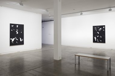
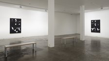
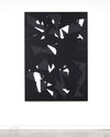
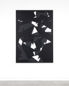
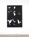
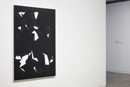
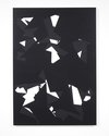
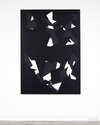
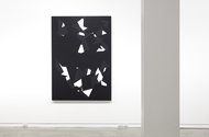
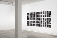
Four canvas paintings and seventy smaller compositions on paper, printed by Kevin Burns and displayed in a grid on the large end wall, make up this Jeena Shin show. The works are less holistic than her Motus series of three years ago, ie. less complicated and less dominated by an over-all pattern. The angular, tangram-style shapes remain, but fewer in terms of the surface of the picture-plane and somewhat deeper in their sense of illusionistic depth, implying foreshortened geometric forms. They even suggest looking up at a skyline of surrounding buildings, especially churches with steeples.
In terms of tones Shin uses black, white and a grey that is charcoal-like and darkish, rather than midtone. Back and grey dominate absolutely, and in the paintings the edges of the masked off forms containing built up layers are done so fastidiously that they look like tiny walls, not juxtaposed shapes.
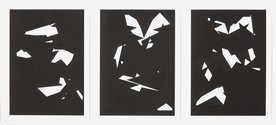
The overlapping angular black and grey forms leave spiky gaps, angular negative shapes in white that sometimes result in teeny-weeny splinterlike slivers or minute triangles. Each work has a lovely improvised quality as if the result of a unique chain of decision-making processes. The restraint—with so few white components—makes you examine the compositional format, the asymmetrical organisation of the geometric elements: how they are positioned, and Shin’s interest in light.
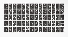
Looking at the end wall, the seventy works on paper seem positioned in the grid according to chance, and it is hard to determine any sequential logic or chronological movement. Maybe if they didn’t have white framing borders, they could merge into one big ‘black’ rectangular image in a flurry of fluttering shards. As individual compositions they might have been better as a separate show upstairs, the compositions generously spread out far apart so each vertical paper rectangle can be studied one at a time.
Though called digital photograms, that description is misleading because photograms suggest darkroom technology without a camera-using some light-excluding stencilling process. They certainly are beautiful images on paper though, a lovely parallel to the canvases, pristine and flickering—as the acute and obtuse angles jab and nudge away at the picture planes and edges of the small vertical rectangles—all aligned in a floating paper grid. A nice contrast to the much taller and thicker canvas works that revel in their comparative isolation.
John Hurrell



 Advertising in this column
 Two Rooms presents a program of residencies and projects
This Discussion has 0 comments.
Comment
Participate
Register to Participate.
Sign in
Sign in to an existing account.