John Hurrell – 17 September, 2020
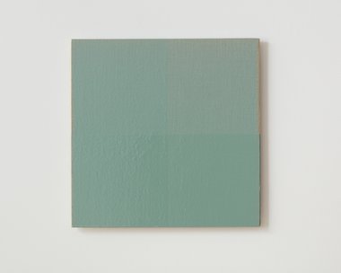
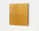
First one layer is applied to the whole square and left to dry, then the same thin paint applied to the bottom half, and again left to dry. Then a third layer is applied over the lefthand half. The result is a square that is faintly divided into four quarters. The thinnest paint (with detectable gridded texture) is found on the top righthand quarter, and the thickest (with gluggy tactility) the bottom lefthand quadrant. The top left and bottom right ones both have two layers.
Auckland
Simon Morris
Colour follows light, light follows colour
5 September - 10 October 2020
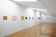
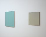
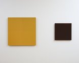
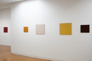
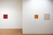
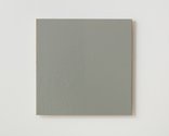
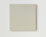
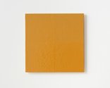
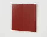
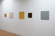
Upstairs in the narrow gallery of Two Rooms, Simon Morris presents thirteen monochromatic unframed panels-all squares but of different sizes. With linen or jute (on wood) as the woven fabric support.
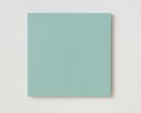
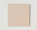
Though ostensibly ‘monochromes’ these very subtle works focus on the surface results of acrylic layering on textured material. First one layer is applied to the whole square and left to dry, then the same thin paint applied to the bottom half, and again left to dry. Then a third layer is applied over the lefthand half.
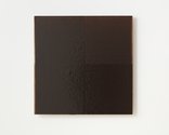
The result is a square that is faintly divided into four quarters. The thinnest paint (with detectable gridded texture) is found on the top righthand quarter, and the thickest (with gluggy tactility) the bottom lefthand quadrant. The top left and bottom right ones both have two layers.
Morris‘ point is—through his application process—to let us enjoy the angled light that rakes across the tiny gridded weft and warp of the woven material underneath the glossy coloured pigment. He encourages you to duck and dive when moving your eyes into the right position. Morris is exploring saturation but manipulating paint in a very different way from the large installation he did in Christchurch in Yellow Ochre Room in 2016. That work utilised dilution and dispersion. These works are different. While also involving the latex medium that carries the pigment, they focus on liquid cumulation via layering.
You can also enjoy his choice of colour mix—the sort of hues he constructs (choosing a particular tonal and chromatic range: usually connected to land, sea and skyscapes)—outside of contrasting saturation levels, plus what happens at the edges of the stretcher within the four quarters. The sense of the four sections (each with two outer edges) is very apparent, as you analyse the impact of the added thinly layered rectangles to the surfaces beneath.
Occasionally I find Morris‘s projects on application process and medium control at bit dry—in the sense that the act of looking is not well rewarded with obvious sensual satisfaction—but these works are not at all mentally monotonous, having a perfect balance of observational demands and subtle perceptual benefits. Perhaps it is the formal geometry of four small butted together squares (inside a larger one) with different degrees of edge acuity. He has created something optically compelling.
John Hurrell
 Advertising in this column
 Two Rooms presents a program of residencies and projects
This Discussion has 0 comments.
Comment
Participate
Register to Participate.
Sign in
Sign in to an existing account.