John Hurrell – 30 August, 2023
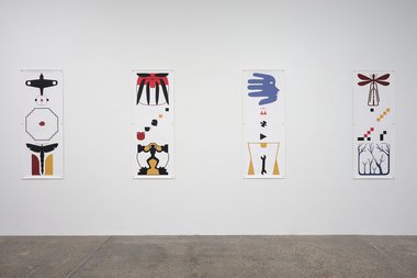
With the five vertical 3:1 canvas oblongs, descending square structures of stacked thirds dominate, often with a middle section presenting a diagonal movement (from lower left to top right) of small elements. Usually at the top, there are winged/fingered or leafed motifs; no layered overlaps, but with strident spatial isolation to maximise morphological clarity.
In this current Richard Killeen show there are two formats of loose canvas work, both types seen in his exhibitions before: 1524 mm x 1524 mm squares (not tilted as diamonds); and 1524 x 595 mm vertical oblongs—all held in place via grommets and strong pins.
The three large square Hahnemuhle canvases, each with 8 grommets, tease with possible alignments, for they can be turned to any of four options. Yet even though some rendered containers are deliberately depicted on their sides, I have a feeling the way these squares are shown here is the way the artist likes them.
In these three (Jar with Ladybird; Tin with Head; Tin with White Bird) there is a typical layering of jostling motifs, negative white spaces (mammals, fish, birds) and positive black spaces (insects, spiders, trees). Some Walters references are noticeable in a couple of inserted planar fields, while the English artist, Michael Craig Martin, has a presence in the elegant cleanly linear style. There is also the occasional floating patterned head, tilted 3D semi-colon, and spiral seashell forms in patterned formation.
Overall they are akin to works of the American artist, Al Held (from the late sixties) in their spatial mingling and entangling of simple linearly-defined volumes to make complicated fields, with horizontal cylindrical jar/tin forms, boxes and patterned planes. Some patterned planes extend beyond the plasticity of their original forms to enter other adjacent forms.
With the five vertical 3:1 canvas oblongs, descending square structures of stacked thirds dominate, often with a middle section presenting a diagonal movement (from lower left to top right) of small elements. Usually at the top, there are winged/fingered or leafed motifs; no layered overlaps, but with strident spatial isolation to maximise morphological clarity. These are like earlier presentations of this format, but not modelled, patterned or textured, retaining a silhouette style and exploiting three or four colours.
Within these vertical rectangles you find yourself focussing on the organisation, comparing signs (pairing them up semantically or matching formal ocular qualities), or optically following linear diagonal/vertical sequences that imply cognitive activity over time, or perhaps syntactical sentence structures.
Often you ignore the middle sections and compare top units with bottom ones, savouring the similar silhouetted shapes or meandering linear formations, qualities in this process akin to American meta-abstractionists like Jonathan Lasker where patterns of logic in ‘scribbled’ formations are being teased out. Waiting for your evaluation.
Some motifs (or blended motif parts) you find are common to both squares and oblongs: eg. A black ladybird, or square-shaped wire hinge with triangular flaps, a plane or fish. This suggests that the show might be tightly organised overall, that smaller narratives are threading through the separated larger ones, tangentially linked. Maybe the vertical rectangular works can be seen as listed ‘footnotes’ to the larger square ‘texts’.
Perhaps you are like me, in that, sometimes you come across essays that are painfully boring, but with surprisingly juicy informative footnotes. With Killeen, however, both ‘sorts of format’ are engrossing: linked or unlinked. Two distinct methods of manipulating the attentive viewer’s mind.
John Hurrell




 Two Rooms presents a program of residencies and projects
 Advertising in this column
This Discussion has 0 comments.
Comment
Participate
Register to Participate.
Sign in
Sign in to an existing account.