John Hurrell – 21 October, 2014
Yet I like these works as pleasurable little columns, where rather than three items resonating tightly together as the artist intends (a visual and semiotic chord, or say a conceptual triangle) with certain commonalities stressed or oppositional positions acknowledged, one skips from one motif to the other, but rarely hovers over the synapse in between, with the third component possibly ignored.
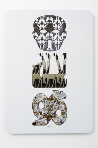
As is well known, Richard Killeen has been making images for paintings for a long time now - his computer files cover work from five decades - and his new show features random selections of hybrid images typical of those he has been presenting in recent years: heavily patterned, blended creatures and objects that look as if they were carved out of thin decorative marble. These chance selections (thirteen works) he is showcasing in triads, vertical displays (flat stacks frontally presented) rendered as if the motifs were reliefs - with rounded edges and glittering highlights.
Each thin ‘carving’ has a name, a portmanteau appellation that is likewise a hybrid and consistent with the two main (shape-elucidated) origins of each condensed, very compact mutation - usually there are at least three referents. Most of these names are obvious, like ‘fronner’ (frog, spanner), ‘snakat’ (snake, cat) or ‘deeg’ (deer, dog) - and sound vaguely Celtic. Or something written by Michael McClure.
These names are written on the panel below each image, in small type. You have to get close to read them as it is not so easy when you stand back. It is almost like a variety of semiotic club sandwich where a textual poem merges with a heraldic emblem: three lines alternating with three motifs. You could pry them apart and ‘read’ them separately as pure poem or pure image.
Embodied within each suspended panel is an interesting ‘political’ dilemma, because even though the elements are selected by chance as a method of creating an unforeseen combination, ripe for inventive interpretation, vertical stacking implies hierarchy. A horizontal row doesn’t.
So in such a column, the item at the top has greater status than those below - albeit all three picked by chance and their positions determined likewise. The top item also provides the name for the work.
Or (conversely) is it like a music concert, when the last performer of the evening has highest status? Do our eyes start at the top and work their way down to the ‘star’? (Or is such vertical movemet a reference to an infinite chain of signifiers where no ‘stable’ signified is ever reached?)
The last possibility is that, looking at the configurations in the gallery, they are carefully hung so that (ideally) the middle image is level with the eye height of the average New Zealand gallery visitor. Of the three the central motif theoretically gets the most attention.
Yet I like these works as pleasurable little columns, where rather than three items resonating tightly together as the artist intends (a visual and semiotic chord, or say a conceptual triangle) with certain commonalities stressed or oppositional positions acknowledged, one skips from one motif to the other, but rarely hovers over the synapse in between, with the third component possibly ignored.
However I am aware that with three images being so close together that are not three separate artworks, but parts - over time one’s investigative predilections towards individual components can drift. Likes and dislikes can flip. Yesterday’s boredoms can become tomorrow’s passions. As with a CD of musical tracks or an anthology of poems, one’s enthusiasms within each unit, over the years radically change.
Even though these have been randomly grouped it would be interesting to see if works carefully selected by Killeen would be that much different, his triad picking rationales more transparent. Perhaps not?
John Hurrell


 Advertising in this column
 Two Rooms presents a program of residencies and projects
This Discussion has 0 comments.
Comment
Participate
Register to Participate.
Sign in
Sign in to an existing account.