John Hurrell – 21 April, 2010
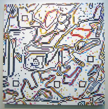
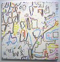
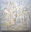
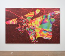
They are a sort of grid painting (with tiny modules) where three varieties of overlapping map, representing topographic landforms, global contours, and inner city streets, coalesce with a form of aerial perspective that seems to show a high up, three-quarter view of city buildings.
Auckland
Sue Novell
Bionica
8 April - 8 May 2010
The seven paintings displayed by Sue Novell at Antoinette Godkin’s feature a colourful pixelated line where paint is applied in linear formations of small squares. They are a sort of grid painting (with tiny modules) where three varieties of overlapping map, representing topographic landforms, global contours, and inner city streets, coalesce with a form of aerial perspective that seems to show a high up, three-quarter view of city buildings.
So while they are highly abstract, and hint of the gesturally random and jumbled, you still think of maps, perhaps television screens, and rug or basket weaving - while also spotting the occasional rooftop, courtyard, park or waterfront. While at the first glance these paintings may seem formulaic, it doesn’t take too long to realise that the works greatly vary in canvas size, pixel size, chroma range, tonal range and density of mark. Some have surprises like double lines that look like knitted bike chains, or rectangular jutting forms near the bottom edge that look like fuzzy wharves or jetties.
Within these apparently competing systems the ones that aesthetically work best seem to be the densest in terms of surface covering and layering, and which feature fluid compositional movement and dramatic use of dark tones. The ambiguity of various interwoven amorphous forms is not undermined by too much openly airy space or perpendicular geometry.
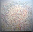
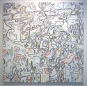
Novell’s largest work here is the pale and less griddy P926000 VI. It has an all pervading looseness, and is the earliest of the series. The pastel squares are in fact blobby dots, whilst the whole surface is more painterly as a series of marks and less referencing of electronics. In contrast the middle sized works often have a diagonal movement of shimmering organic shapes while the smaller paintings have a nuggety compactness caused by relatively large dark pixels. That makes them somewhat graphic, bringing a crisp concision, an appealingly robust energy.
 Two Rooms presents a program of residencies and projects
 Advertising in this column
This Discussion has 0 comments.
Comment
Participate
Register to Participate.
Sign in
Sign in to an existing account.