John Hurrell – 18 March, 2011
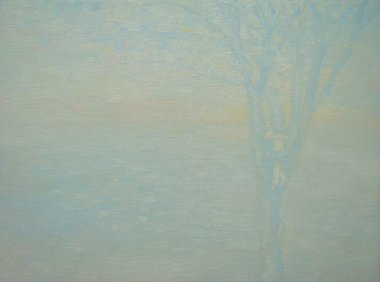
The Willemsen works that stand out are ambiguous and not easy to provide a narrative for. Something odd is happening in their muddy (but beautiful) chromatic murk that you mentally try to grasp but can't quite: a tree seems to be clutching a child in its fork; a gesticulating man is addressing somebody unseen in the greasy fog.
Of these two artists, it is probably Ruth Thomas-Edmond who is better known, especially as she recently reached a wider audience with her cardboard landform-based sculpture at Te Tuhi’s drawing wall.
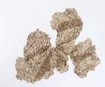
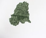
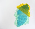
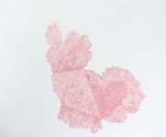
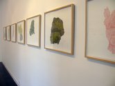
Here, in this current dealer show, besides some small coloured sculpture (they are far too small in my view) she exhibits some of her distinctive drawings, painted on paper using thinly mixed acrylic and skinny brushes to make clusters of looping marks reminiscent of coffee beans or puffed wheat. The best images are the ones sticking to a single colour, especially natural or browny earth hues. Related to Judy Millar, they have ragged and torn outer edges to their organic shapes but when new layers are added, the traversing diagonal edges are impeccably straight - as if done using a ruler.
These hedgelike forms intrigue with their understated nuances of implied geometry, mixed with obsessive repetition and spontaneous changes in direction generated by a restlessly disembodied hand. I like the metaphor of growth so apparent, the drawer as botanical cultivator.
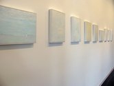
Alexi Willemsen makes small oil paintings that specialise in tonally matched, much caressed greyish hues. Her over-all pale field of stroked on paint is interrupted by forms rendered in carefully controlled chroma, modulating each panel’s visual temperature and narrative image.
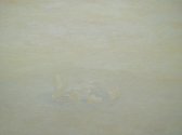
The ones that stand out are ambiguous and not easy to provide a narrative for. Something odd is happening in their muddy (but beautiful) chromatic murk that you mentally try to grasp but can’t quite: a tree seems to be clutching a child in its fork; a gesticulating man is addressing somebody unseen in the greasy fog; another man helps a woman find the cigarettes in her coat pockets, or are they fighting; a crumpled piece of paper might be a fallen figure.
Some images, like the portraits or running figures, are easy to recognise but lack mystery; the best ones avoid too many colours and keep to a limited palette.
Actually I’d like to see Willemsen make bigger paintings. Her work would suit a more spatially expansive dynamic, where a sea of tonally/chromatically manipulated paint would push the viewer into a more careful scrutinizing of the planar surface, square inch by square inch. Her paintings need to be more ambitious with more wallop, so they become even more memorable - and change from being nice to being great.
John Hurrell


 Two Rooms presents a program of residencies and projects
 Advertising in this column
This Discussion has 0 comments.
Comment
Participate
Register to Participate.
Sign in
Sign in to an existing account.