


John Hurrell – 4 June, 2017
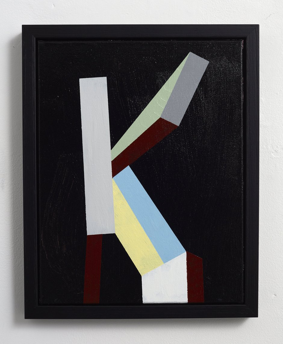
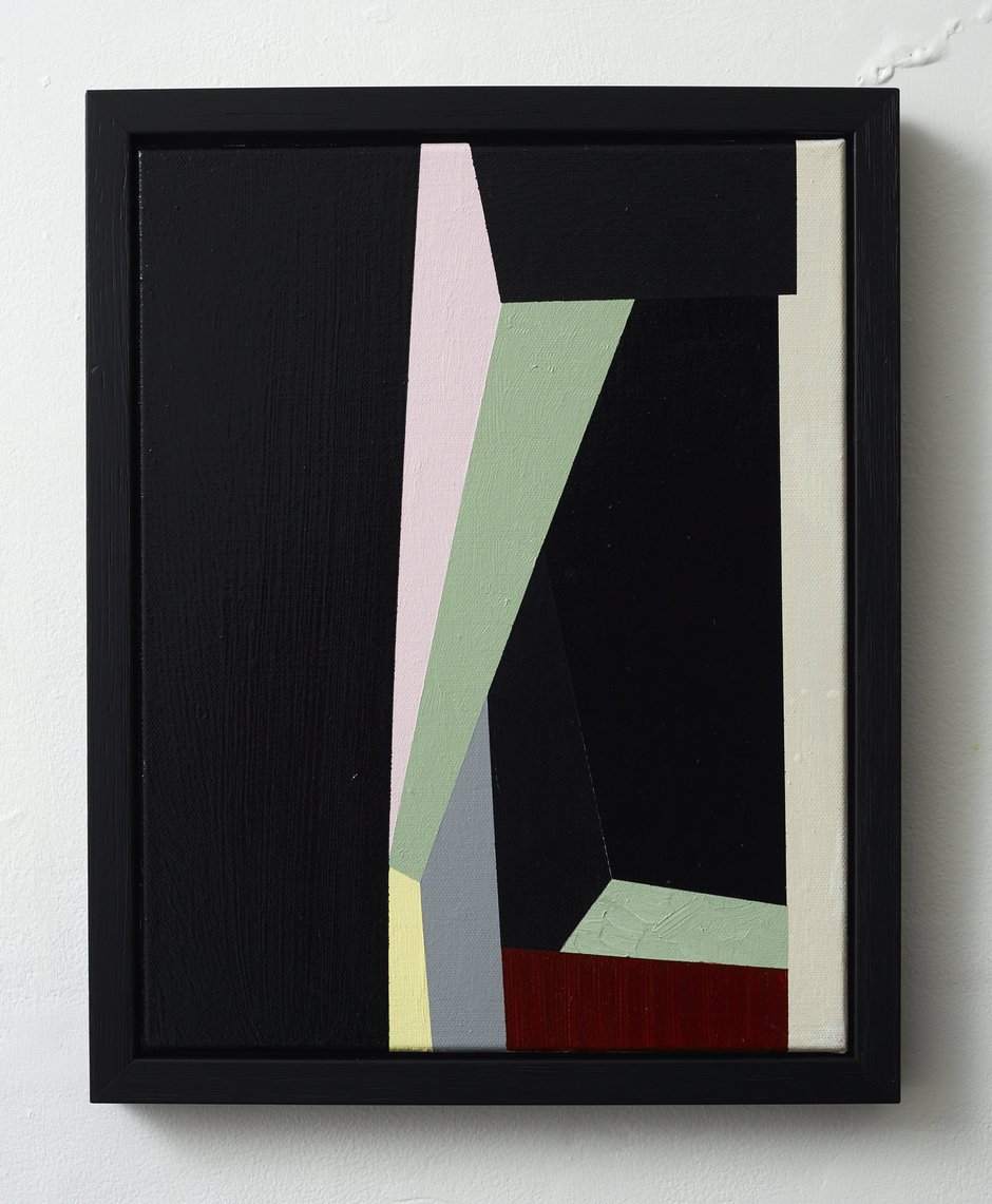
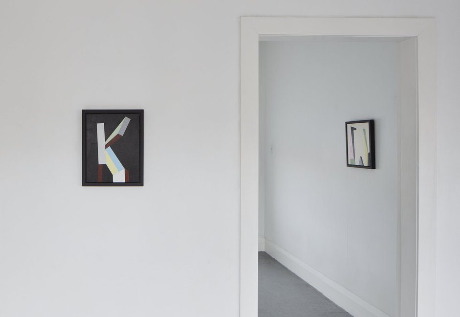
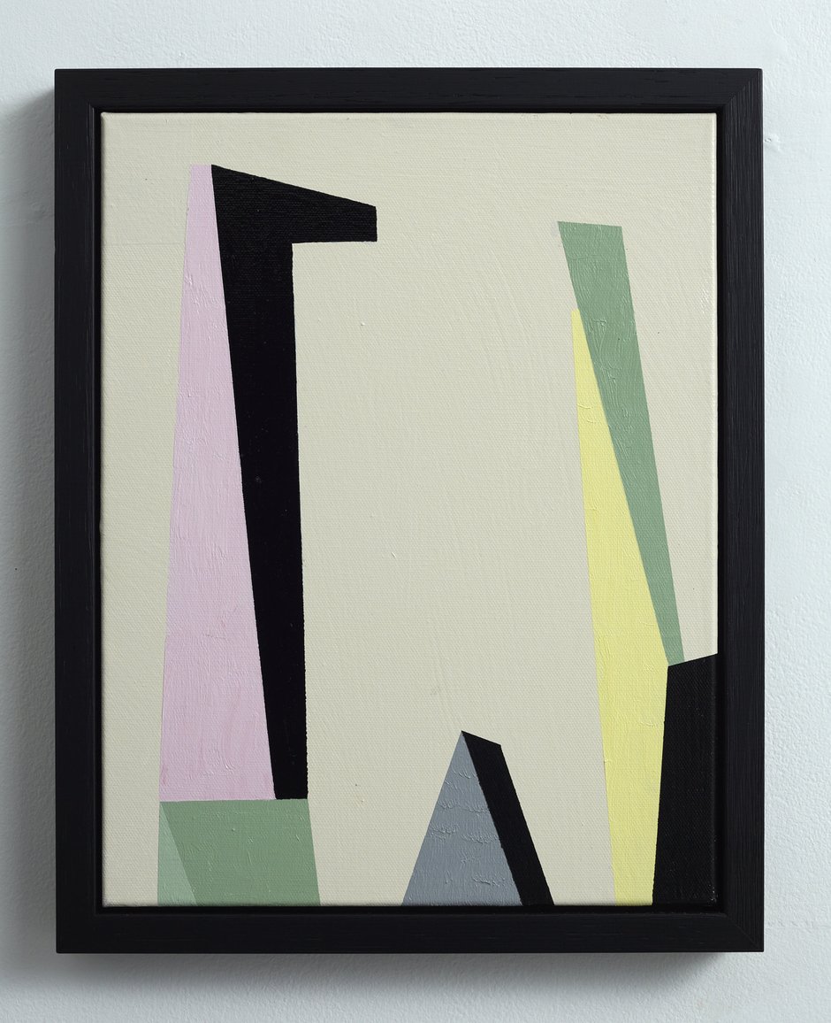
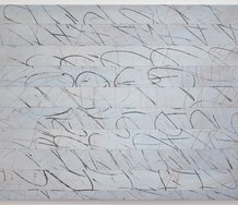
While of the seven works, three long vertical paintings emphasise flickering rhythms and the integrity of the picture plane, three others are much smaller - composed around letter forms such as K, U and W, with diagonally aligned vectors that tend to buckle or recede and exploit the conventions of perspective.
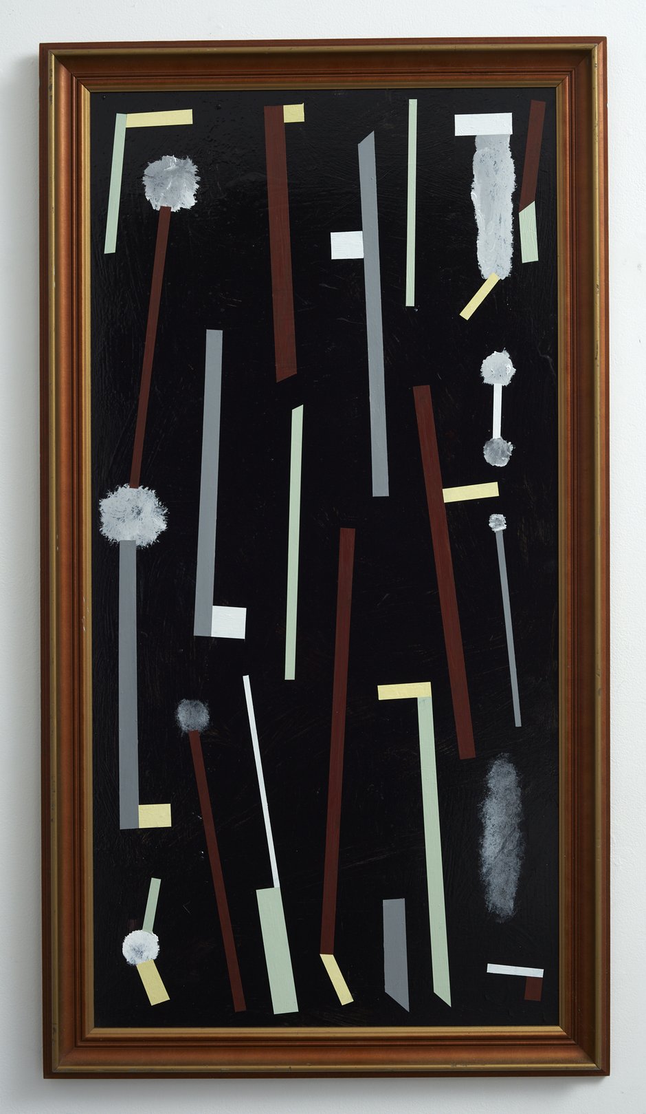
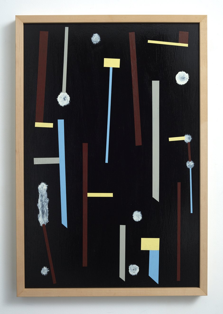
In this presentation of ‘modern’ paintings with its ambiguous title, the seven new works from Tony de Lautour have formal concerns (glowing vertical strips interacting in space with fluffy dandelionlike balls) that also combine to be elongated alphabetical letters, but more likely appear to be tools such as long-handled bottle cleaning brushes, or brass tubes or parts of pistons. The hovering ‘handles’ have a throbbing musicality, a shimmering pulse of floating lines, and the black acrylic-enamel background is dominated by a Frizzell-like sheen.
While of the seven works, three long vertical paintings emphasise flickering rhythms and the integrity of the picture plane, three others are much smaller - composed around letter forms such as K, U and W, with diagonally aligned vectors that tend to buckle or recede and exploit the conventions of perspective. In the vertical rectangular works - by way of contrast - the yellow or golden bars or rods are accompanied by wind blown fluffy seeds: dandelions or moth plants - or else cigarette smoke from the shorter ‘bars’.
The hard, vertical and narrow is accompanied by the circular, soft, evanescent and insubstantial. Their space is like a narrow slot, with the hovering lines parallel to the standing viewer, and the black air laden with potentially generative vegetative traces or wisps of tobacco-laden mist. There is a hint of an exploding workshop, a raining down from the sky of brass mechanical pieces and finely proportioned saw blades.
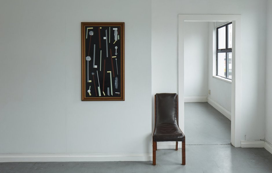
De Lautour’s collections of vertical images are bordered by ‘op shop’ frames, the type commonly found surrrounding tourist landscapes of mountains and lakes, pale blue and purply landforms surrounded by air that with its purity is the very opposite of de Lautour’s oily aether. The ‘alphabet paintings’ naturally are framed differently, being deliberately plain and simple, exploiting an elegant minimalist austerity devoid of irony. The internal painted space is deeper, more tunnel-like, and the extending letter forms twist around inside it.
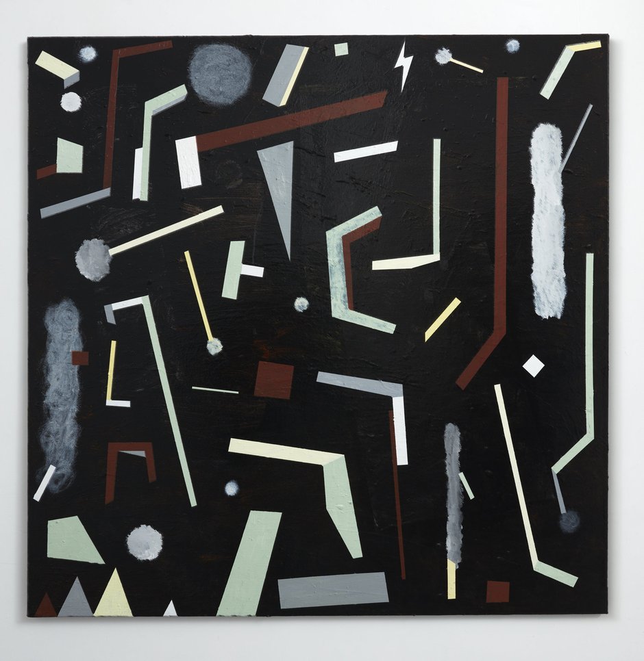
The seventh work is square in format, and features thin, black, over-painting of an abandoned stretcher from another artist, now recycled. Its internal forms are more compact and squat than in the vertically aligned images, and the black coating much less dense, more brusherly. The shape gives the forms less drama and directional movement, making them comparatively unstable and less anchored. It could be seen as parallel with a written personal letter as well as a collection of assorted phonetic symbols, a missive where the emotional content is volatile and jittery, darting all over the place. Indecisive, not focussed and firmly channelled like the others.
John Hurrell
 Two Rooms presents a program of residencies and projects
 Advertising in this column
This Discussion has 0 comments.
Comment
Participate
Register to Participate.
Sign in
Sign in to an existing account.