John Hurrell – 29 January, 2018
These two very different painting projects reference the architectural fittings of the space, and although not critiquing, reference in their thinking the works of Billy Apple from the late seventies. They draw attention to the power point fittings near the floor and the square air-conditioning grille in the ceiling, for example.
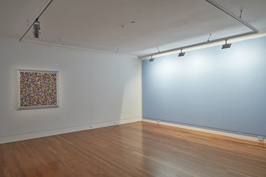
Wellington painter Gary Peters presents two works in Te Tuhi’s Gallery One: one a painted—gridded up—wooden panel (Very modern, 2017) suspended on the wall; and another much larger monochrome work (Slipped monochrome #2 (Oxymoron), 2017) painted directly on to another wall. These two very different painting projects reference the architectural fittings of the space, and although not critiquing, reference in their thinking the works of Billy Apple from the late seventies. They draw attention to the power point fittings near the floor and the square air-conditioning grille in the ceiling, for example.
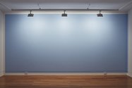
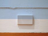
The large pale blue monochrome wall painting takes the measurements of the main wall it is painted on (above the power points) and drops the large rectangle down about three inches—while also swinging it to the right. The proportions of the wall descend and swivel. This way it goes round the corner and onto the next wall: just a narrow vertical strip on the adjacent plane. The width of the drop down and across seems to reference the width of the lighting track from which the wall is illuminated, a horizontal frame that is attached to the ceiling.
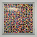
While the blue monochrome wall work is matte, the multi-hued gridded painting is shiny with a gloss varnish applied over thin paint that accentuates the vertical brush texture. Apart from this texture it looks very much like a paint supply chart, so that you instinctively look and see if you can find the blue of the adjacent wall. You can’t.
The four mitred framing panels enclosing the coloured grid are painted in two tones of grey, with small circles indicating the positions of the four screws holding the nearby, square, cross-sectioned, air conditioning unit in. The flickering grid has 41 x 41 modules with only one side flush with intact squares. The other three are truncated, in slivers.
Each horizontal row uses the same line up of separate and distinct hues, with each unit randomly positioned. Five of the forty-one colours are repeated, to be scattered amongst each row: a pale yellow; a pale peach; a dark purple, a very dark purple; and a very dark khaki. All of the hues are enclosed in a white, eighth of an inch thick, linear grid.
So we have here two very different sorts of painting that exploit the architectural properties of the room. Both are quite complicated and subtle, and both take time to analyse. As Peters says: A slow take.
John Hurrell

 Two Rooms presents a program of residencies and projects
 Advertising in this column
This Discussion has 0 comments.
Comment
Participate
Register to Participate.
Sign in
Sign in to an existing account.