John Hurrell – 28 March, 2022
The selection is varied and full of surprises. Thornley seems to like to play with logic, particularly via geometry; while embracing clarity. Also trying out novel methods of painting/drawing; testing out water-resist under-painting, gridded masking tape composition and ‘dry-brush' roller application—exhilarating in creating unpredictable, emerging highly textured layers of marks.
Auckland
Geoff Thornley
From the Collection of Dame Jenny Gibbs
16 March - 2 April 2022
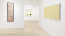
In this beautifully sequenced show, eleven paintings (made between 1972 and 1988) are presented—almost all being up for resale—from this most remarkable (and under recognised) Auckland-based abstractionist. The exhibition gives us an unusual opportunity to examine and think about Thornley’s meticulously crafted and exceptionally elegant visual art statements.
The selection is varied and full of surprises for the observant. Thornley seems to like to play with logic, particularly via geometry; while embracing clarity. And trying out novel methods of painting/drawing; testing out water-resist under-painting, gridded masking tape composition and ‘dry-brush’ roller application—exhilarating in creating unpredictable, emerging highly textured layers of marks.
There are five morphologically connected pairs that are for sale, and one additional work—connecting opposite methodological poles—that is not.
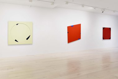
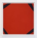
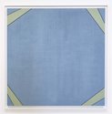
In the four corners of two large stained squares (Construction No. 15, 1983; Construction No. 16 Corner Work, 1983), outward extending unparallel lines open up unseen but implied spaces. On one side of each corner converging edges; on the other, splayed and separating.
Both works have the triangular and small quadrilateral elements cut-out and reinserted, with a deep 8 mm trough that serves as a delineating perimeter. The two works (red and blue) are tonal opposites in terms of the relationship between the central planes and the diverging bands crossing the corners.
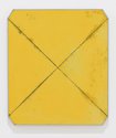
One light yellow ochre work (Painting Yellow No. 8, 1979) has truncated corners where the sliced off points indicate where the vertical and horizontal edges met, initiating tensions through two vibrating thin diagonal masking tape lines that cross over and traverse the picture plane.
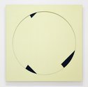
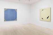
In another (Construction No. 12 Red, 1983), four different sized semi-circular canvas-covered pieces tightly lock together to create tensions around a red rhomboid’s four edges, 8 mm linear troughs again serving as lines. Or, in another (Construction No. 7 Tondo, 1982), a large creamy circular centre exposes in internal cross-section where three layers of plywood board are used: the flat enclosed disc; on top of that, three black different sized chunks of segments; and on top of them the planar contents of a square beyond the creamy circle.
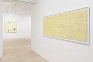
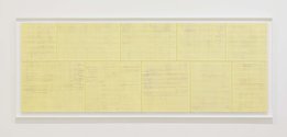
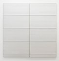
Several works have gridded stacks of delicate rectangular modules, visible or implied (as almost visible). Some matrixes (Untitled No. 5, 1988; Cipher, 1990) have deep cut-into edges, and in the bone coloured Cipher, the top and bottom edges are raised so they catch the raking light as the descending plane swoops down only to suddenly lift up. Within Untitled No. 5‘s ‘modular’ plywood rectangles are further textures, rippling roller paint patterns stacked up within, but raised and covered with ‘dry’ paint. In this butter coloured work the proportions of the apparently modular horizontal units subtly diminish from left to right.
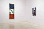
The two earliest works (Vertical Untitled No. 7, 1972; Papalangi (Banner) No. 8, 1972) feature watery softly stained smudgy colours on paper, and well-known western symbols such as hearts and crosses. There seems to be a spiritually focussed (heraldic) mindset at work, less preoccupied with materiality and manipulation of pigments suspended in agitated fluid.
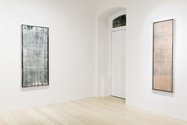
To my mind, I personally prefer the restraint and austerity (non-literalness) of the later paintings, though it might be argued that their grids and geometric forms are no less symbolic or literal. The works from 1972 help us understand the development of the two possible peaks of the exhibition, the 1975 White Painting No. 6, and Albus Vertical No. 14.
The former has a gorgeous grey texture from vertically sweeping, dramatic, pale brush-bristle marks peeking through a speckled inky grey wash; while the latter has pink vertical rectangles delineated by very thin masking tape where the horizontal and vertical borders are each accompanied (one at a time) by separate translucent washes, so that tiny charcoal squares appear at the corners.
While in this show the nuanced geometry of Constriction No. 7 Tondo, and Construction No. 12 Red, is utterly mesmerising, especially with its remarkable use of small curved edges versus straight, White Painting No. 6 and Albus Vertical No. 14 make me want to explore them spatially in an immersive sense, to repeatedly return, look around engrossed, and never leave.
A terrific exhibition.
John Hurrell





 Advertising in this column
 Two Rooms presents a program of residencies and projects
This Discussion has 0 comments.
Comment
Participate
Register to Participate.
Sign in
Sign in to an existing account.