John Hurrell – 21 March, 2014
With that nose to paper scrutiny much information gets visually shredded, becoming nonsensical and almost all texture - like a high definition, jagged seething carpet. Nevertheless there is a strong sense of compositional placement and an awareness of time and memory for the viewer, as they negotiate the length of the paper sheet comparing salient motifs, their overlaid contents and intruding edges.
One of the problems for artists making prints involving the digital collaging of images (esp. computer drawn images) is that there is a certain look, common to say Richard Killeen, Andrew McLeod, Kim Meek, Gregory Bennett and ‘Toy Story’, that has become ubiquitous now through advertising. This finish could be called ‘slick’. Maybe ‘uber-perfect impeccable’ or ‘super-duper anal’ is more appropriate. Rough and raw looking elements tend to be downplayed in favour of smoothness. No accidents are permitted: order rules.
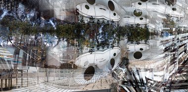
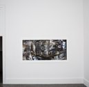
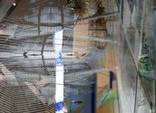
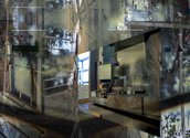
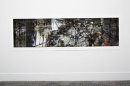
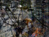
Deborah Crowe‘s images, based on repeated interior and exterior shots of buildings, are personally taken ‘field’ photographs that are repeatedly overlapped and juxtaposed so that the once discrete architectural structures merge. The prints seem vaguely related to the layered screenprints of Rauschenberg (and perhaps early Warhol), but with very high definition and naturally, no ink/paint spillages. There is an embracing of chaos, a sense of wild abandon where control appears to be slipping away. Within it there’s a density of laid-over shaped mark, and intricacy of detail, that you could almost call ‘painterly’ - not in surface tactility (as if on the paper) but in richness of minute detail (its density) and acuity.
Within this ‘painterly’ quality of jumbled (but precise and delicate) domed birdcage-forms, filigrees and clashing receding perspectives, there are some parts - when you stand back - that could almost be dark paint applied with a scraped comb, spatula or squeegee. They have a slightly humorous fifties ambience, a hint of manually contrived geometry.
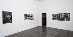
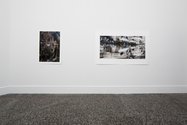
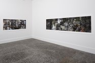
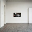
On her horizontal rectangular sheets, one can see in Crowe’s compositions controlled rhythms, methodical patterns where certain architectural elements are repeated, mirrored, tilted, reversed, reduced or slowly condensed. The ink sheen is soft and matte, enhanced by the avoidance of glass, while the interwoven tonal elements overall cling to the picture plane like reflections - with the occasional ‘hole’ providing depth. While the gallery blurb discusses the experience of architecture as multi-sensory - it provides one assumes a source of inspiration for these images - the images themselves in the gallery are experientially hugely different in nature. You need to hover close to the pinned up piece of paper to see what is happening within it and appreciate the intermingled layerings; it is not as involving of pronounced bodily movement as an item of freestanding sculpture or enterable architecture would be. Not as physical. Only side to side.
With that nose to paper scrutiny, much information - due to the incessant overload close up - gets visually shredded, becoming in some, nonsensical and almost all texture - like a high definition, jagged seething carpet. Nevertheless there is a strong sense of compositional placement, as I’ve mentioned. This brings an awareness of time and short-term memory for the viewer, as they negotiate the length of the paper sheet - toing and froing between related sections - comparing salient motifs, their overlaid contents and intruding edges. Not time and memory of the original photographed building and locale of course - not that artist impetus; the time and memory of being in the gallery with these strange jammed up rectangular abstractions, the physical encounter with the barely decipherable, swirling sensation of maximum density.
John Hurrell


 Advertising in this column
 Two Rooms presents a program of residencies and projects
This Discussion has 0 comments.
Comment
Participate
Register to Participate.
Sign in
Sign in to an existing account.