John Hurrell – 27 February, 2014
It's exciting to see this classy publication appear in Auckland. It is a good foil for the continually improving Reading Room, being less overtly institutional, possibly more spontaneous - and with images more generously mixed with text. Smith and Tweedie-Cullen make an editorial excellent team though for my taste I'd like to see it move away from functionality and community and head more towards subjectivity and interiority (perhaps looking at artists not in Auckland).
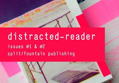
distracted-reader #1 Mixtures
Writings, b/w drawings and photographs by both Xin Cheng and Allan Smith
distracted-reader #2 A ridge, a section, an existing boundary, additions, a removed partition. A floor: concrete (where possible)
Photographs and essays by Michael Parr and Blaine Western, Michelle Menzies, Lance Peace and Henry Babbage
Both edited by Allan Smith and Layla Tweedie-Cullen. Design by Layla Tweedie-Cullen
split/fountain 2013
What a great title this is for a magazine. Better even than the title of that other terrific (but unrelated) publication, The Believer. Distraction is one of those notions that is so embodied in the act of reading, ‘off-course’ absorption so fundamental, that one wonders with such activity when does the mind not wander, and when is it ever ‘on’? With these two differently sized issues from split fountain, the first looks at the sculptural practice and (inseparable) ‘natural’ lifestyle of Xin Cheng, the second the architecture focussed projects of Blaine Western and Michael Parr. Both 156 page issues were edited by Allan Smith and Layla Tweedie-Cullen.
I’m by nature a hoarder and I still have my First New Zealand Whole Earth Catalogue I bought in the summer of 1972. It was something I acquired because I was very curious. However I was never really rapt. I never repeatedly pored over it. So four decades down the track it fascinates me to see someone like Xin Cheng fully embrace an organic DIY green ideology, doing it in a way that actually goes beyond accessing information that in a bigger picture is deeply conscious of the health of the planet.
It is not just having the savvy, independent self-supporting ethos, or craft skills, though you might think so from the way she and Allan Smith in recorded conversation extol the value of the latter. She has an artist’s instinct and touch, partially in the way she intuitively appropriates, and partially through a manual dexterity that puts forms, textures and colours together in a dynamic fashion. It goes beyond mere function to present a subtly consistent visual appeal that could be easily downplayed in favour of ‘design’ and utility. As with many artists (like say Richard Wentworth) she takes excellent photographs of inventively arranged, often improvised structures (holding up things) she chances upon as she travels around the world.
Xin Cheng‘s half of distracted reader #1 focuses on her preoccupations with research, recycling, growing and preparing food, and constructing devices to aid the practical needs of daily life. Allan Smith’s half of the publication in contrast contributes articles, photographs and images taken from his drawings.
It is great with this to have a substantial collection of Smith texts available now. (His email correspondence with Wystan Curnow on Venice and Ruskin is the highlight of Reading Room 5.) Smith’s essays concentrate on Xian Cheng, his cousin the architect Maurice K. Smith, his own urban and artist’s studio photographs, his ‘Un-illustration’ drawings (ruminations on), and of course - in characteristic fashion - copious lists (as presented within ornately worded quotations from favourite writers).
distracted-reader #2 focuses on Western and Parr‘s interest in architecture, has some inserted coloured photography and printed pink rectangles mimicking photographs - but no drawings. Sequences of photographs dominate (they have spasmodically inserted phrases, making a sort of ‘essay’ by Western and Parr) with at the end three other (textual) essays by Michelle Menzies (on the organic architecture of Barton Gillespie), and Lance Pearce and Henry Babbage (two essays on Western and Parr). It has a different feel to #1, being less busy or compact in mood, with more spatial elegance and ‘air’. The photographs have careful rectangular placement and sequencing. Not so visually dense, it’s cooler. Just as you’d find comparing the two sorts of exhibitions these artists present.
It’s exciting to see this classy (weighty yet portable) publication appear in Auckland. It is a good foil for the continually improving Reading Room, being less overtly institutional, possibly more spontaneous - and with images more generously mixed with text. Smith and Tweedie-Cullen make an editorial excellent team though for my taste I’d like to see it move away from functionality and community and head more towards subjectivity and interiority (perhaps looking at artists not in Auckland - to break out of the Elam graduate preoccupation which it has). However it’s clearly packed with scholarly research (excellent for younger writers) and like Reading Room a ‘must have’ for serious art ‘readers’ in Aotearoa. Publications you can constantly dip into (even wallow in) and never get enough.
John Hurrell
 Two Rooms presents a program of residencies and projects
 Advertising in this column
This Discussion has 0 comments.
Comment
Participate
Register to Participate.
Sign in
Sign in to an existing account.