John Hurrell – 19 October, 2011
What Henry is doing here is playing with logic and memory the way other artists like Bochner, Lewitt, Stella and Johns have done, but making it site specific so you have to bodily engage with the space to discover the careful alignments. You have to consider what is hidden around corners and what is lined up to be seen from certain locations, and why.
Matt Henry is known for a number of shows at Starkwhite where he played on the morphological connections between minimalist sculpture or painting and architectural fittings and household appliance design - using a super fastidious industrial finish, ‘constructivist’ saturated colour and very precisely built stretchers.
In this Te Tuhi installation he employs three rooms that together enclose a fourth, using strategically positioned coloured works in those spaces to cross-connect - and that room providing a chair and reading table of pertinent literature about the exhibitions.
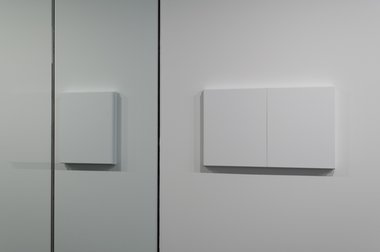
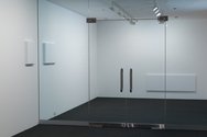
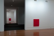
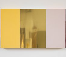
The first room is visible through the glass doors that approach this suite of exhibiting spaces at the lefthand end of Te Tuhi. Let’s call it the ‘first white room’ for at head height it has a white rectangular painting outside the glass doors about two thirds of a stretcher width out - and level on the inside with two versions of itself (butted very tightly together), the same distance in. The stretchers are double layered, a thick back panel supporting a front thinner one that is deliberately not flush at the top and bottom edges but slightly under.
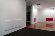
The works together tease out the visual dynamics of reflection, for if you stand in the right position within the first room ghostly traces on the glass hover around what is behind it. From the other ‘outside’ of the glass doors, looking through them into the galleries, on the opposite wall low down is a long panel. This seems to mimic the length from the outer lefthand canvas edge (in the foyer) through the glass to the other outer righthand edge of the twin panel on the inside (in the gallery). In other words it alludes to the entire horizontal combination shown in the top photograph.
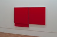
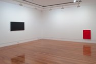
Inside this ‘white’ room from its corner we can look across to the second gallery. Let’s call that the ‘second red room’. It has two red works and one black, all hung low, like the long white painting that could be a heater. Again these works are sandwiched panels, but this time absolutely flush at all edges except for the back canvas that extends downwards for about a fifth of the height of the front one. The red double width work (see image #4) has this downward extension only on the lefthand side.
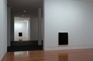
The black work (that is behind us if we are facing out) can be seen in the distance from the ‘third black room’ opposite across the reading space (darkened in the photos but not during the show) if we were standing over there. We in turn from here can see a red painting that seems to match the red work this side.(Look at photos #5 and #8). However, when we walk into this third room we find the back panels extending upwards - not down. We can’t tell until we move towards them and get close enough to see the faintly shadowed horizontal edges of the front canvases near the top.
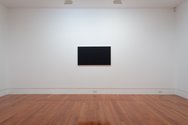
In the last room the long black canvas is hung high. It is not a sandwich layer but a single thickness. It is the same width as the low red work in the ‘second room’ that has a back panel dropping down on its left. (Photograph #4 again)
What Henry is doing here is playing with logic and memory the way other artists like Bochner, Lewitt, Stella and Johns have done, but making it site specific so you have to bodily engage with the space to discover the careful alignments. You have to consider what is hidden around corners and what is lined up to be seen from certain locations, and why - in terms of the bigger picture, the totality of the show. Plus there is the aspect of spatial extension through colour and tone, its experiential nature and how you often perceive areas to be bigger than what they actually are.
And while I would have liked to see all the power points and distracting humidity recorders removed from the space - they’re so irritating (but that would have been an expensive undertaking) - Henry succeeds in getting the intricacies of his planning across. There is a witty spatial symmetry using position, distance and sight that duplicates the use of reflection featured in the show’s entrance. A wonderful, truly exceptional, exhibition.
John Hurrell
 Advertising in this column
 Two Rooms presents a program of residencies and projects
This Discussion has 0 comments.
Comment
Participate
Register to Participate.
Sign in
Sign in to an existing account.