John Hurrell – 22 December, 2014
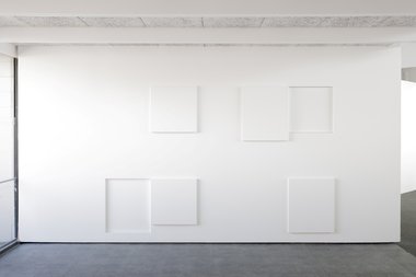
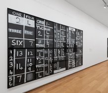
If you look at the three rows - well the two main (top and bottom) rows separated by a central blank band - you can see there is a sort of game of logical permutation going on when you ponder the vertical columns. Binary combinations being mucked around with - within the guise of what appear to be open or shut cupboard doors. Fittings in a kitchen.
Pakuranga
Matt Henry
Structural Relief (Te Tuhi)
15 November - 24 December 2014 3 January - 15 February 2015
Matt Henry was last in Te Tuhi in 2011. This time however he is concentrating on the Drawing Wall and not using several rooms.
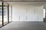
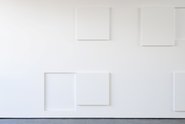
In this new ultra pristine wall relief there is a very fine line between sterility and fascination, between the boring and the exhilarating. For success in manipulating planar spatial relationships is a fragile thing, where not enough is just as disastrous as cluttered over-statement. Henry’s white composition of meticulously positioned rectangular or square shallow trays and projections is all about fine tuning and fastidious placement, working around the structure of a vaguely pulsing 3 x 8 grid.
Well not precisely a 3 x 8 grid. There is a little bit tacked on to the right to account for the wall’s edge and the optical distractions of the main room, while there is also some extra added height - to allow for foreshortening when you stand too close; plus the small implied strip underneath the bottom row allows the gridded image to anchor down and not ‘float away’.
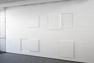
Comparisons are the key, as you measure rectangle with square, or receding tray with projecting slab, or the gaps in between - forever cognisant of the light, the grey shadows on the white, the occasional burst of starkly reflected sunlight.
If you look at the three rows - well the two main (top and bottom) rows separated by a central blank band - you can see there is a sort of game of logical permutation going on when you ponder the vertical columns. Binary combinations being mucked around with - within the guise of what appear to be open or shut cupboard doors. Fittings in a kitchen.
This relates to Henry’s earlier projects where his box shaped sculptures looked like stereo speakers, heaters or fuse-boxes, where - using a minimalist/constructivist format - sculpture to be looked at and architecture to be entered merge.
So these ‘cupboards’? One could guess that the two ‘closed’ ones are where the doors match the trays, and that the remaining ones are the two varieties where door and tray are ill matched. Altogether they bring a very balanced, formal beauty.
But perhaps there is also an economic or social message too, about poverty - ‘when the cupboard was bare‘ from Old Mother Hubbard referring to being skint. Here it appears to be about times when parts (say, in a social structure) don’t join up: when a community is fragmented and components that should have empathy stay disparate, unconnected and misaligned. The show’s title - Structural Relief - seems to be a sly pun that is soaked in irony. Being actually about Unstructured Unrelief.
This understated but clever work creeps up on you. On the precarious edge of aridity it embraces wit and slowly hooks you.
John Hurrell
 Advertising in this column
 Two Rooms presents a program of residencies and projects
This Discussion has 0 comments.
Comment
Participate
Register to Participate.
Sign in
Sign in to an existing account.