John Hurrell – 9 June, 2022
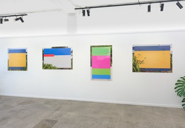
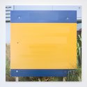
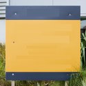
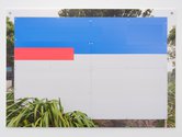
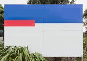
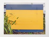
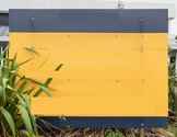
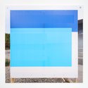
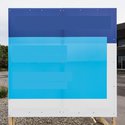
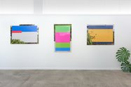
After taking the original photographs, for various reasons, Henry's project of making paintings and the attendant stretchers began to drop away. However those photographic studies eventually became artworks in themselves, especially when Henry devised the strategy of digitally obliterating the letters of the promotional language using coloured rectangles that matched their backgrounds, printing the images on corflute—the same material the signs were made of—and fastening them to the gallery walls with screws and washers: again like the signs with their attached wooden stakes and reinforcing batons.
Matt Henry (ex-New Plymouth, ex-Melbourne, ex-Auckland, and now Wellington-based) is a conceptual painter, sculptor and installation artist, well known for his interest in architectural interiors, portable commodities usually connected with sound or heating systems or monitors, and ambiguities that link these to the austere geometry of Minimalism.
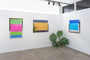
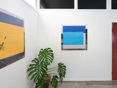
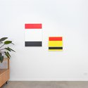
This show, organised by Emil McAvoy for his experimental project space PHOTO OP. (currently located in the front room of Skar Image Lab in Kingsland, and open on Saturdays) presents a selection of eight Henry works, surprisingly consisting of six photographs and two paintings.
Originally, around 2015, Henry took photographs of realty signage in Wellington and Auckland, for use in constructing paintings that alluded to blocks of text being redacted—and which looked like small (super-fastidious) three-colour Elsworth Kelly canvases.
They were research aids that uncropped included the realty signs in their entirety (other than the original blocked out letters) such as its background cityscape context. We see ragged torn edges of battered, butted together corflute sheets, some with screws and washers missing, and weather-induced rust stains. Sometimes plants are in front or behind; sometimes the Photoshopping chops up parts of the sign imagery or adjacent vegetation. Sometimes leaves can be seen bursting through split corflute panels.
After taking the original photographs, for various reasons (such as the responsibilities of a fulltime job and renovating his house), Henry’s project of making paintings and the attendant stretchers began to drop away. However those photographic studies eventually became artworks in themselves, especially when Henry devised the strategy of digitally obliterating the letters of the promotional language using coloured rectangles that matched their backgrounds, printing the images on corflute—the same material (light corrugated plastic) the signs were made of—and fastening them to the gallery walls with screws and washers: again like the signs with their attached wooden stakes and reinforcing batons.
Henry’s show is called Double Grammar Zone, referencing the fact that both Auckland Grammar and Epson Girls’ Grammar are in the same prestigious zoning catchment, that both art and real estate (as potential investments) are referenced in parallel, and that geometric modernist abstraction and property advertising exploit similar visual ‘grammars’. Plus there is a further doubling when the photographed corflute signage is printed again on top of corflute.
There is also a feasible doubling in perceived intention. Not only is there an art historical layering, but a political one pertaining to Aotearoa’s salient housing crisis: for a critique of a national housing shortage is implied by the exasperation caused by the shortage of readable language when these modified signs (with obvious origins) are encountered. Functional dwellings and functional language are both sought and found absent.
Trying to analyse the light on the surface of these signs is another interesting challenge. It can be a pale sheen reflected on the rippled corflute—or when framed: the glass—that contrasts with the more matte digitally overlaid oblongs. Or the illumination can be coming through the semi-translucent corflute itself, from behind, revealing the normally-hidden batons that act as vertical reinforcers. Such different and varied vectors of light interacting with the support, when overlapping, cause further confusion.
And what if these were genuine documentations? What if Henry had discovered indications of a bizarre intervention process, with mysterious abstractions stapled to stakes, popping up in suburban shopping malls or building sites—enigmatic nihilistic glyphs designed to frustrate and baffle the public. It is a delicious thought, persons unknown trying to aggressively mess with property speculators and blending activism with surrealism by inserting fake (but incomprehensible) signage into the cityscape.
Henry, however, is not of that ilk—though he might be a jokester—for his is gallery art, playing on corrugated corflute being photographed, fiddled with, repositioned on corflute, and screwed to the gallery wall. He is toying with the tactile materiality and translucency of surface, playing it firmly against smooth and opaque art-receptive walls—while encouraging us to mentally imagine a life-world beyond any art space, where crazy sign-cats suddenly rush in and scatter the ubiquitous sign-pigeons.
John Hurrell




 Two Rooms presents a program of residencies and projects
 Advertising in this column
This Discussion has 0 comments.
Comment
Participate
Register to Participate.
Sign in
Sign in to an existing account.